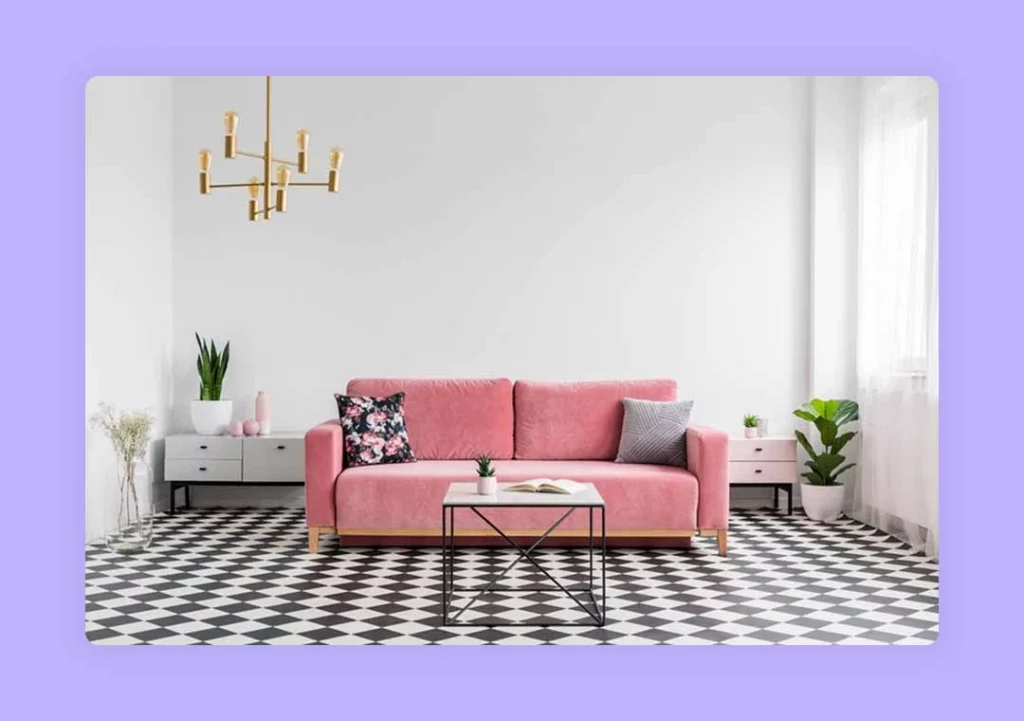
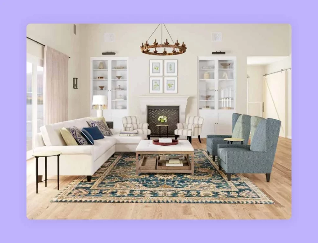
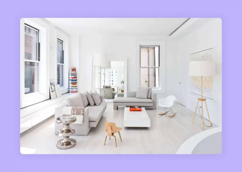
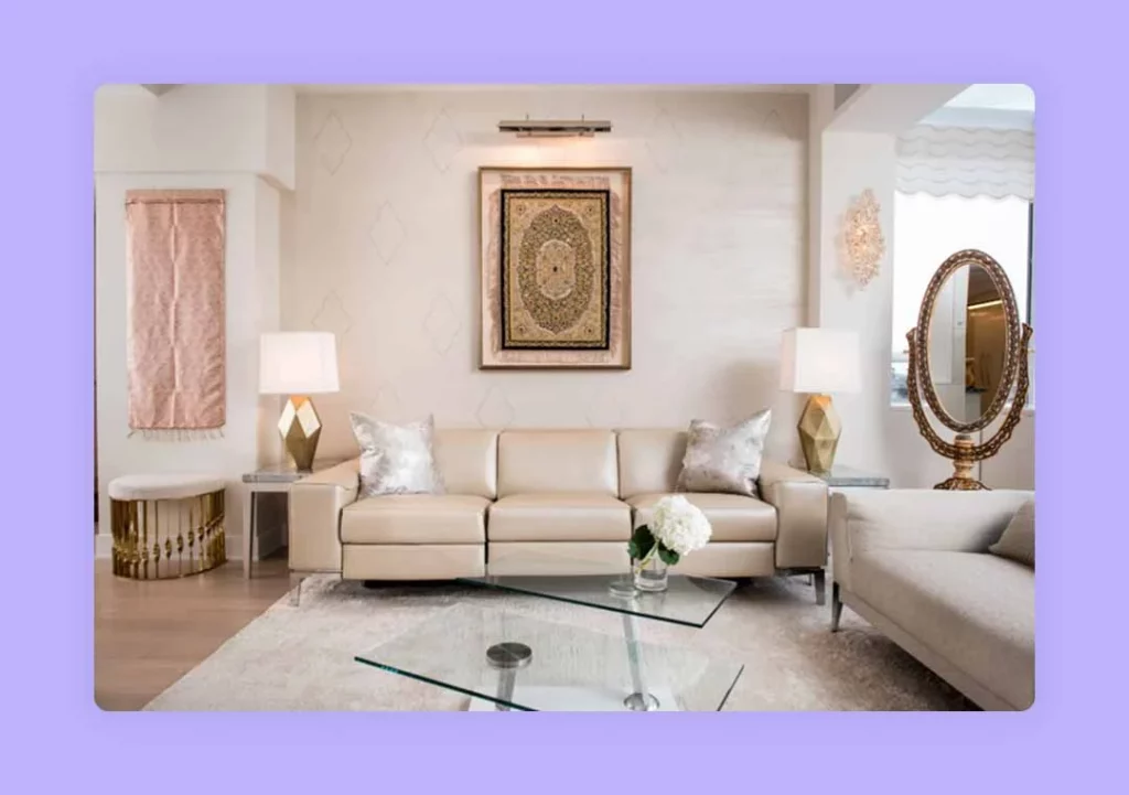
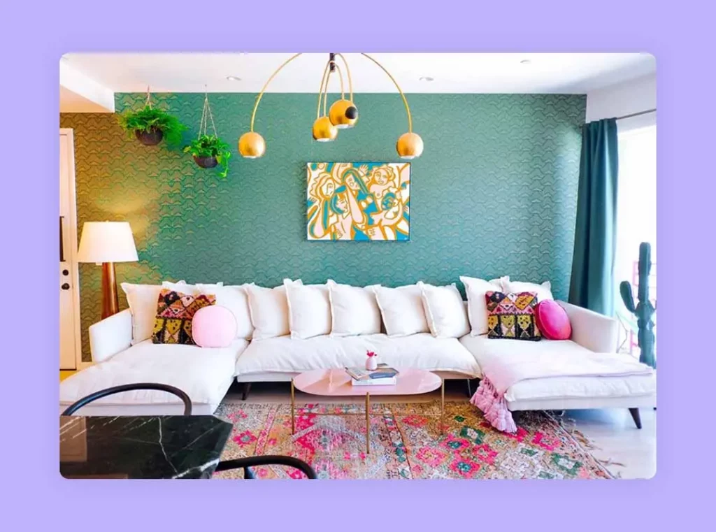
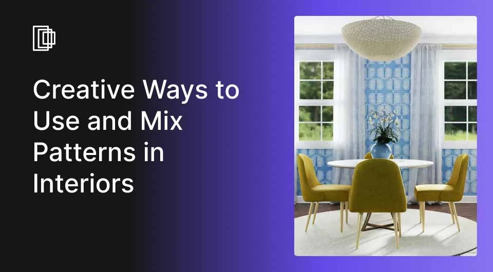
While for some, adding a pattern in the interior design of the house or office is a way to uplift a dull space or corner, for others, it resonates with their personal style. Patterns, in the form of draperies, paintings, wallpapers, wall or floor coverings, or even bedlinen, reflect a sense of character to the interior.
With the documented history of humans using a pattern dating back to 20,000 BC in the form of cave paintings, one can wonder how the pattern in interior design has always mesmerised mankind. With a more refined tone and multiple splashes of colour, patterns can instantly tone up the space.
So, if you wish to embrace prints that add an atmosphere and depth to the space, here is a guide to the types of patterns and how to use patterns in interior design.
Read also – The Definitive Guide To Use Line in Interior Design
Types of Patterns in Interior Design
When you think of patterns in interior design, your mind gets occupied with the geometric or vertical patterned wallpaper covering the entire wall, probably mismatching with the colour of the other walls. But, let us assure you that there is more to pattern than just incorporating wallpaper, and we have curated for you the different types of patterns in interior design.
1. Stripes
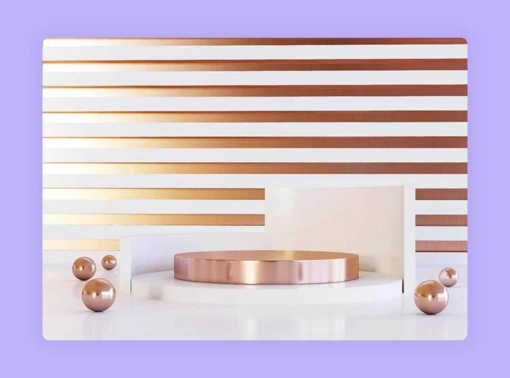
Stripes, both horizontal and vertical, are the most basic yet elegant form of pattern in interior design that can add a certain length and width to the space. For instance, a horizontal line pattern can make the interior of the space look enhanced in width and give an illusion of a large space. On the other hand, the vertical line pattern adds height to the space, giving it the illusion of a high ceiling.
Read also – How To Create Perfect Focal Point in Interior Design?
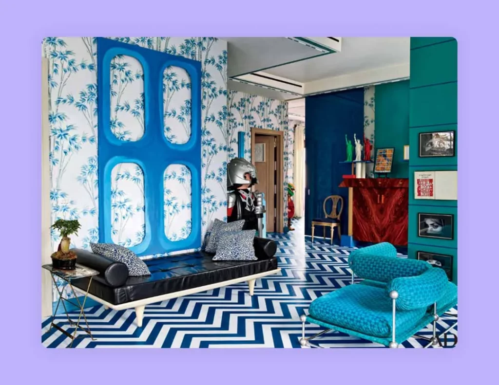
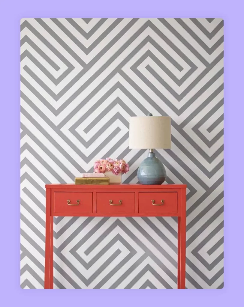
 2. Complex Patterns
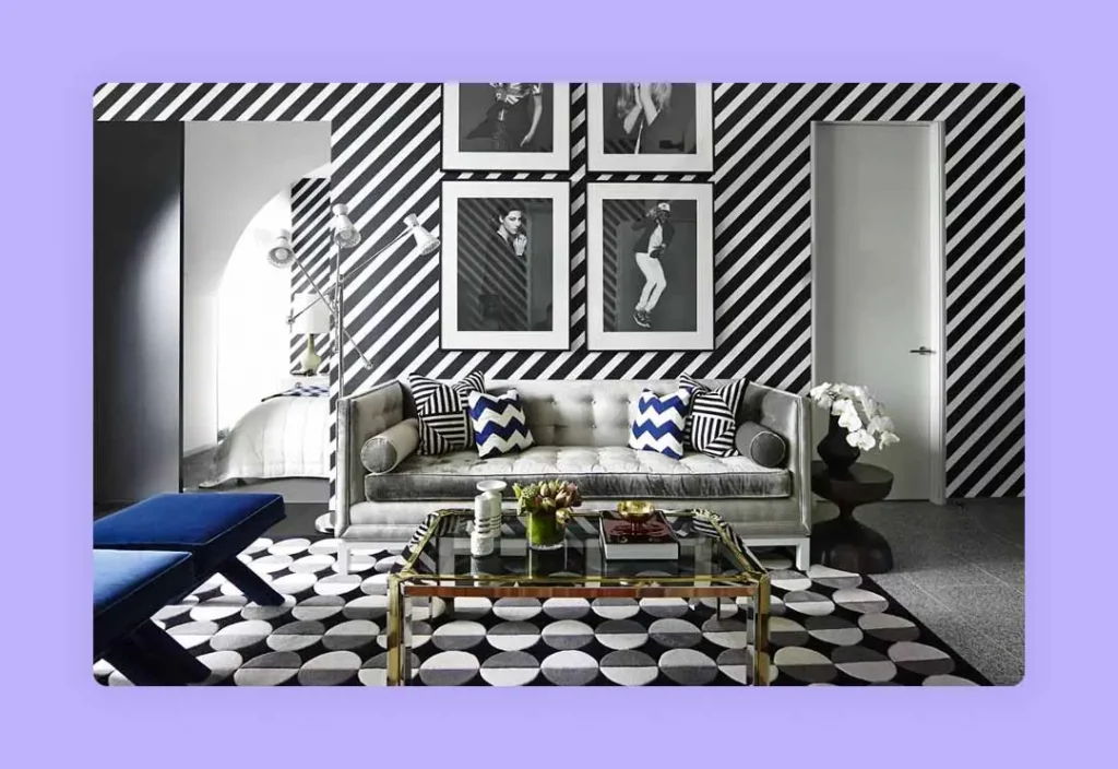
A good way to liven up the interior of the house is to include complex patterns. This style may include various colours and a combination of crisscrossing or diagonal lines in different scales.
This pattern in interior design is slightly overwhelming for a small scale area, considering the complexity of the pattern, which will make a small room smaller. However, this decorating style will work great in large scale areas or open spaces, which will offer a sense of domination to this pattern.
Read also – How To Find Your Personal Interior Design Style?
Image Credit: pinterest.com
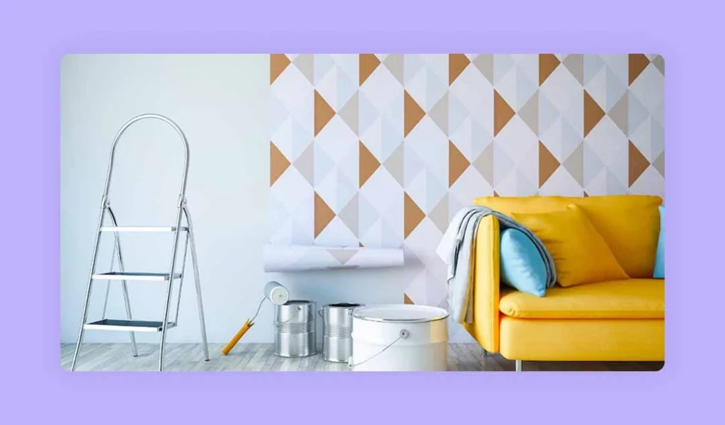
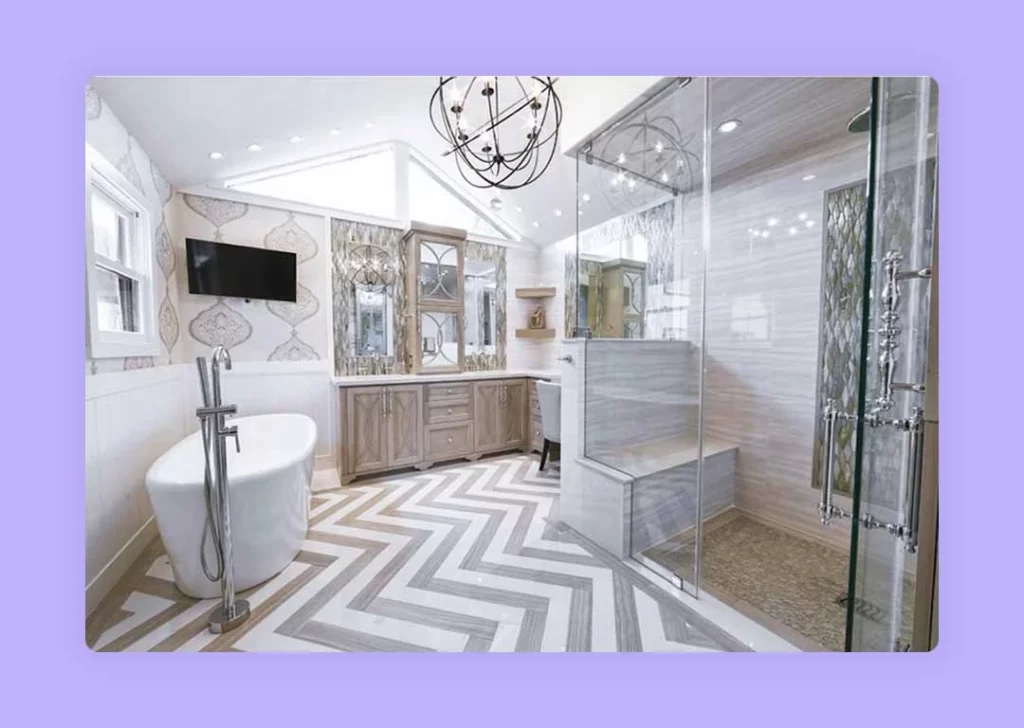
3. Geometric Pattern
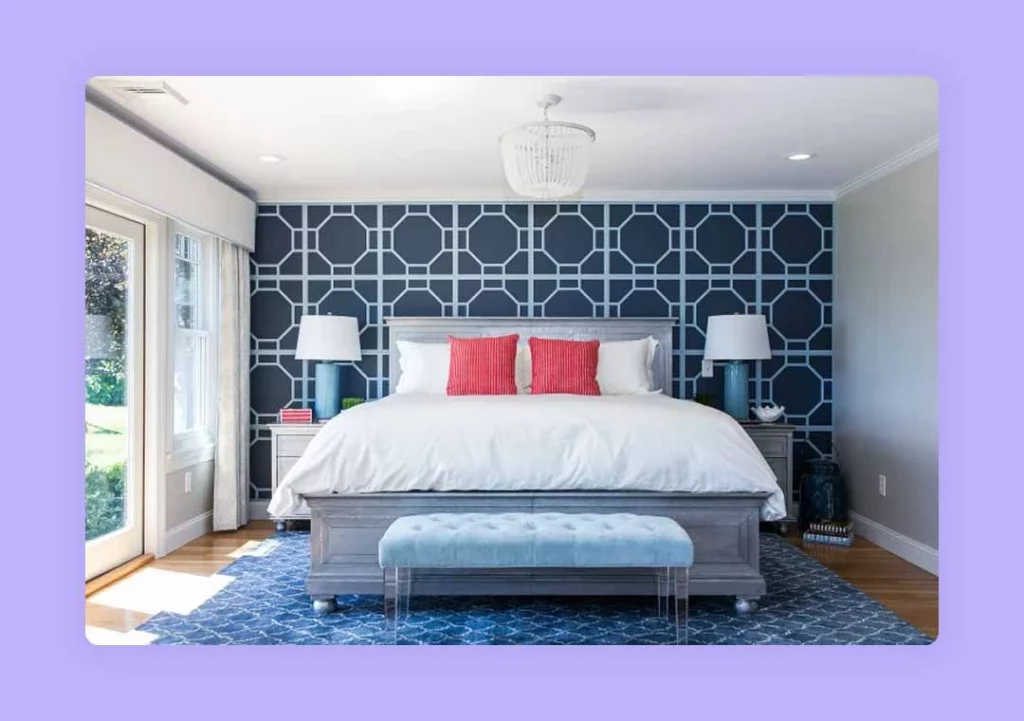
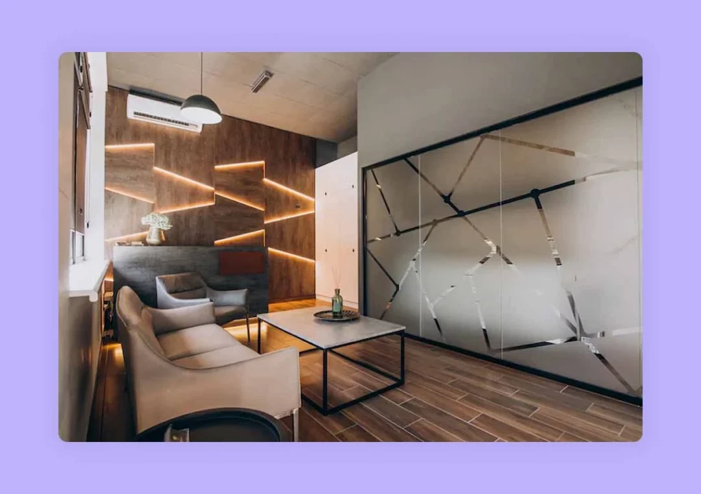
Very common yet pleasing to the eye, geometric pattern in interior design gives the space a predictable visual order. It includes points, surfaces, lines, angles, and shapes in a repetitive manner in both two and three-dimensional structures to give the space a sense of calmness. Moreover, it is surprisingly easy to add geometric patterns in interior design and give the area different looks, from chic, contemporary, modern to vintage.
Read also – 20 Common Interior Design Mistakes To Avoid
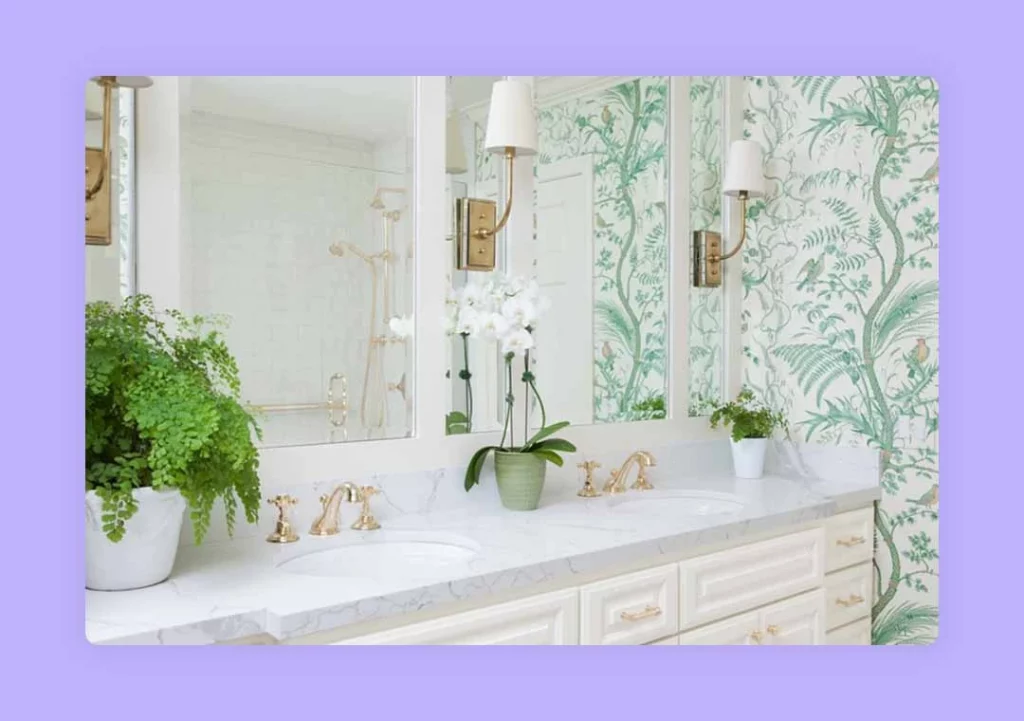
 4. Floral Pattern
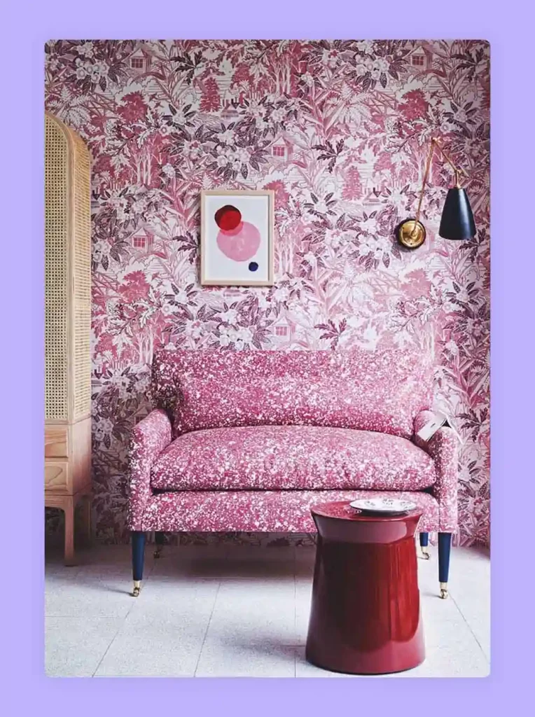
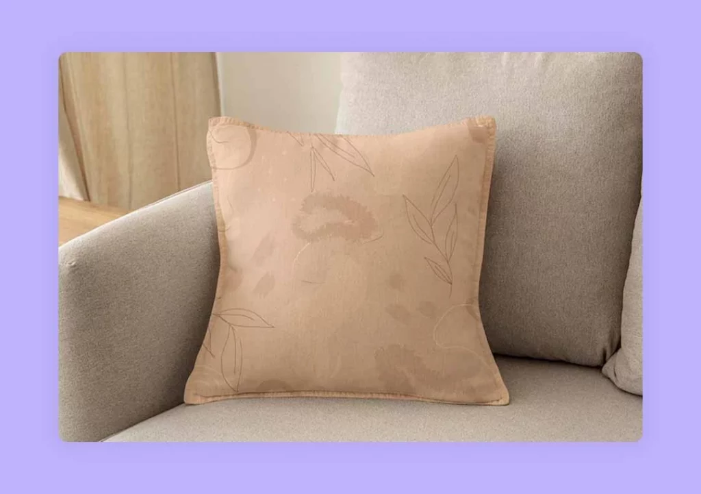
Floral patterns in interior design can be either small and delicate flowers, leaves or big, blowsy patterns with varying hues. As a general rule, the bigger the space, the bigger the pattern and the smaller the area, the smaller the print to maintain symmetry.
But, one aspect of floral patterns that remain consistent is the sense of calm it brings to the space while giving a grandeur outlook to it. It can be big and extravagant or small and delicate and will give a very different look and feel to a room.
Read also – 10 Tips To Create Healthy Spaces
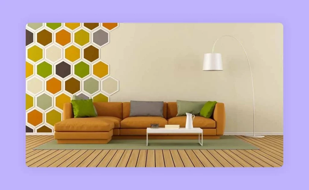
 5. Motif Pattern
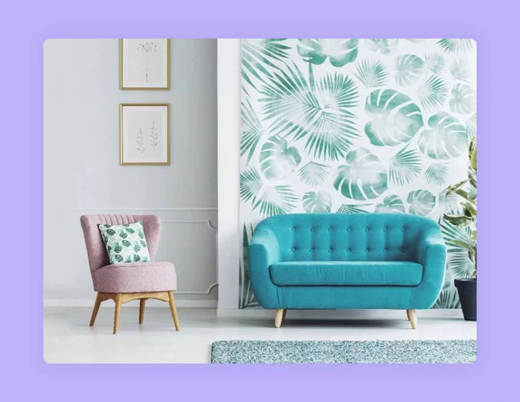
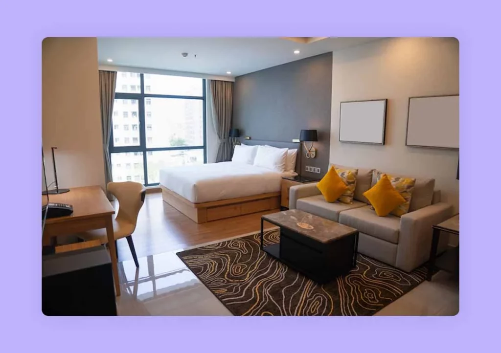
Motif pattern is the abstract print in the form of a recurring pattern used across the space or drawn on a wide-open space. While this modern chic shape pattern reflects the work of art, it also adds a sense of continuity to the interior.
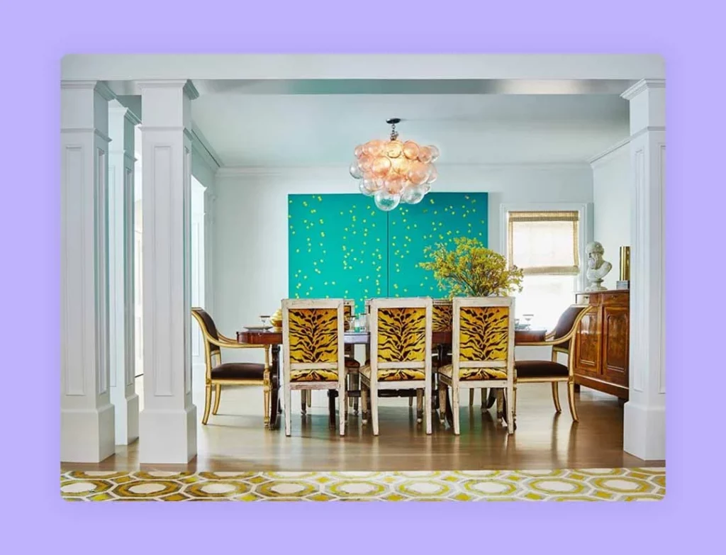
 6. Animal Pattern
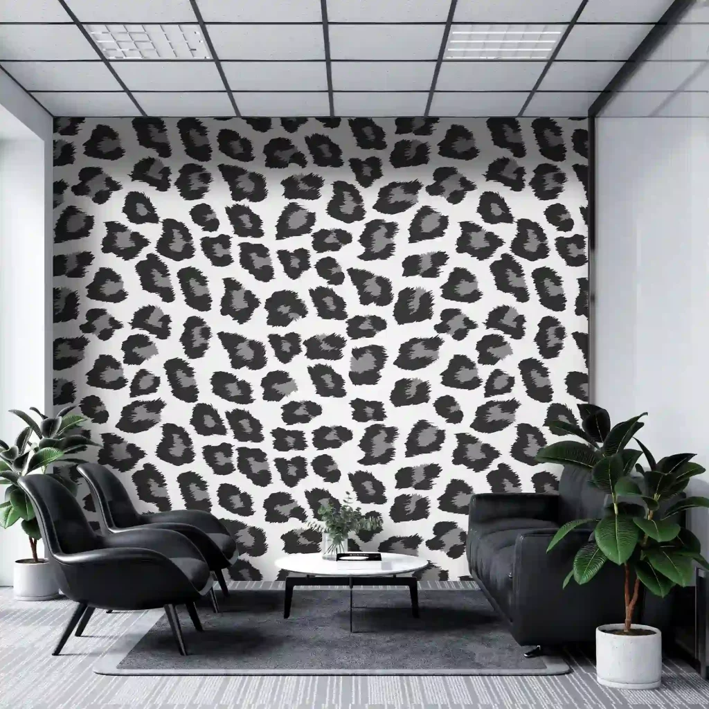
This fashion statement exuding bold patterns through animal fur and extending to the photographic representation is not for the faint-hearted. The animal pattern in interior design is luxurious home decor or statement piece for large spaces, mainly living rooms. However, this interior design pattern’s popularity waxed and waned with the change in fashion.
Image Credit: bestofbharat.com
Pattern should be Placed in Interior Design?
The pattern in interior design can be added in different ways and is not limited to adding wallpaper to the wall or cabinet. One can use patterns in cushions, soft furnishings, rugs, pieces of furniture, ceiling style, sofa, floorboards, etc.
However, it is not what pattern that matters most but where should the pattern be placed in interior design that matters most. For instance, adding a hexagonal design on a wall bracket against the contemporary side table will instantly change the effect of the room.
A patterned tile on the kitchen splashback while keeping everything else neutral or the bathroom floor can transform the dull look into a delightful space. The trick to adding the pattern in interior design is to limit the design patterns to a minimum, ideally two and then balance the patterned fabrics or other patterns with subtle, neutral colours.
Read also – How To Choose The Best Materials for Interior Design?
15 Tips on How To Use and Mix Patterns in Interior Design
1. Play with different sizes of the pattern
The answer to how to mix patterns in interior design begins with knowing that it is vital to ensure that they are not of the same size. A small pattern would not harmonise with other small patterns and deserve drama in print. So, you can use a large scale pattern in interior design as the dominant pattern and then combine it with other small patterns to accentuate the entire look.
For example, herringbone patterns can be classy for the living room, but if you style the entire space with this pattern, you will end up overwhelming the area. Instead, you can fancy the pattern on the back wall and then dial it down by adding some small patterned cushions or throw pillows.
Read also – The Complete Guide To Use Textures in Interior Design
Image Credit: fabricsandpapers.com
2. Use similar or harmonious colours
Multiple patterns of numerous colours end up making the space look chaotic and must be avoided. While adding the pattern in interior design, you must opt for hues that complement each other rather than create friction. So, choose colours from the same color palette and then create an aesthetically appealing landscape for the shades to harmonise.
While you can accentuate the appearance with bold colours, however, it is recommended to adhere to the 60-30-10 rule. This rule identifies you to keep 60% of the space immersed in the dominant hue, 30% by the secondary hue and the remaining 10% by the accent of bold shade.
Read also – The Definitive Guide To Space Planning In Interior Design
Image Credit: blakelyinteriordesign.com
3. Simple and complex patterns are best when blended
Combining an accentuating or intricate pattern in interior design with a simple pattern is the best fusion of style. So, while you wish to add drama to the living room or dining room with a splash of complex patterns, tune it with a simple pattern of complementing shade to keep the variation symmetrical without deviating from the aesthetic.
Read also – 12 Ways To Incorporate Wabi-Sabi Interior Design in Your Home
Image Credit: wakefit.co
4. Less is more
Never engage in multiple patterns for the same space. Pick two to four patterns and stick with them while you remodel the bedroom, living room or any other space. Developing the style of the space should be done with patterns that can energise the area without overwhelming it.
Image Credit: medium.com
5. Contrasting effect
The contrasting effect is the ultimate resort that has proven effective every time it is implemented. To incorporate the contrasting effect of pattern in interior design, you should maintain the balance of colours while hovering between light and dark shades. This technique will help you control the narrative of the space and still draw eyes to dominant areas.
Read also – 8 Best Ways to Tell Your Story Through Interior Design
Image Credit: architecturaldigest.com
6. Let your eyes feel the visual balance
Your eyes will never lie, so let them feel a balance before you mix and match the pattern completely on the area. So, mix patterns in interior design and match them according to the space.
This will not only help you explore your design capabilities but also create the pertinent option. While you can keep the patterns flowing through the entire space, you may break the shapes or lines and add accentuating elements to enhance the environment.
Read also – 20 Best Wall Decor Ideas
Image Credit: homeguide.com.sg
7. Stay careful with prints
The right balance of shapes, shades and sizes is everything when mixing patterns in interior design. For instance, if you mix animal prints on the wall with animal prints on the rug and animal prints on the cushions, you are simply exploiting and overwhelming the space. The right balance would be to not use too many graphics everywhere; rather, balancing it with subtle shades offers a more harmonious visual design.
Read also – Interior Design Basic Concepts
Image Credit: 1stdibs.com
8. Understand when it does not feel right
Patterns in interior design also come with some straight-up rules that must always be adhered to if you want a perfect balance of patterns. For instance, floral and stripes never go well with each other, the same as polka dots do not gel well with an ikat pattern.
Moreover, there is a gut feeling while blending the patterns and requires you to go ahead with the trial and error method. You can try this with samples of different patterns, and if it does not feel right, it most probably is not.
Read also – Guide to Layering in Interior Design
Image Credit: modsy.com
9. Be careful with whites
You would not want the patterns to take away the beauty from each other by mixing them all in a different white color scheme. While white is universally calming as a background colour, mixing different patterns in a different shade of white can take away the essence of the combination and make the space appear unbalanced.
Read also – 21 Most Popular Types of Interior Design Styles
Image Credit: decoist.com
10. Neutral colours are a good base option when playing with large prints
Large prints can be tastefully combined with bold patterns in interior design if the mixing pattern has harmony with it. You can start by using neutral colours as the base for walls or flooring and use bold or large prints in the form of a key furniture piece, upholstery, area rug, a statement cushion or flooring. You can also fill in the space with neutral shade chairs, ottoman or sofa to give the space a more balanced look.
Image Credit: elledecor.com
11. Subtlety in the pattern is a safe bet
You can always choose subtlety in patterns if large or bold prints intimidate you. After all, not every person wants their space to be in the face, only to stay in vogue. Subtle statement pattern interior design can be chosen as per the visual interest. From adding a natural wooded flooring to antique hardware and chevron print, the pattern adds charm to a contemporary environment.
Read also – Importance of Accessories in Interior Design
Image Credit: dazeyden.com
12. Unify the direction of the pattern and follow the tone
There is always a general direction in the geometric patterns, and this orientation is vital to make the space look symmetrical. So, whether it is horizontal, vertical or diagonal, maintain the direction of the pattern. This will make the pattern in interior design look neat, organised, and stylish.
Read also – Why Form Should Follow Function In Interior Design?
Image Credit: hgtv.com
13. Size appropriation is vital
Keep one side of the pattern bigger and the rest smaller if you are mixing two or more patterns. You can also make the other patterns less appealing so as to bring the focus on one print. This will maintain the flow of the patterns and will not overpower the space, making it chaotic.
Read also – Positive and Negative Space in Interior Design
Image Credit: interiorsinfo.com
14. Start the pattern from the lowest part of the room
Starting from the bottom-most part of the space and moving to the upper section is ideal and will keep the patterns in harmony. You can implement this technique for every section that you wish to print.
Image Credit: alexandrarae.com
15. Do not undermine the existing patterns in the space
The existing design elements in the space can highly influence the new patterns you wish to add to it. Therefore, while you are revamping or decorating a room or any space, make sure to consider the permanent sections.
Image Credit: aceinteriors.in
Ready to start using patterns in interior design for your next project, or still sceptical? If in doubt, connect with a specialist. To assist in your interior designing journey, Foyr Neo eases your design needs from start to finish, in one-fifth of the time to get you going through the projects.
And that’s not it; Foyr Neo has a community platform that provides training to help you every step of the interior designer journey. Head straight to the Foyr community with easy signup and start your 14-day free trial today and witness it for yourself.
Conclusion
While adding patterns in interior design is the fun part of revamping or decorating the spaces, one wrong mix can bring down the entire look of the environment. However, you can use the tricks from this guide to gain an impressive take on interior design patterns.
Frequently Asked Questions
1. What is a pattern in interior design?
A pattern in interior design refers to repetitive decorative elements like stripes, florals, or motifs used on walls, fabrics, or furnishings. Patterns add rhythm, texture, and depth, making spaces visually engaging and balanced.
2. What is the 3-5-7 rule in interior design?
The 3-5-7 rule encourages using odd numbers of elements when styling interiors. For instance, arranging three patterned cushions looks more natural and dynamic than even numbers, creating balance while showcasing design patterns harmoniously.
3. What are three types of Design Patterns?
Common interior design patterns include geometric, floral, and motif styles. Geometric patterns provide order and symmetry, floral patterns bring freshness and elegance, while motifs add artistic or cultural flair, making each type suitable for different moods and spaces.
4. How to mix patterns in interior design?
When mixing patterns in interior design, vary the scale, stick to a complementary colour palette, and balance bold prints with subtle designs. Using Foyr Neo, designers can experiment with combinations digitally before applying them to real spaces.
5. What are the different types of pattern layouts?
The types of patterns in interior design layouts include stripes, checks, florals, geometrics, motifs, and animal prints. Each layout brings unique effects; stripes add height or width, florals soften spaces, and geometrics provide structure and symmetry.



 2. Complex Patterns
 4. Floral Pattern
 5. Motif Pattern
 6. Animal Pattern