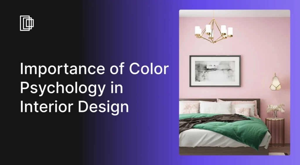
Interior design is an art that combines a person’s personality with their preferences to create a significant representation of their inner self. It is a blank canvas on which we fill the colors and add the nuances of woodwork, ceramics, and glass. We bring them all together to create a natural and logical flow in residential and commercial properties.
Although interior design is largely focused on creativity, we also need to look at the implications of the color schemes we use. The psychology of colors in interior design is a critical element that influences the mood and perception of a space.

The Science of Color Perception
The way we perceive color is a fascinating blend of physics and biology. When light hits an object, the object absorbs some of the light and reflects the rest. The wavelengths of the reflected light enter our eyes, where specialized cells called cones interpret these wavelengths as different colors.
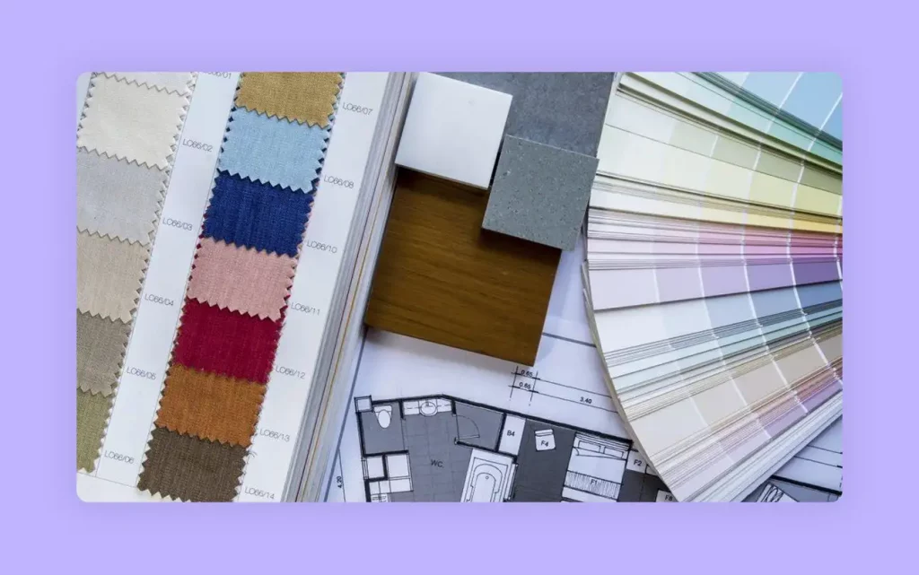
Image Credit: stile.it
This biological process is universal, but our emotional and psychological responses to those colors can be deeply personal and influenced by culture and experience. Understanding this is the first step in mastering colour psychology for interior design.
See also – Bohemian Interior Design Style for Colorful Decor
What is Color Psychology?
Color Psychology is a theory of how each color affects a person’s mood, cognitive functions, creativity, and productivity. When a person is surrounded by calming hues such as blue or green, they feel relaxed. Whereas, if a person is surrounded by loud, vibrant tones such as red, maroon, or orange, they feel energetic and passionate. Similarly, neutral colors such as white or gray make them feel serene.
Color Psychology is based on the scientific effect of different hues of each color of the spectrum on the human brain. Although the effects of the colors may seem similar, studies show that each individual responds differently to standard color schemes.
Here is our fascinating YouTube video to guide you through the process of selecting the perfect colors for your interiors:
How Does Color Psychology Affect Interior Design?
Color schemes are an essential factor in Interior design. The psychological impact of colors in interior design is profound, as each person reacts differently to various colors. The color of the walls, furniture, natural elements, decorative pieces, lights, and fixtures are all key interior design elements that influence your mood in different ways.
Based on the results of multiple studies on the psychology of colors, each person reacts differently to each color. For instance, some people find the color black to be depressing and demotivating. However, several others find the color black to represent order and functionality. Some people find the color red to be threatening, while others find it inspiring.
Therefore, it is best to ask your clients what kind of color schemes they find most appealing. Even if they can’t choose the colors, you will get an adequate idea about what they like and what they don’t. Let us discuss the effects of the popular colors in detail so you can make an informed decision while implementing your home design ideas.
Key Concepts of Color Psychology
At its core, color theory in interior design is the study of how colors mix and the visual effects of their combinations. To effectively use colors in interior design psychology, it’s helpful to understand the following key concepts:
- The Color Wheel: The color wheel is a visual representation of colors arranged according to their chromatic relationship. It consists of primary colors (red, yellow, blue), secondary colors (orange, green, violet that are created by mixing primary colors), and tertiary colors (that are created by mixing primary and secondary colors).
- Emotional Responses: Different colors are known to trigger distinct emotional reactions. For example, warm colors like red and orange can create a sense of energy, excitement, and passion. In contrast, cool colors like blue and green often promote feelings of relaxation, tranquility, and calm.
- Space Perception: Color has a significant impact on how we perceive the size and shape of a room. Lighter colors on walls and ceilings make a space feel larger, more open, and airy. Darker colors, on the other hand, can create a sense of intimacy and coziness, making a large room feel less vast and more enclosed.
- Desired Mood and Function: When choosing a color palette, it is essential to consider the intended purpose and desired mood of the space. The function of a room should guide your color choices. A bedroom, for instance, would benefit from calming blues and greens to promote rest, while energizing yellows or oranges could enhance a home office to boost focus and creativity. If you are hesitant about a bold color, create a mood board with accent pieces like pillows, rugs, or artwork before committing to painting a whole wall.
Role of Different Colors in Interior Design
The psychological effects of color in interior design vary widely from one hue to the next. Ostentatious colors add tones of energy and make the environment lively, while more subdued colors have a calming effect on the senses, creating a relaxing environment.
Here is a list of 10 colors commonly used in interior design and the effects they have on the human mind:
Red
The color red is the most vibrant color that represents emotions in their entirety. Whether it is dark shades like maroon or light shades of ham red, they create an atmosphere of love and camaraderie. Implementing the color red in your design plans adds excitement and vigor to the entire room
You can use red in office buildings or home offices, in the living room, and in the bedroom. In offices, red inspires leadership, willpower, high energy levels, and friendship. When used in the living room, the color red in all its shades inspires friendship and stimulates conversation. But the best utility for the color red is in the bedroom, where it kindles feelings of love, desire, and passion.
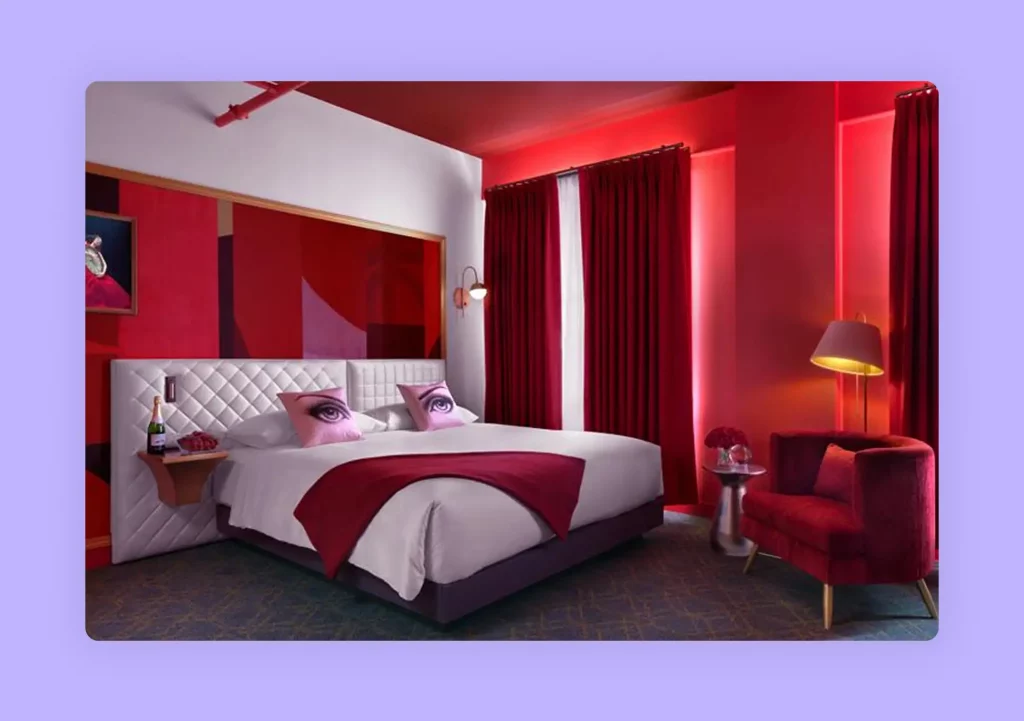
Image Credit: costar.com
Red also inspires feelings of anger and revenge, which is why it is best to combine it with calming color tones such as white or beige to balance the human emotion. You can add higher nuances of red to stimulate productivity but make sure to compliment it equally.
For instance, you can use red on one or opposite walls in the bedroom, while using calm and subdued tones in the overall room. This will instigate passion while keeping the blood pressure levels in check with the help of complementary colors such as yellow, or natural tones of light green, or plain white touches.
Emotions associated with the color Red are:
Joy, Love, Passion, Desire, Sexuality, Sensitivity.
Energy, Power, Vigor, Strength.
Determination, Leadership, Courage, Will Power.
Anger, Rage, Malice, Wrath.
Danger, War.
Hunger.
Use our inspiration to design – Red Velvet Monochromatic Living
Brown
A lighter and softer deviation from red is the color brown. With its natural hue and soft, reassuring essence, brown can work wonders in vast spaces to synchronize different elements of modernism and classic.
The color brown is best used sparingly. As interior designers, you must ensure that the wall colors, room colors, and the color of the overall interiors make the inhabitants feel warm and comfortable. The color palette you choose must also serve to inspire them. Brown tends to relax the senses, maybe a little too much, leading to inactivity and lack of goals. On the other in combination with vibrant shade and other natural hues, brown can symbolize resilience and security.
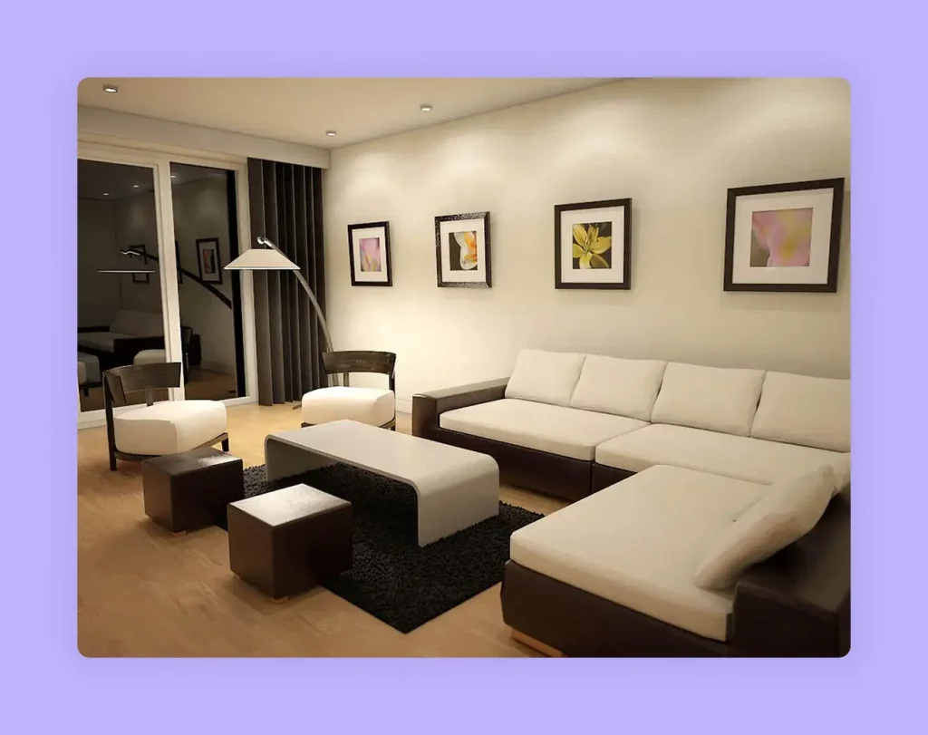
Image Credit: decoor.net
In interior design, brown is used abundantly when it is meant to create a rustic look and somber atmosphere. Although elegant, the color has a tendency to evoke depression, so ensure that you combine it with happy colors such as yellow, white, red, green, and orange.
Emotions associated with the color Brown are:
Safety, Security, Dependability, Warmth, Comfort.
Resilience, Spirit, Determination, Rigidity.
Sadness, Loneliness, Depression, Isolation, Indifference.
Vastness, Openness, Starkness, Solidarity.
Strength, Power, Sophistication.
Use this inspiration to design – Dark Brown Kitchen with Cosy Vibes
Orange
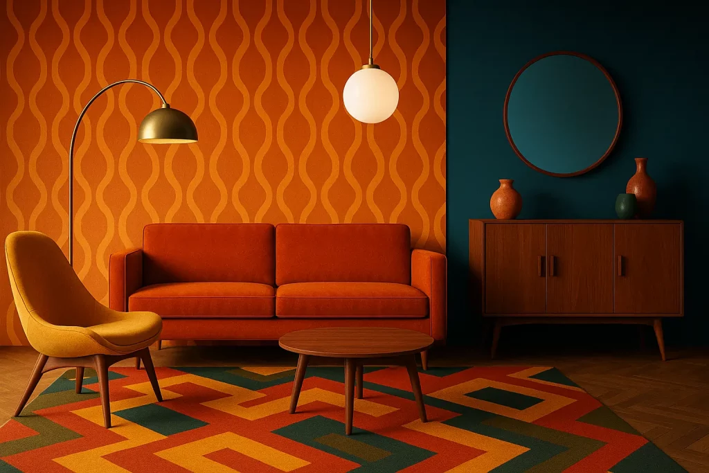
Another prominently vibrant color is orange. It symbolizes sunshine and nature. Orange and all its shades pretty much have a positive effect on the psyche. Distant tones of Orange, such as gold represent wealth and prosperity. It can either reflect on the client’s personality or their desire for success and fame.
Orange, much like red, also inspires desire, love, sexuality, and appetite. This color predominantly has a calming effect on the senses as it reminds people of laying on the beach, drinking tropical beverages.
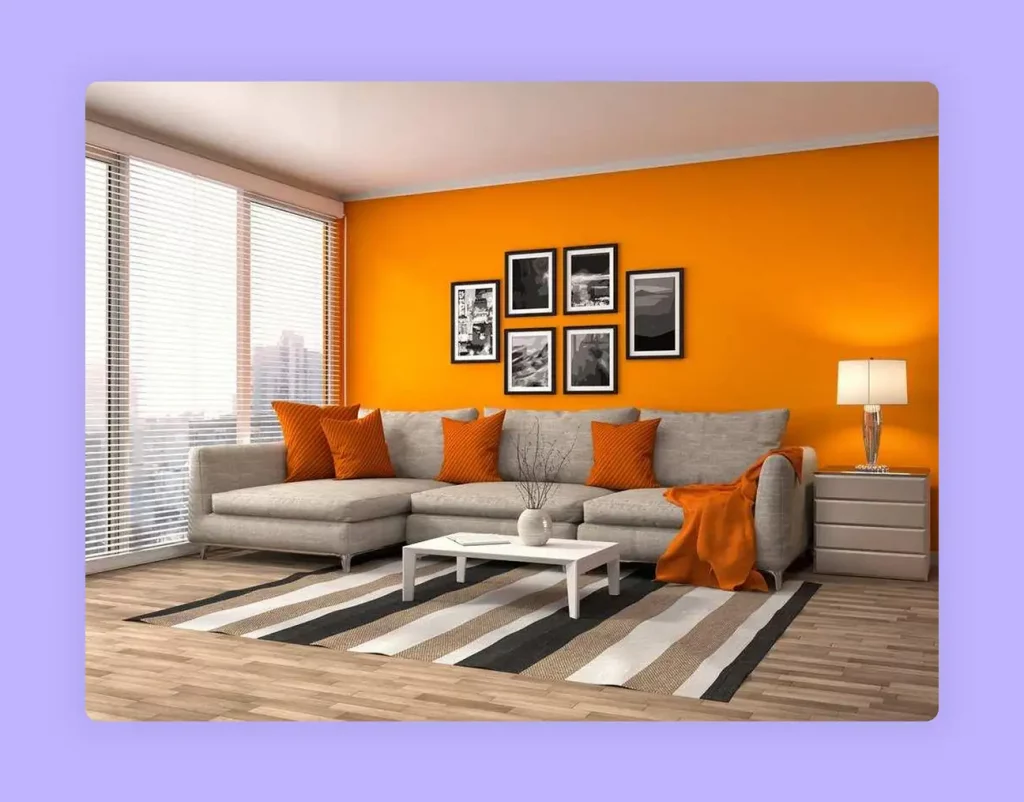
Image Credit: wtsenates.info
Orange is typically best used in bedrooms with complementary tints that tone down the extreme effects of the color. You can also use it in exercise areas to stimulate people.
Orange can increase appetite, which is why it is well-suited for indoor and outdoor kitchen areas.
For instance, you can use natural and neutral shades on the walls for a calming effect. The,n introduce hanging lamps in orange patterns or use orange chairs and cushions to tie the room together.
Emotions associated with the color Orange are:
Happiness, Calm, Joy, Relaxation, Warmth.
Love, Attraction, Passion, Sexuality, Pleasure, Desire, Attachment.
Encouragement, Determination, Enthusiasm, Stimulation.
Success, Wealth, Prestige, Prominence, Prosperity, Wisdom.
Deceit, Betrayal, Aggression, Dominance, Distrust.
Healing, Energy, Vibrations.
Creativity, Fascination, Adventure.
Use this inspiration to design – Teal and Orange Vibrant kitchen
Yellow
The color yellow is synonymous with sunshine, thereby spreading the effect of light and happiness. Yellow is also associated with intellect and prosperity, due to its close associations with the color gold.
In interior design, the color yellow is recommended for the kitchen, dining areas, hallways, and bathrooms. The color automatically uplifts people’s spirits making the room feel bright and sunny.
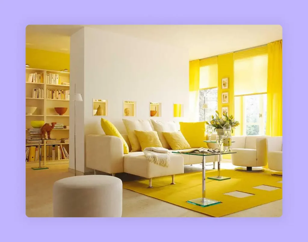
Image Credit: homedit.com
Although most shades of yellow have a positive effect on the psyche, dull yellow colors instigate a feeling of doom, decay, and sickness. It is best to use yellow in its bright shades around the house. Make sure to use it sparingly though, as yellow tends to stimulate uncontrollable emotions. Due to the extreme optimistic effect, a completely yellow room can drive up blood pressure. The brain associates high blood pressure with feelings of anger, thus causing people to lose their temper without any provocation.
Yellow also adds a level of sophistication to interior design, especially when it is paired with grey or white. Yellow stucco walls with grey linings and patterns gained quite the popularity in the 90s, and it is making a comeback with better quality materials.
Emotions associated with the color Yellow are:
Joy, Happiness, Care, Cordiality.
Intelligence, Excellence, Obedience, Productivity.
Energy, Freshness, Nature.
Caution, Sickness, Doom, Decay, Jealousy.
Optimism, Encouragement.
Use this inspiration to design – Mid Century Bedroom with Industrial Glam
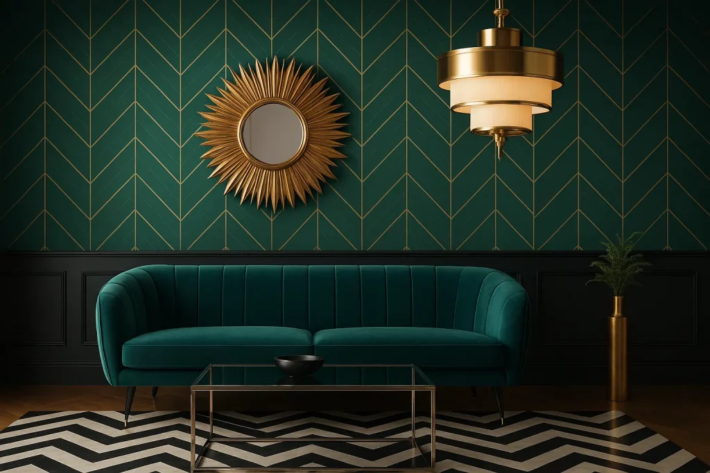
Green
When people see the color green, they think of nature. Although in reality, nature can be cruel, the human psyche associates nature with freshness, peace, and trust. Thus, green is a powerful color in interior design. Additionally, pale green is often associated with the color of pea soup, which is comfort food. It helps relax the senses and lowers the levels of hypertension and blood pressure.
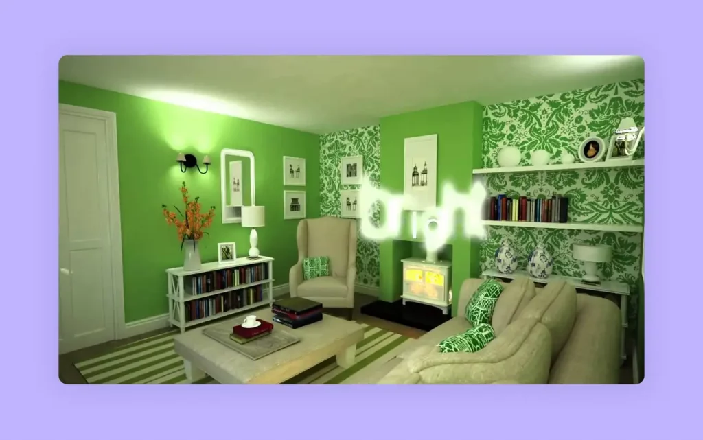
Image Credit: ytimg.com
Green is a highly versatile color. Different shades of green promote different emotions. While light and aqua green have a calming effect, dark green is mainly associated with greed and jealousy. Olive green, on the other han,d is recognized worldwide for peace and harmony.
Green can be used in different shades throughout the house. You can use lighter shades on the walls and create contrast with dark shades of green with plants. The effect of the dark shade is neutralized as plants automatically remind people of nature. The color green mostly has a calming effect with a sense of security, which makes it an ideal color for interior design.
Emotions associated with the color Green are:
Nature, Harmony, Growth, Fertility.
Peace, Security, Safety, Protection.
Freshness, Joy, Healing.
Greed, Jealousy, Ambition.
Cowardice, Sickness, Conflict.
Calmness, Sincerity, Comfort.
See also – Monochromatic Green Living Room Interior
Blue
Blue is among the most calming colors in the palette for interior design. In regards to the psychological effects of color, blue relaxes the mind and slows down heart rate, metabolism, blood pressure, and hypertension.
Aquatic shades of blue, in particular, such as sky blue and light blue, have a healing effect on the mind. It reminds the inhabitants of the sea or swimming pools. Blue is the only color that has an array of positive effects and little to no negative impact on the psyche.
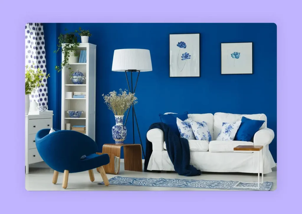
Image Credit: ltkcdn.net
You can use different shades of blue in all areas of the house. You can use darker shades such as royal blue as primary colors and pair it with yellow and use it for the kitchen, playroom, etc. You can also use a combination of light and dark blue colors in the bedroom and dining room.
Although using blue in dark rooms with small spaces can create an eerie feeling like that of being trapped in ice, you can add a touch of warm colors to neutralize the effect.
Most dark shades of blue are associated with elegance, luxury, and royalty, while Sapphire colors add prominence to the design plan. Blue lights are also easy on the eyes, thereby decreasing any discomfort. All in all, blue is an excellent color scheme that works well with all modern and contemporary interior design ideas and trends.
Emotions associated with the color Blue are:
Calm, Tranquility, Control, Bliss, Softness.
Knowledge, Wisdom, Intelligence, Power, Seriousness.
Faith, Trust, Loyalty, Truthfulness, Courage, Integrity.
Healing, Health.
Elegance, Luxury, Prosperity.
Use this inspiration to design – Bold Monochromatic Blue Bedroom with Gold Accent
Purple
The color purple is usually associated with elegance and royalty. Purple color schemes work well in areas that inspire creativity and design. Bright hues of purple such as violet or plum add flair to your design scheme. Whereas, lighter shades of purple such as lavender and mauve create a calm but regal effect in your design.
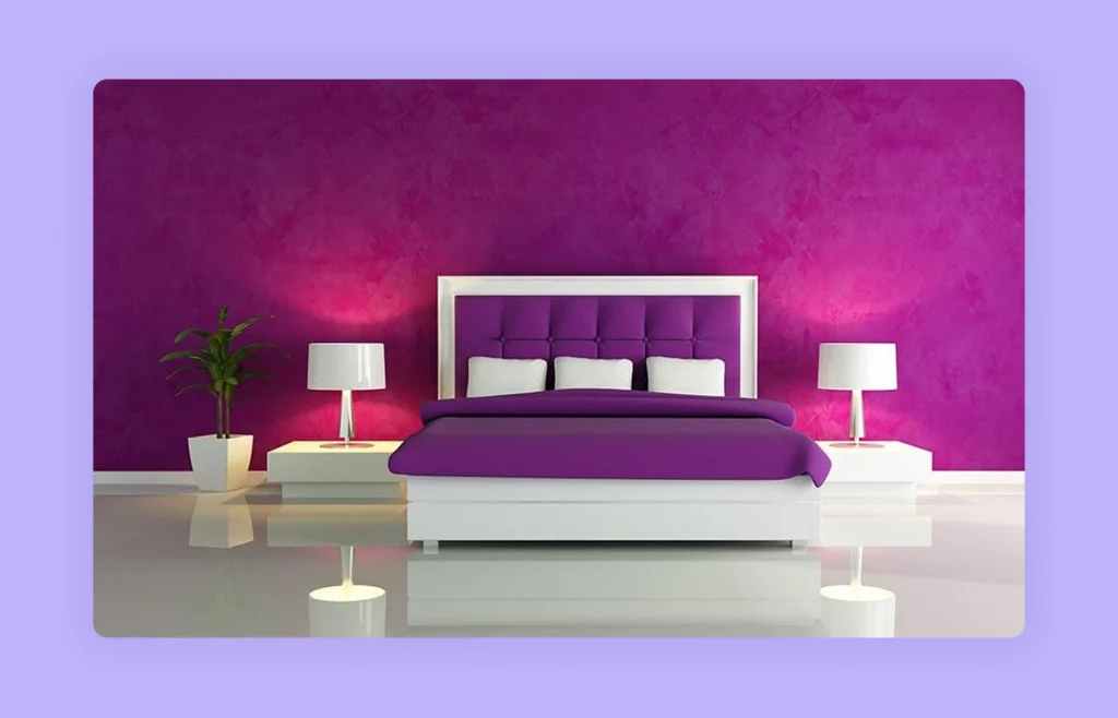
Image Credit: designcafe.com
Since purple inspires creativity, you can add it to dressing rooms, walk-in closets, in-house art studios, or even the kitchen. This color is particularly popular with adolescent teens as it inspires them towards creative and performing arts and helps them find their path.
The regality of purple also works well in the foyer or living room, where your guests spend time. It gives an essence of calm, elegance, and luxury.
Emotions associated with the color Purple are:
Elegance, Luxury, Richness, Sophistication.
Drama, Depth, Excitement.
Creativity, Mystery.
Calmness, Tranquility, Relaxation.
Use this inspiration to design – Lively Purple Living Room
Pink
The color Pink influences emotions that are closer to the heart. When used appropriately, pink and all its shades create an atmosphere of love and compassion.
Although pink is largely associated with feminism, you can still use this color for a masculine effect. Simple patterns and sophisticated designs can take pink to a whole new level in latest interior design trends. It instigates feelings of comfort and love. Vibrant shades of pink such as Magenta, Fuchsia, etc. help make a statement when paired with secondary colors such as light blue. You can use them to bring out the playfulness of wall patterns.
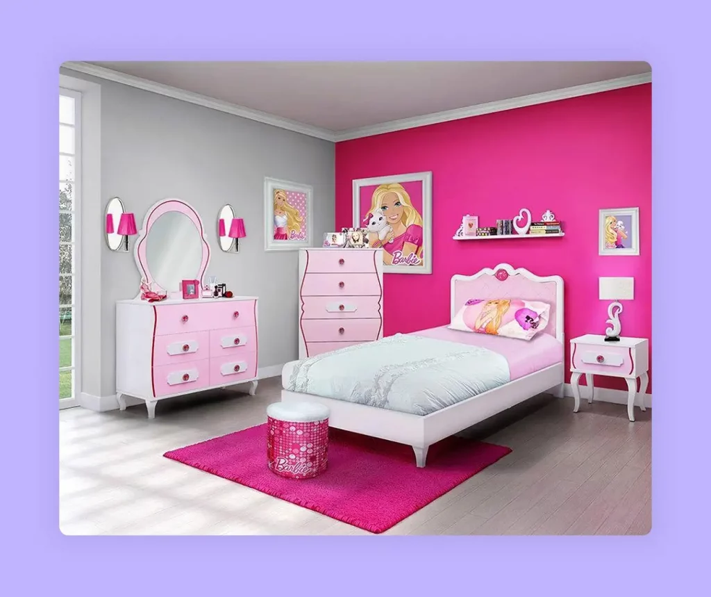
Image Credit: pinimg.com
Complement the color pink with natural hues or vibrant tones of red and white for form and function. It helps in preventing any sentiments of loss and excessive sweetness. Pink is best used in the room color for teenage girls or in the living room and bathroom to create an atmosphere of joy and bliss.
Emotions associated with the color Pink are:
Sweetness, Warmth, Comfort.
Love, Compassion, Nurturing.
Compliance, Loss (especially of romantic attachments).
Romance.
Cleanliness, Functionality, Sophistication.
Glamour, Feminism.
Use this inspiration to design – Coral Pink Kitchen Design with Hints of Ethnicity
Black
The color black has always fared well with versatility and elegance. Black signifies simplicity and functionality. This color works best in modern interior design and architecture.
On a psychological front, an all-black room can be overwhelming and gloomy. However, if you pair the color with red, white, blue, or almost anything else, it provides excellent contrast.
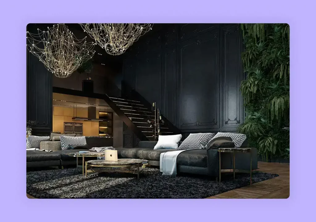
Image Credit: pinimg.com
Contrary to popular belief, the color black is an excellent addition to interior design, especially in the kitchen, living room, dining area, and bathroom. With this color scheme, form follows function and accommodates simplistic design trends.
Emotions associated with the color Black are:
Functionality, Simplicity.
Desire, Protectiveness.
Grimness, Depression, Untidiness, Terror.
Elegance, Modernism, Sophistication.
Efficiency, Control, Beauty.
Use this inspiration to design – Sleek Black Industrial Kitchen Design
Grey
The color Grey is another neutral color that is highly associated with elegance and style. Although there is some controversy as to the effects of grey on the human mind, if used correctly, it can have quite a positive effect.
Some people do find the color depressing. However, grey can be used as a neutralizer for vibrant color schemes. It is best to avoid using light grey colors on the walls, but you can use dark grey on one wall and surround it with happy colors such as white, yellow, or pink. You can also implement grey colors in furniture in a bright room. It adds elegance and sophistication to the design plan.
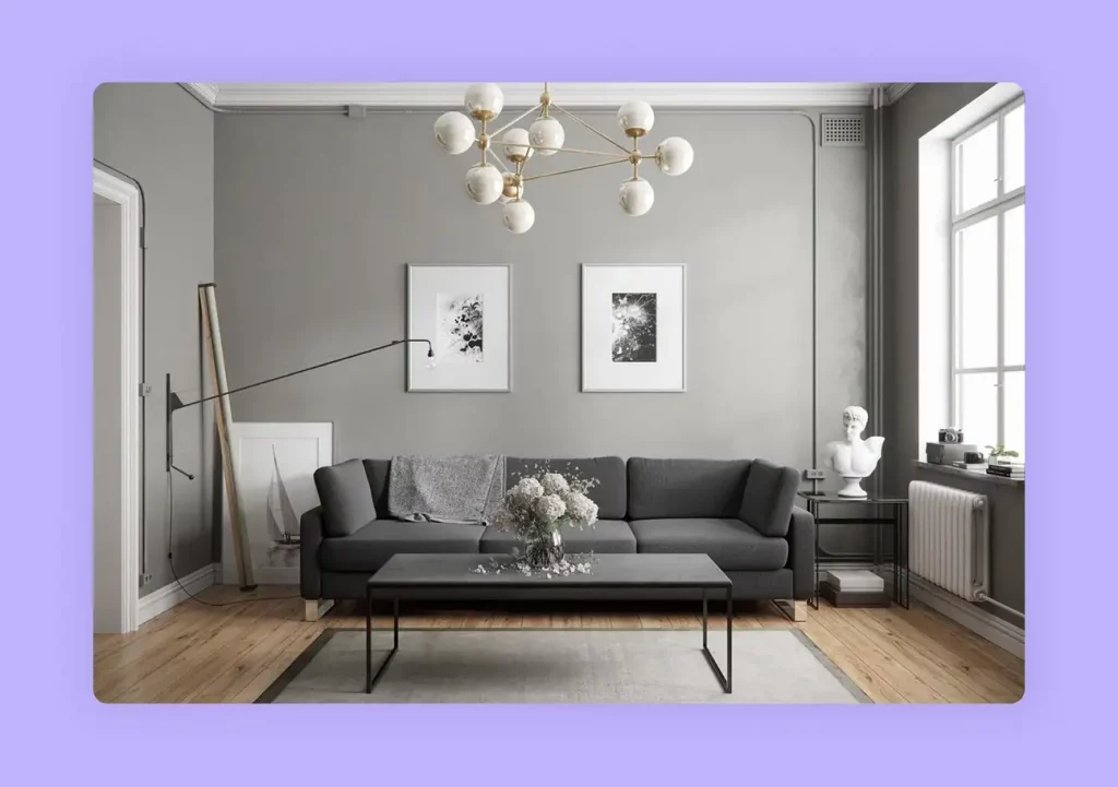
Image Credit: wallpapertip.com
In reality, grey invokes different feelings in different people. The various shades of grey can have a calming effect for some people, while it drives others into depression. It is safer to use grey in textiles rather than wall colors. If you do use it as a dominant room color, make sure to introduce plenty of natural light to make the room feel more welcoming and warm.
Emotions associated with the color Gray are:
Form, Functionality, Productivity, Simplicity.
Gloominess, Depression, Steely.
Strength, Power, Rigidity, Determination, Will Power.
Style, Elegance, Sophistication.
Use this inspiration to design – Transitional Kitchen with a Gorgeous View
White
The color white is a universal neutralizer. Although all colors of the spectrum essentially emerge into white, in interior design, White serves as a powerful color scheme.
There are different shades of white, such as Ivory, which is widely used as a standard color for walls, Eggshell, and many more. Beige takes on a combination color scheme but still serves well on a white palette.
 Image Credit: home-designing.com
The color white is associated with peace and tranquility. It is why spa facilities, Japanese architecture, and Scandinavian cultures implement white in abundance. It represents cleanliness and makes it easy to spot any marks or dirt on the surface.
The color White also serves as a blank canvas to implement all your design ideas. On a psychological level, the white color scheme is great for people suffering from Claustrophobia, which is a fear of closed spaces. The implementation of white makes the room seem larger and cleaner. The color scheme also works well for people with anxiety and hypertension. The calming effect of the neutral color helps in controlling the heart rate and blood pressure.
White symbolizes simplistic living. Therefore, the inhabitants are rarely disturbed by extremes and excitement. You can use white in any part of the house, including the bedroom, bathroom, kitchen, living room, dining area, or you can simply use white throughout the property. It seemingly increases the visual space and reduces tension.
You can pair white with any other color for a vibrant effect. For a luxurious design, you can pair white with gold, grey, or yellow. For more vigor, you can pair it with red, orange, or green. You can also pair white with blue for calmness and relaxation.
Emotions associated with the color White are:
Tranquility, Peace, Harmony
Cleanliness, Hygiene
Openness, Trust, Fraternity
Creativity, Challenge, Productivity, Efficiency
Control, Effectiveness, Functionality
Elegance, Luxury, Prosperity
Use this inspiration to design – Open Compact All-White Kitchen

Practical Tips for Choosing Colors
When using color psychology in interior design projects, consider these practical guidelines:
- Consider the Room’s Purpose: A bedroom should be calming, so blues and greens are ideal. A dining room might benefit from red to stimulate conversation and appetite.
- Think About Lighting: Natural daylight shows colors truthfully, while incandescent lights bring out warm tones and fluorescent lights cast a sharp, cool tone. Test paint swatches in different lighting conditions.
- Use the 60-30-10 Rule: This classic design principle helps create a balanced color scheme. 60% of the room should be your dominant color (e.g., walls), 30% a secondary color (e.g., furniture), and 10% an accent color (e.g., decor).
- Start Small: If you are hesitant about a bold color, introduce it through accent pieces like pillows, rugs, or artwork before committing to painting a whole wall.
For inspiration on how to combine colors effectively, explore our guide to 20 Top Interior Color Schemes for Your House Design
After you have decided on the mood you want to create, the next step is to visualize it. This is where tools like Foyr’s 3D interior design software come in handy. Instead of guessing how a red accent wall will look, you can use Foyr to create a realistic, high-quality 3D rendering of your space. This allows you to experiment with confidence and perfect your understanding of the psychology of colors in interior design before making any final decisions.
Bring your color psychology concepts to life with Foyr’s intuitive drag-and-drop interior design platform. Start a 14-day free trial today.
FAQs
What is the role of color psychology in design?
The role of color psychology in interior design is to strategically use colors to evoke specific emotions and influence the mood and behavior of people in a space. It helps create environments that are not only aesthetically pleasing but also functional and emotionally resonant, enhancing comfort, productivity, or relaxation.
How do interior designers use color theory?
Interior designers apply color theory by selecting hues that work harmoniously while achieving desired psychological effects. They utilize the color wheel to create balanced schemes (complementary, analogous, triadic), consider color temperature (warm vs. cool), and adjust saturation levels to control visual intensity. With tools like Foyr’s 3D visualization platform, designers can experiment with different combinations to see how color psychology principles will affect spaces before implementation.
What are calming colors for interior design?
Calming colors for interior design are typically cool tones. Blue is known to lower blood pressure and create a sense of serenity. Green evokes the tranquility of nature, while light purples like lavender are restful. Neutrals like white, beige, and light grey also create a peaceful, uncluttered atmosphere.
How to pair colors in interior design?
TSuccessful color pairing follows the principles of color psychology for interior design by considering color relationships on the wheel. For high contrast, pair complementary colors (opposites on the color wheel). For a serene feel, use analogous colors (neighbors on the wheel). You can also use a tool like Foyr to upload an inspiration image and have it generate a color palette for you.
What is the most powerful color in psychology?
Red is often considered the most powerful hue in color psychology due to its intense emotional associations. It can signify love, passion, and energy, but also anger and danger. Its high visibility and ability to provoke strong reactions make it a color that designers use carefully and deliberately.
Which color is most attractive according to psychology?
Blue consistently ranks as the most universally attractive color according to psychological studies of color. Its association with trust, dependability, and calm makes it widely appealing. In design, its versatility allows it to be used in various shades to create spaces that feel both safe and sophisticated.