Table of Contents
Interior design is a work of art and science. You cannot have one without the other if you want to create a beautiful living space for your client. Years of study are required to understand the significance of floor plans, room layouts, furniture placement, choosing decor, and more. But the most important aspect of this mind-blowing profession is learning about color ideas, and how to effectively utilize interior design software to bring those ideas to life.
A good interior design implements the most thoughtful color scheme. Simply choosing the interior paint colors is not enough. There are various factors to take into account starting with:
- What is the purpose of the room that needs painting?
- Do these rooms receive natural light?
- Who will be the occupant of the room (if it is a bedroom) and what are their reactions to certain colors?
- What is the type of paint finish that fits the vibe of the room?
- What color schemes are best for the common areas such as the living room, dining room, parlor, patio, halls, and foyer?
Answering all these questions is vital to understanding how to produce an effective color scheme for a home that resonates with the homeowner. An interior color palette is a meticulous and well-thought-out selection and strategic placement of colors help revive the occupants of the house. This visual language of colors dictates people’s influence and experience in that home.
Also, Read: 20 Ways To Add Color To Your Home Without Painting
Types of Interior Color Schemes for Houses
When creating an appealing color scheme, it is vital as a designer to let your creative juices flow. But it’s not always necessary to reinvent the wheel. There are tons of pre-existing color palettes that you can play with for a rejuvenating effect.
These can also be a good foundation for you to build advanced color schemes if the homeowners have a penchant for certain shades or a negative reaction to colors that you need to avoid.
Let’s consider some of the typical color schemes we have seen.
1. Complementary Colors
Colors located at the opposite ends of the color wheel are termed complementary colors. The concept of a complementary color scheme is to bring out the character of the contrasting color.
The rule of thumb for implementing a complementary color scheme is to use one subtle and one dominant color to avoid undertones or overtones.
2. Split Complementary Colors
If the client is looking for dramatic effects during the home makeover, the split contemporary color scheme involving alternating the primary colors is your best bet.
For bold nuances, you can choose a primary color, then complement it with the two immediate shades on either side. This dramatic effect can help you create a unique statement as a designer, especially when creating sectionals or focal points.
3. Monochromatic Colors
In this age of minimalism, monochromatic shades are widely popular. They basically consist of one primary color complemented by all its shades and hues. The swatches are entirely based on altering the value of the primary color with saturation to develop nuanced tones.
4. Analogous Color Scheme
They are also called analogous color scheme which involves colors that sit next to each other in the color wheel. For example, blue paired with teal and bluish violet. It’s a great way to introduce variety and to keep transitioning from one color to the next. Gives you a soft and subtle color scheme. No combination should feel jarring when you choose this color scheme. This is suitable for anyone who wants to safely experiment with color palette creation.
5. Double Complementary Color Scheme
Under this scheme, you have two sets of opposing complementary colors in the same palette. The further away they are, the more aggressive the overall look will be. Choose accordingly, and visualize several times in your tool before finalizing, so your choice is final and works well.
6. Triadic Color Scheme
This color scheme involves choosing three colors that are of equal distance from one another in the color wheel, and those form a triangular pattern. That doesn’t mean they have to be bold and dramatic. If you want a soft and subtle palette, choose the lighter tones of the colors, and create a homey look.
7. Square Color Scheme
Take the triadic formation a bit farther by choosing colors that form a square on the color wheel. Ensure there’s a lot of room between the colors, so you know you’re going for this very color scheme. This color scheme is usually used in commercial designs because it is eye-catching, attention-drawing, and dramatic. Infact the boldest color scheme ever.
Why Interior Color Scheme is so important?
Although it seems simple, picking an effective color idea can make all the difference when creating a stunning interior design for your clients. Warm colors, cool colors, and muted colors, all have different effects on the mood. There are several advantages of establishing a good color scheme, but let’s take a closer look at some of the most critical aspects to consider.
1. Connect the house
A color scheme can flow through the house, connecting each room to create an eye-catching visual language. The house color must correspond to the rooms within, including the entryway, living room, bedroom, hall, and kitchen.
For instance, you can ensure the room stays neutral and monochromatic while adding pops of colors with the throw pillows, sectionals, or lampshades for dramatism while ensuring a significant flow around the color wheel.
2. Mixed Madness
Conversely, you can choose different interior color schemes for different areas of the house to add a fresh perspective. Some clients are more than willing to experiment with a varied color palette. You can get a complementary color scheme from room to room instead of focusing on the interiors of one room.
3. Neutral is the norm
If your clients prefer a quiet, serene setting and dislike pops of color, do not fret. Having neutral colors doesn’t necessarily mean boring. You can propose a calming palette of attractive neutral colors and play with their undertones.
The palette you select should have either a subtle grey or beige to bring down the vibrancy of the house color. You can still introduce light blue, taupe, light pastels of green, or variating shades of white to play with the undertones of the color palette without compromising the client’s desire for neutrals.
Just make sure to share the swatches and observe their reactions to each shade in order to determine which of the lighter colors close to neutral you can work with to introduce a little style.
4. Let the natural light speak
The wall color scheme can be adjusted per the natural light available in each room. If you don’t factor this in, you risk a room looking too dull or too vibrant. In a room with plenty of sunlight, even lighter hues tend to look brighter while darker rooms can make warm colors seem foreboding. It is necessary to factor in the effects of natural light on the color palette you choose.
5. Start with the most commonly used area
Always remember to start planning your color scheme from the most commonly used area in the house. In most cases, it is the living room or dining room. On entering the home, this room is practically the introduction to your color schemes and concepts right after the entryway.
6. Consider neglected spaces
Transition areas such as entryways, landings, and hallways are often neglected. Make sure to bring these spaces into the narrative when you plan the interior color scheme. If done well, these areas can become the focal points of the house with accent colors and unique treatments.
You can also select the color of the year, which in 2023 as per Benjamin Moore are raspberry, starry night blue, conch shell, savannah green, north sea green, wenge, and cinnamon to add character to these neglected areas.
Quick Read: The Psychology of Colors in Interior Design
How To Choose an Interior Color Scheme for Home?
Starting with the static elements in the room is an easy approach for an appealing interior paint color scheme. This could be the inflexible aspects of the home such as the architectural elements, furniture, flooring, tiles, or even the artwork.
You can then start determining the perfect colors for the walls based on the immobile objects with the help of the pointers given below.
1. Get Inspired
Inspiration can be derived from anywhere. It could be a picture your clients love or a theme you both like. Anything that appeals to the eye and sparks joy in the heart can be the foundation of your color scheme.
2. Value the color tone
When choosing colors, keeping the color values in mind is vital. Color value stands for the hue’s darkness or lightness. Playing around with these values can help your color scheme take on a deeper meaning and look more attractive.
3. Plan well before execution
It’s easy to get intimidated by the variety of colors available. You can make a floor plan or a 3D home model to experience the space with all its color combinations. Ensure to share the swatches with the client and get their approval.
You can create a mood board with the different materials, textures, and furniture from the room placed against the proposed color. Planning well can help you achieve the desired goal and prevent unwanted errors during the execution of your design ideas.
4. Take natural Light into account
Natural light has a fantastic effect on every color, even in small spaces. After all, color is a reflection of light. Hence you can use real-time sun charts available in 3D software to map out how light from natural and artificial sources will react with the wall paint and accent colors.
Please note that if you are designing a new home for a client instead of undertaking a makeover, then you can switch the pattern. Choose the wall colors first, then select the perfect colors and textures for the furnishing, plants, artwork, linens, etc.
Now that you know the importance of interior color schemes, let us discuss the top 20 interior color scheme combinations that add distinctive character to the living space and their effect on each room.
Recommended Read: 15 Best Ways To Increase Natural Light In Your Home
How to Use Color Schemes?
Use a design principle called ‘rhythm’ to blend different colors in the color scheme. Repeat the colors in the space in obvious ways, such as throw pillows, accent walls, pillows, and flower vases. You can also use the undertones of the different colors.
| Nick Lewis, an interior designer and stylist says, “When you start to repeat shapes, colors, patterns, and textures in the space, it makes the entire space look cohesive. Of all these ways, blending color schemes to bring cohesion is the easiest, and the most effective of all. You just need to know how to combine different color schemes.” |
See how you can pull all components of a room together by evenly spreading and repeating colors in the scheme over and over again. Rhythmic repetition visually pulls the space together.
20 Top Interior Color Schemes for Your Home
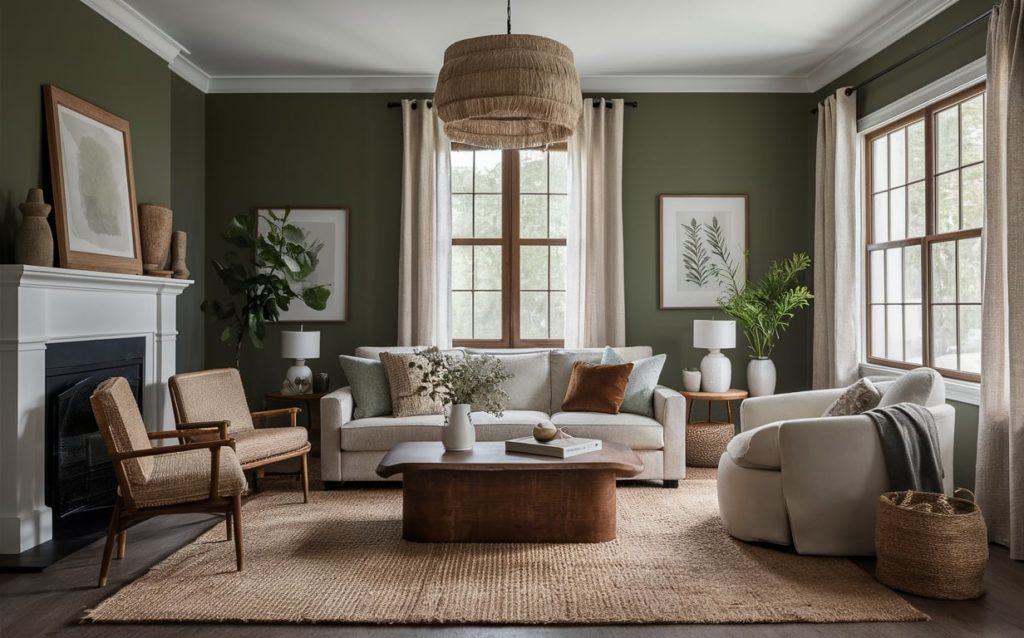
1. Moss Green + Tan + White
For nature lovers, there’s no combination as perfect as moss green, tan, and white. Natural textured fabrics like linen, burlap, hemp, etc., are brilliant complements to this palette.
You can further dramatize this combo by adding nature-inspired artwork. The Sherwin-Williams moss green has been a cult favorite for a good reason. This rich, delicate, and classy combination is here to stay.
Quick Read: How To Choose The Exterior Paint Colors for A House?
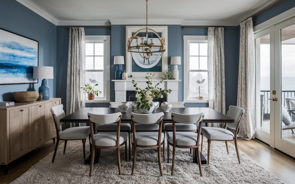
2. Gray + Sand + Blue
Look no further if you are looking for a nautical or coastal vibe that’s not done to death. The grouping of blue, sand, and a touch of gray is refreshingly beach-like.
This palette is instrumental in designing interiors that have a sophisticated, modern, yet easygoing air. The dining room and living room can seem welcoming when donned in this palette.
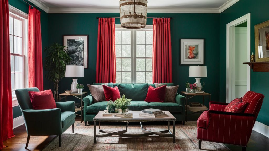
3. Hunter Green + Red
Not for the weak of the heart, this is a recipe for a chic masterpiece if used well. It lends any room young and vibrant energy. When paired with the correct furnishings, you can expect to be blown away by its discernable old-world charm.
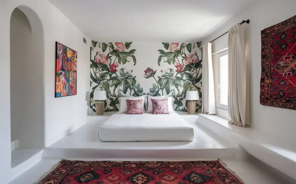
4. White + Pops of Color
White paint is literally the blank canvas on which your imagination can run wild! Pops of color in the form of a mural, abstract shapes, or artwork can adorn this canvas. Every element gets highlighted and showcased in white.
However, overuse of this theme may get chaotic if crowded with details. Master bedrooms, or any bedroom for that matter, can be personalized with this approach using thoughtfully curated bedroom color schemes.
Suggested Read: Bohemian Interior Design Style for Colorful Decor
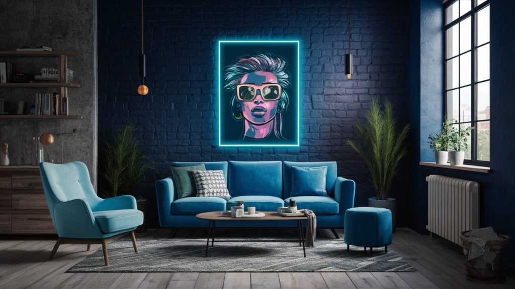
5. Blue + Neon
An unconventional and jarring color choice that’ll make your space look exuberant and punk. Neons can garnish any old corner and immediately make them the focal point with zero effort. Think accent walls in the bar areas or balconies with a mystic, overgrown vibe highlighted by this color combination.
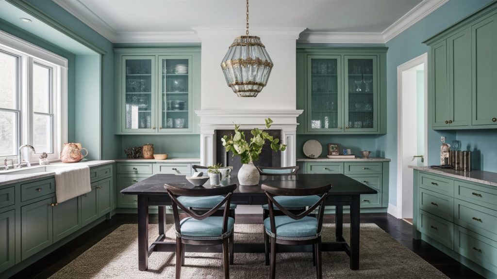
6. Light Blue + Emerald
Softer shades of blue paint with the opulence of emerald green is pure elegance! The Benjamin Moore Emerald Isle has been a long-time favorite of designers. These room colors give off a serene albeit confident trail. They can be comfortably used to adorn cabinetry too.
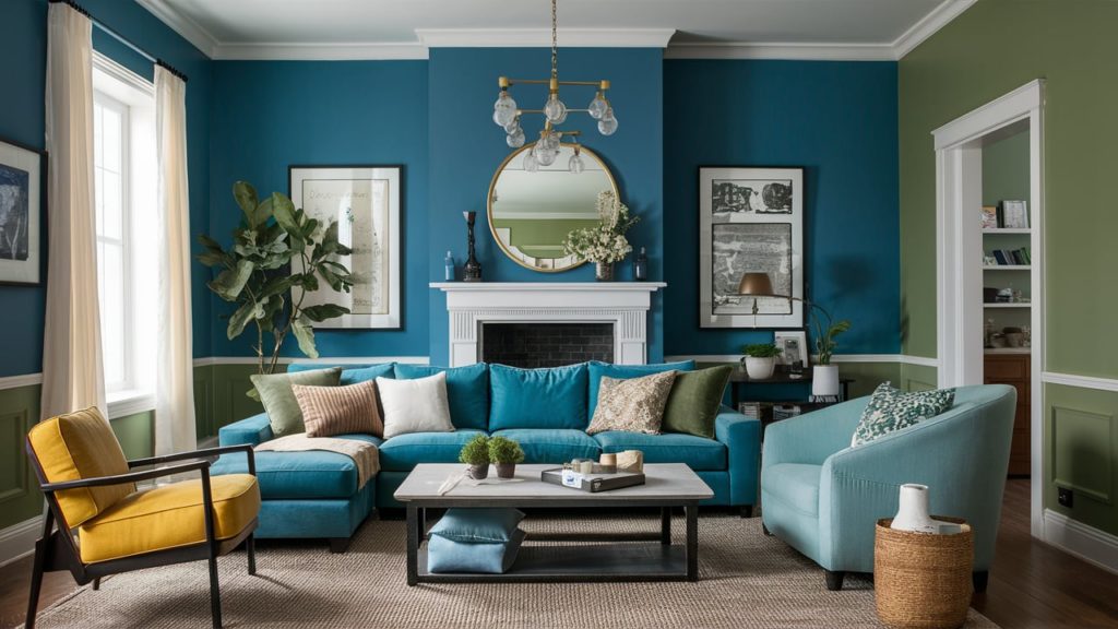
7. Blue + Grass Green
Splitting the walls with two cool tones like blue-green makes it seem smart and sharp. How you create the sectionals in the room with the two hues will depend on the size of the room and the amount of light it receives.
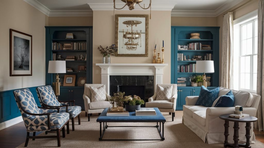
8. Blue + Beige
You must have guessed by now that blue plays a pivotal role in most color combinations. Blue is a color that offers wings to the mind, while beige keeps the feet firmly planted on the ground. This combination is best for formal settings like the living room, home office, or study.
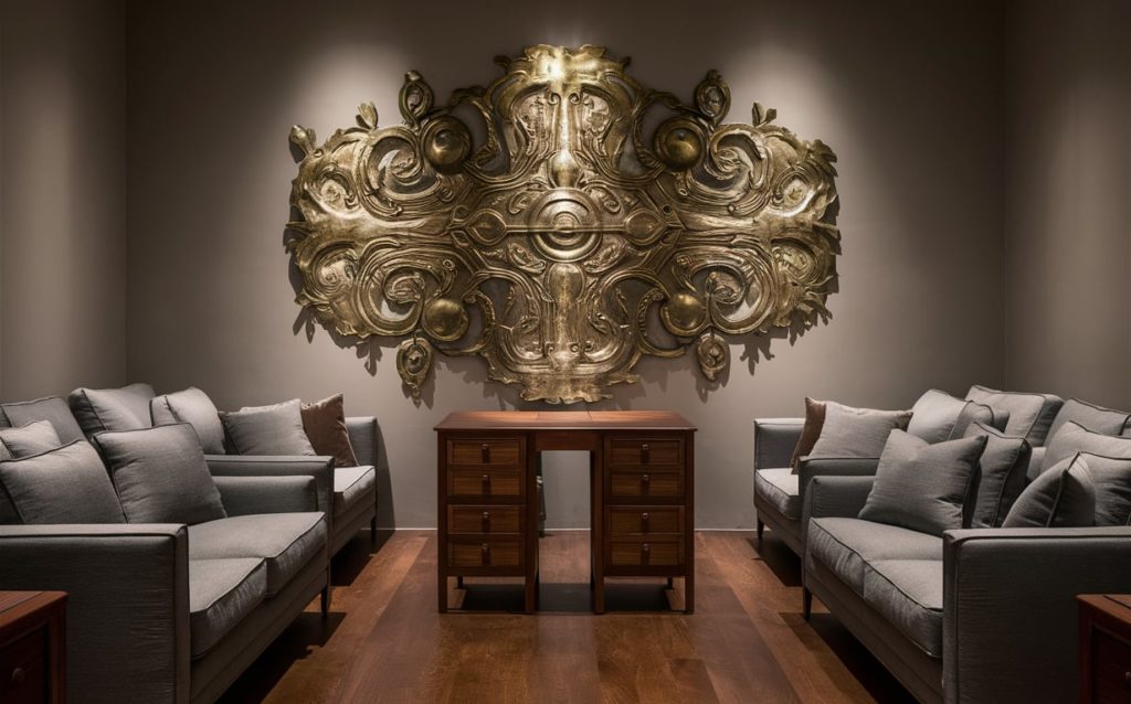
9. Gray + Brown
Opt for rigidly neutral colors like gray and brown for highly intense focal points. This combination works best when you want to highlight a brass or bronze statement piece of artwork.
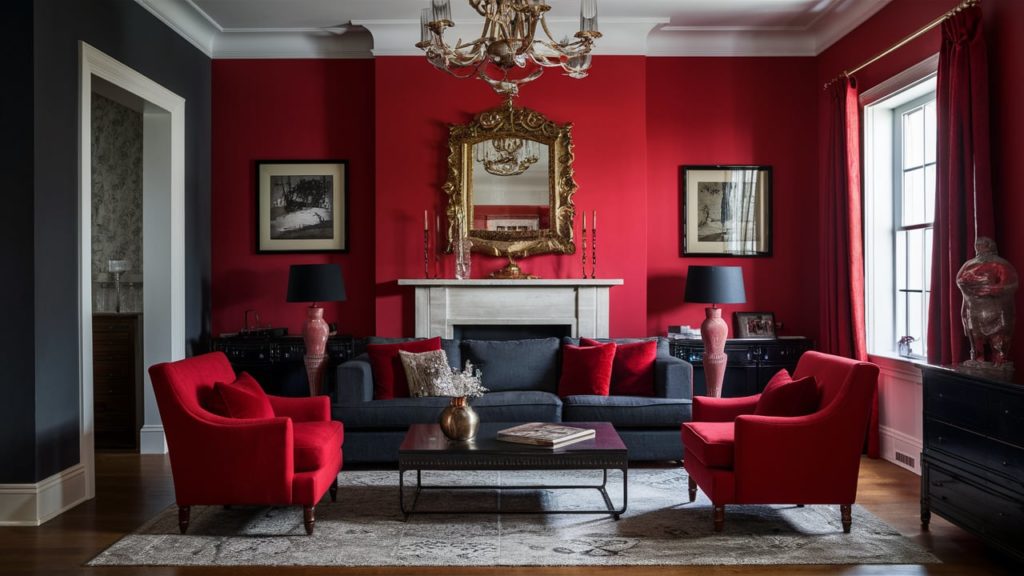
10. Black + Red
It pays to be brave! The drama unfolds in oodles when there is a medley of red and black. This combination packs a punch and is perfect for focal points in dens, parlor rooms, hallways, and stairways. It envelopes the room and its inhabitants with a ferocity that cannot be tolerated by all!
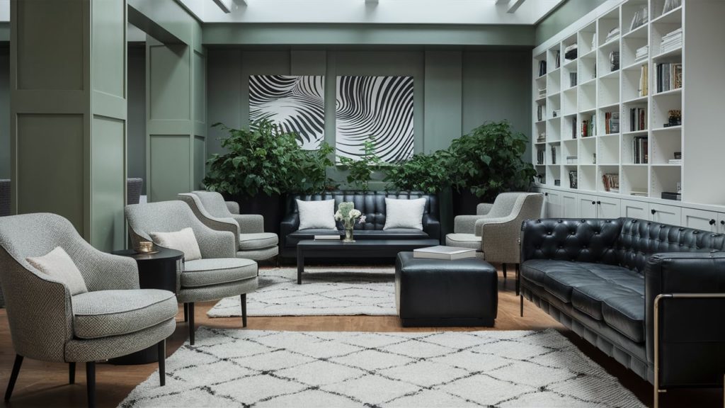
11. Gray-Green + White + Black
To incorporate nature into the interiors more formally and subtly, go for the contemporary gray-green, white, and black combo. While grayish-green and white add a smidgen of crispness to the room, black anchors the rest of the elements.
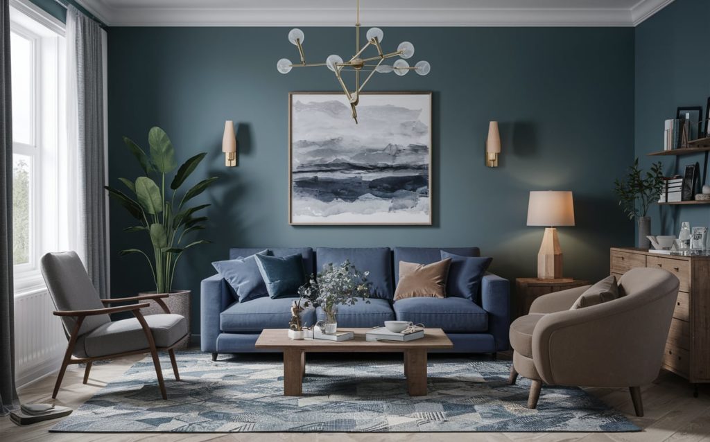
12. Blue + Gray + Taupe
Colors in a room can largely influence our mood. Universally, shades like gray and blue are restful, while taupe is a warm color with a cocooning effect.
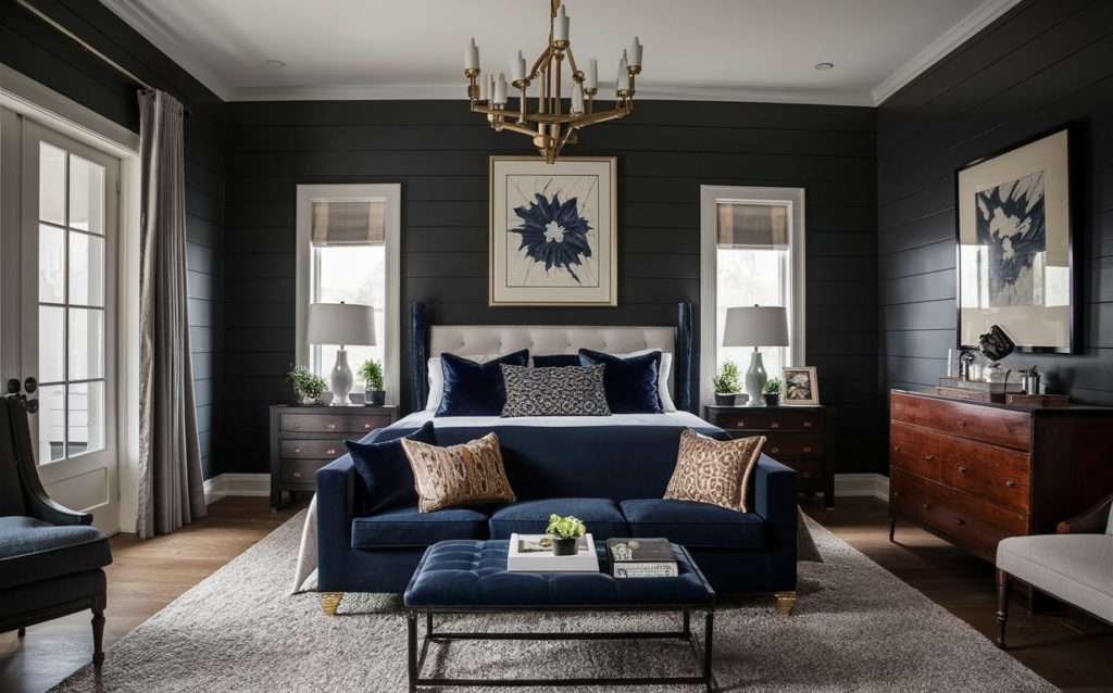
13. Black + Navy
It is a common misconception that neutral shades are boring and monotonous. Two heavy hues such as black and navy can be combined to create a sumptuous stately appearance. A classic for masculine energy, these go well in dens, master bedrooms, and even kitchens.
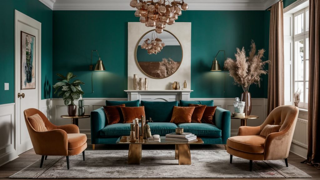
14. Emerald + Tan
Jewel tones like emerald can be burnished in a glossy finish. They bounce light around and instantly lift spirits. Add to it the earthiness of tan, and you have a room makeover! As a bonus, let the color seep onto the soft furnishings in plush textures like velvet.
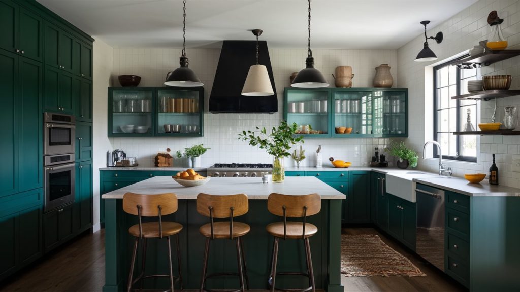
15. Forest Green + Light Gray
When paired with a buoyant hue like light gray, vibrant colors such as forest green become perfect options for wall paint in open areas. These interior paint colors fit seamlessly into various kitchen color schemes, with cabinets in darker shades complementing lighter walls. Add to it some vintage fixtures and lights, and you are golden!
16. Yellow + Gray
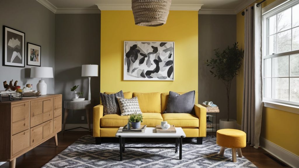
Yellow is the most stimulating wall color on the color wheel. The happy-go-lucky yellow seem mysterious when paired with a moodier subtle gray. This combination feels fresh and can work wonders in nurseries and playrooms as well as the living room or breakfast nook.
17. Pink + Green
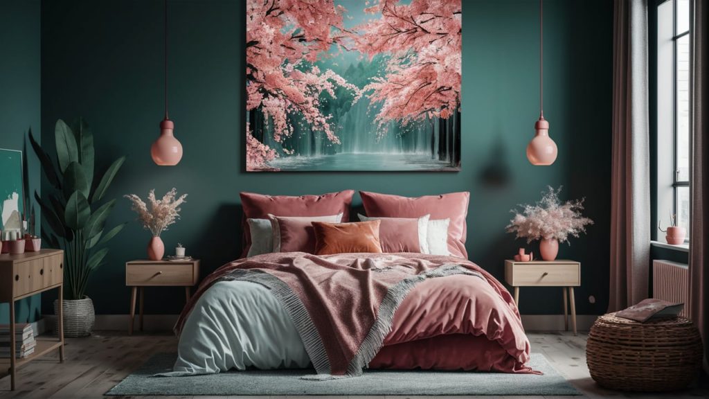
Have you ever wondered what happens if we take two deep colors and blend them together? The combination of pink with green immediately impresses and can breathe new life into a bedroom or living room.
The vibrancy and warmth of pink pop out against the natural aspects of green, much like cherry blossoms, making the room seem more lively and it is summer all around the year.
18. Blush Pink + Black
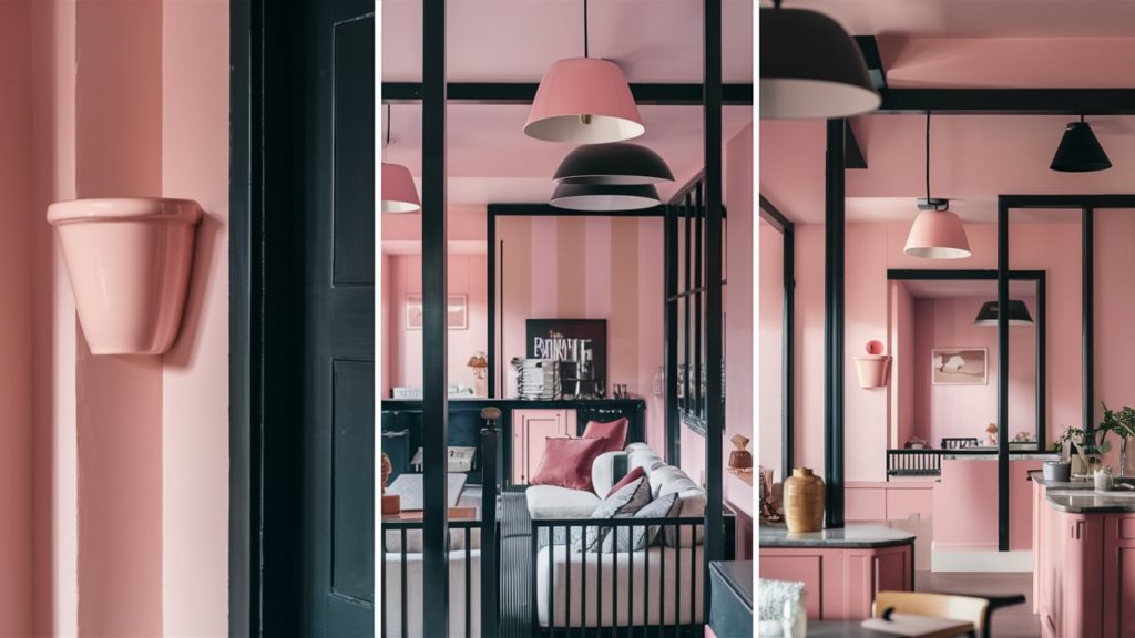
One more modern practice is pairing a dark color with a pastel shade, e.g., the soft Pink Cup from Farrow & Ball and black. The warm playfulness of pink is comforting and flattering, while the dark contrast of black is the missing touch of suave.
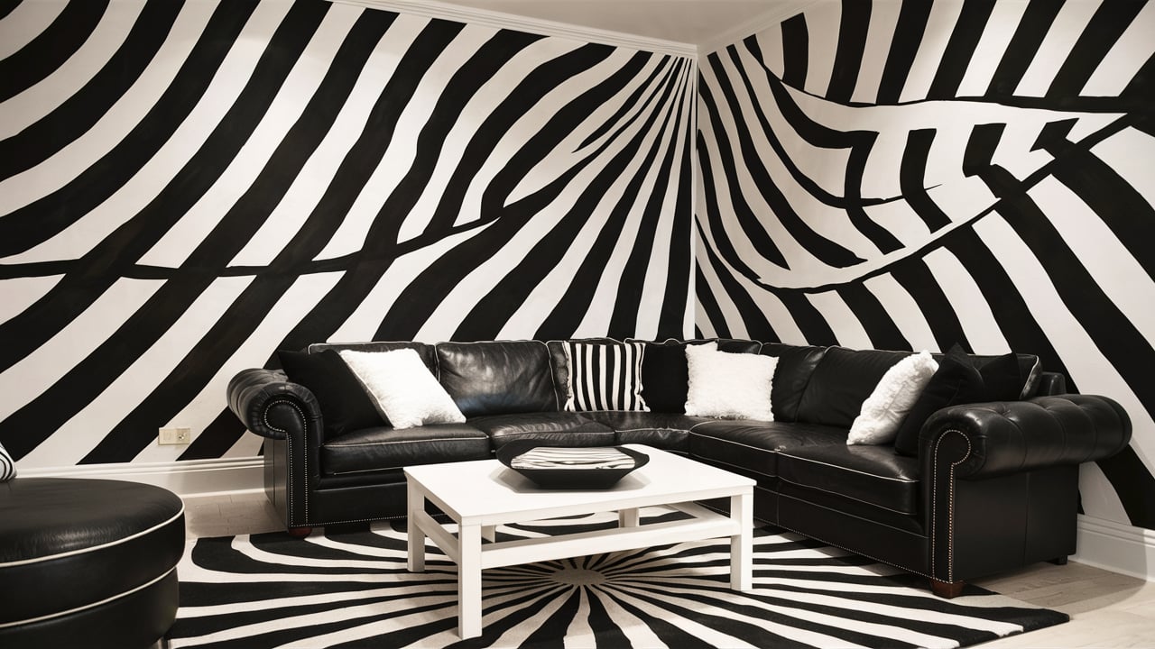
19. Black + White
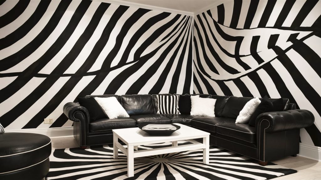
Classic black and white are the favorite colors in interior design color schemes for ages. No matter how you use it, this combination seldom goes wrong. You can use either color on the walls and furnish the room with the other or add them in radial patterns around the room to create vibration and rhythm.
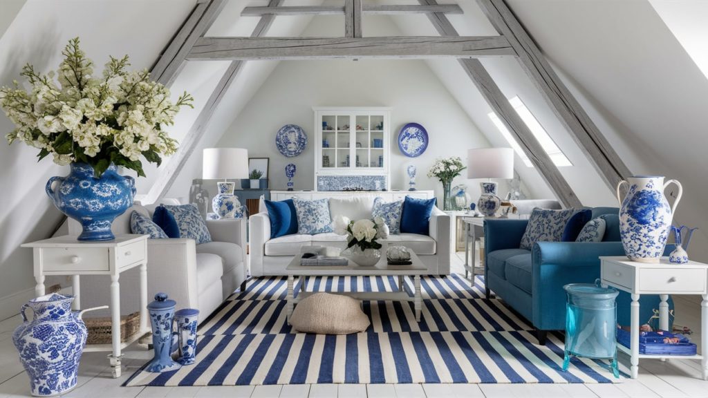
20. Blue + White
Depending on the interior style, blue and white can play the roles of modern and elegant as well as carry rustic DIY and plain on its shoulders. One of the most straightforward combinations to use, it is an evergreen merger.
Conclusion
While it’s natural to be excited to try all these color combinations and convert the space into a visual masterpiece, things can get messy and complicated if you get the colors wrong. Getting the client’s nod of approval on the swatches before putting any color on the walls is always better.
To help you with the challenge, you can always take the help of a powerful rendering software such as Foyr Neo. Add different elements like home decor and furniture from the extensive library of blocks and models available at your disposal.
You can then try out the various color schemes on the model. Finally, render a super realistic visual to see how the room would look after executing the ideas! Sign up for a 14-day free trial to up your color game!
FAQs
To choose a color scheme that suits your style, start by identifying your preferences and the mood you want to create. Consider your favorite colors, and look at your existing décor and personal items for inspiration. Use interior design color schemes to guide your choices, ensuring they align with your style, whether it’s modern, traditional, or eclectic. Experiment with home color design tools or mood boards to visualize how different house color schemes interior can bring your vision to life.
Incorporating bold colors without overwhelming the space involves balancing them with neutral tones and using them as accents. Choose one or two bold colors from your interior design color schemes and apply them strategically on feature walls, furniture, or accessories. Keep the primary elements of your home color design, such as walls and large furniture pieces, in more subdued shades. This approach ensures that bold colors enhance your house color schemes interior without dominating the room.
The latest trends in interior color schemes for 2024 emphasize natural and earthy tones, muted pastels, and deep, rich hues. Home color design is leaning towards warm neutrals like beige and terracotta, complemented by cool shades such as sage green and soft blues. Bold accent colors like deep navy and emerald green are also popular. These trends reflect a desire for calm, comfort, and a connection to nature in house color schemes interior.
Matching your furniture to your color scheme involves coordinating colors and styles. Start by selecting a base color from your interior design color schemes and choose furniture pieces that complement this palette. For a cohesive look, consider the undertones in both your furniture and your home color design. Use fabrics, finishes, and accessories that echo the chosen house color scheme’s interior, ensuring everything works harmoniously together.
Lighting conditions significantly affect your color scheme, altering how colors appear throughout the day. Natural light enhances true colors, while artificial lighting can warm or cool them. When planning your interior color schemes, test paint samples and fabrics under different lighting conditions in your home. This helps you understand how your home color design will look in various light settings, ensuring your house color schemes interior remains consistent and appealing in all lighting conditions.


