Interior Design Website Mistakes
One small inconvenience on your interior design website and boom you’ve lost your dream client to your competition. With millions of websites, small businesses and brands competing for attention, you just cannot afford to slip up.
The front of the house, i.e. the home page, seems rather normal. there’s an easy to follow explanation about what this interior design business is about. This person creates one-of-a-kind nurseries for twins. You want to find out more about her so you click on the About page… or rather the page she titled “Me”.
Once you step inside the About page, little things seem off. You see the portrait or rather the interior designer’s headshot. Instead of a happy smiling face like you picture when listening to that REM song “Shiny Happy People” you see Suicidal Sarah. Her dour face makes you feel like asking her for a quick chat about your art needs will send her into a downward spiral that not even an Interventionist could help.
How many personalities does this interior designer website have? Is it possessed?
If you think you’re nailing it with your interior design website, here are 7 mistakes you might be making that probably never even crossed your mind.
Read also – Best Interior Design Websites and Blogs
Top 7 Interior Design Website Mistakes To Avoid:
1. Above the fold – an unutilized interior design website feature image link
Bold images, snappy headlines, discounts, and controversial statements are just another way to stop people from scrolling.
If you look closely, a majority of these baits are the first thing you lay your eyes on a website. This is the above-the-fold section of a website and anything that requires scrolling is below the fold.
Adding stunning visuals at the top won’t cut it because pretty much every interior design website does this. You need to utilize this section to build an instant connection with your readers and persuade them to take action.
To do this, address a problem they might have, specify how you can solve it, highlight a transformation, and articulate why you should be their first choice. Don’t forget a call to action – add a ‘Let’s Talk’ button and make it obvious what they should do next.
Read also – How To Create A Successful Interior Design Website?
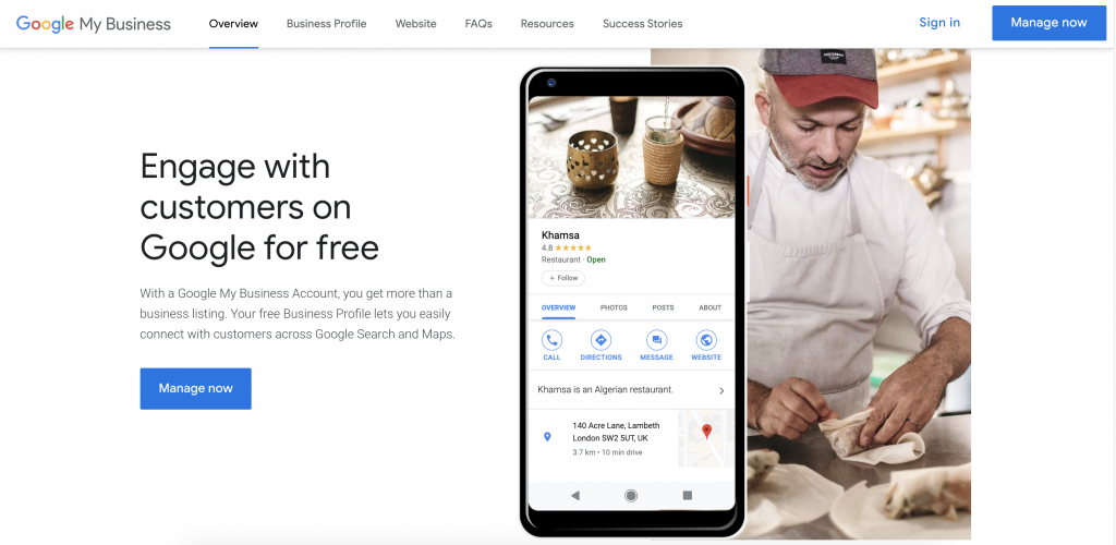
2. Not specifying your location - Google Business Listing (Local SEO)
Kentucky Fried Chicken. It’s right there in the name. As an interior designer, you’re a local business first. Not specifying your location is a huge interior design marketing blunder you need to avoid.
Specify the location on your website and register yourself as a local business through Google. You are more likely to appear in Google Search and Maps when someone in your area looks up ‘Best interior designers near me’.
Image Credit: brightlocal.com
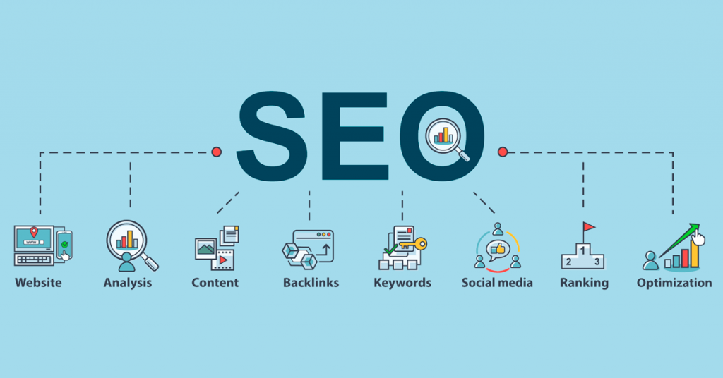
3. Do you even SEO?
What white paint is good for walls? vs Is Benjamin Moore Atrium White OC-145 the best white paint for walls? How are you supposed to know what a layman types in the search bar?
SEO. SEO is how you’ll know.
Not working on your SEO implies you’ll probably never reach those people looking for the best white paint in your area.
Now, there are probably a million websites talking about white paint. How on earth is Google going to decide that your website amongst others satisfies its user’s intent? I think you can see the pattern here. Work on your SEO.
According to Backlinko, organic search is a BIG source of traffic. Search accounts for 10x more traffic than social media and is preferred over a paid search. Think about it, what’s the first thing you do when you want to buy white paint? Go to Google, right?
Next time you write copy for your website, keep SEO and search intent in mind. See what the experts who top most interior design-related searches do. Pick a course that walks you through SEO and keyword research. Moz, Backlinko, and Ahrefs have some of the best resources for SEO.
Read also – 10 Email Marketing Ideas for Interior Designers
Image Credit: statuslabs.com
4. Your USP is not apparent enough
“People don’t buy what you do, they buy why you do it.” What’s your why? If it isn’t obvious to you, it won’t be to your audience. From a marketing standpoint, Simon Sinek – New York Times best-selling author of Start With Why – says people won’t truly buy into a product, service, movement, or idea until they understand the WHY behind it.
By defining your why, you set yourself apart from your competition. This makes it easier for people to choose you over them.
What’s that one thing that gives you an edge over other interior designers? Why should people pick you over a designer near them? The first step to defining your Unique Selling Proposition is by answering these questions. Then, make sure to convey it to your audience.
This takes time but by starting, you’re already doing better than 90% of the people competing with you.
Read also – 20 Common Interior Design Mistakes To Avoid
5. How much copy is too much?
Long paragraphs or 5600×5600 wide images with no context. It’s either Can you get to the point? or Okay, nice ceiling picture you’ve got there, what do you want me to do about it? There’s no in-between when it comes to most interior designers’ website copy. You either can’t stop writing or you don’t write at all.Fix the copywriting for your interior design blogs today by:
- Writing compelling headlines
- Breaking long paragraphs into shorter, more digestible ones
- Making use of lists, bullet points, and sub-headings to differentiate between pieces of content
- Adding a clear call to action so everyone’s on the same page
And, assuming images will do all the talking is big bad-copy energy. Add text that explains images in your blog and let people know WHY it’s there in the first place! If you find writing overwhelming, hiring a copywriter for interior designers is always an option (mua, for instance).
Read also – 17 Best Interior Design Magazines and Blogs
6. Evergreen content is not a part of your marketing
Trends come and go. Remember when everyone was obsessed with barn doors, edison bulbs and all-gray everything? Not anymore. If your website copy is built on trends and trends only, as an interior designer you will be as relevant as that trend.
People will keep buying homes for generations to come and will always want to buy white paint. What they probably don’t care about is what brand the paint is as long as it works. 99% of people search for What white paint is good for walls? (evergreen) and not Is Benjamin Moore Atrium White OC-145 the best white paint for walls (trend)?
What is evergreen content?
Evergreen content is content that’s timeless. It remains relevant to your audience regardless of season and will continue to generate traffic for months and years after you publish it. Kind of like trees that never lose their leaves.
Backlinko analyzed over 3.6 billion articles to understand evergreen content better. One of their key findings was: How-to and list posts are the two most evergreen content forms to exist.
Here are some examples of evergreen content for your interior design website:
- 7 timeless white paints to brighten up your room
- How to design a small office space you will never want to leave
- How to choose the best hardwood floors for your room
- 11 Girl nursery design ideas for new parents
- 5 steps to designing the ultimate bedroom sanctuary
These are just examples. Align your topics with your blogging strategy to make sure you attract the right type of audience.
To stay on top of your game and build authority in your niche, you need to incorporate evergreen content for your interior design business. By prioritizing evergreen posts in your content writing strategy, you not only get regular organic traffic but you also don’t have to worry about updating your content every month or so.
Read also – 14 Content Marketing Ideas for Interior Designers
Image Credit: elokenz.com
7. You are not intentional with your branding
Ever tried arguing with an Apple fan? There’s no winning because to them, nothing beats Apple.
According to this Harvard Business School case study, 95% of the time people make purchasing decisions subconsciously. But how do you reach the subconscious mind? Through your brand personality – something Apple is very good at.
Brand personality should be a part of your interior design marketing strategy as it humanizes and adds a differentiating factor to your brand. There’s too much digital noise and people are busy. So, make sure your branding cuts to the chase.
Read also – How To Building Brand for Interior Design Business?
Common & Technical Interior Design Website Mistakes to Avoid
8. Using an old or unprofessional head shot; lifestyle photos are best
9. Not naming each photo file with the project type, city, and state before uploading to your site
10. Not positioning your Services page around your ideal clients’ specific needs
11. Asking a website visitor to click too many times to find the info they want
12. Using pop-up banners that cover the entire screen
13. Forgetting to list the cities and states that you serve; you’d be surprised how many interior designers, specifically, forget to do this
14. Using a slideshow that changes automatically on any page of their site, especially the homepage
15. Including a blog on your site that you don’t update at least monthly; if you aren’t posting new content, hide that blog
16. Using a website layout that isn’t mobile-friendly
17. Using a website that doesn’t have SSL security; your site should have “https://” preceding the web address if it is secure
18. Using too many font types and sizes
The bottom line, having a well-defined brand personality will make it easier for your customers to care about you. Start off by asking yourself these questions:
- Who is your dream client? What do they care about? Where do they hang out?
- How will it benefit them by choosing you over other interior designers?
- What experience do you promise that they most likely won’t find elsewhere?
Once you’ve arrived at an answer, create a website and social media copy around your brand personality and stay consistent with it.
These were just some mistakes interior designers make on their websites. I could go on but I’ll stop here so that you can reflect on this.
To make sure your website doesn’t get lost in the sea of interior design websites out there, you need to have great copy and branding. As a professional copywriter for interior designers, I know how important content is to stand out as a business.
Read also – How To Start An Interior Design Business?
Conclusion
So there you have it – the top 18 mistakes to avoid while creating or running an interior design website. It can be hard to pay attention to all the technical aspects of maintaining a speckless website. It is advisable to find experts who can do this for you instead of going through the huge learning curve to learn this skill.
If you want to learn more about marketing your interior design services, creating an online portfolio in a few clicks or need help with running your interior design business, head on over to Foyr’s Community.
They are a group of amazing dedicated people, devoted to helping the interior design community in all ways possible. You can find freelance jobs, interface with other designers or even find the perfect mentor for your interior design business! What are you waiting for? Experience the power of community with Foyr!


