Learn » Interior Design Tips »
No one can deny that, interior design is an art in itself. A professional interior designer has to acquire professional education, and then spend years unrelentingly honing and practicing their skill and creativity to be able to expertly transform people’s lives through the correct designing of spaces.
However, some issues crop up time and again while crafting spaces. These oversights can be avoided with a keen understanding of primary design principles.
Let’s go over these mistakes so you’re several steps ahead of your competition and get ready-to-build designs made for your clients every time.
20 Common Interior Design Mistakes To Avoid
1. Using the Wrong Scale
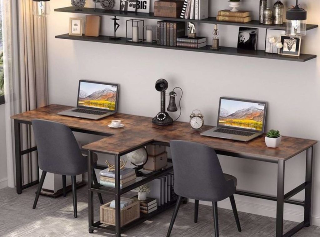
One of the most common interior design mistakes we see is the wrong scale.
Too many small things in a room can make the room look cluttered and messy. Similarly, overloading bulky pieces in a room makes it stuffy.
The trick is to mix the scale. A “skyline” of different heights, shapes, and types of pieces keeps the room interesting.
Similarly, the proportion is tricky to get right. Just because you have a small space does not mean you need to buy small furniture. No one wants to feel like Snow White in the house of seven dwarfs! One large statement piece of furniture will hold your room together.
Read also – 10 Best Client Management Tips for Interior Designers
2. Keeping Too Many Heirlooms Together
Still, holding onto your grandmother’s porcelain figurines that you can’t stand? Time to let them go and find something that you genuinely enjoy to adorn the house. Too many heirloom pieces make your room look dated.
If there are keepsakes you do adore, scattering them throughout the house is downright lazy and random. Instead, break the accessories up into small clusters. And arrange them in groups of odd numbers on ring trays.
Add one large piece into the vignette to anchor everything down and bring out the details of the smaller ones. Again, a mix of different heights, textures, and shapes will yield the most engaging display.
| Artem Kropovinsky, founder and principal designer at Arsight says, “The secret of succeeding in design lies in understanding a client truly. At the start of my professional experience, I managed to decipher between lines, taking what lay in their soul. Quality designs are an undisputable result of this constant approach. This will help you decide which of your client’s favorite heirlooms to keep, and which to keep away from your design.” |
3. Wrong Style and Size of Artwork
Art can be striking and stunning. Unfortunately, also why the mistakes tend to be glaring.
The first mistake some interior designers make is going for the wrong size. Don’t be intimidated by size! Bigger is almost always better. A too-small artwork can look silly, while a grand-scale art can become the room’s focal point.
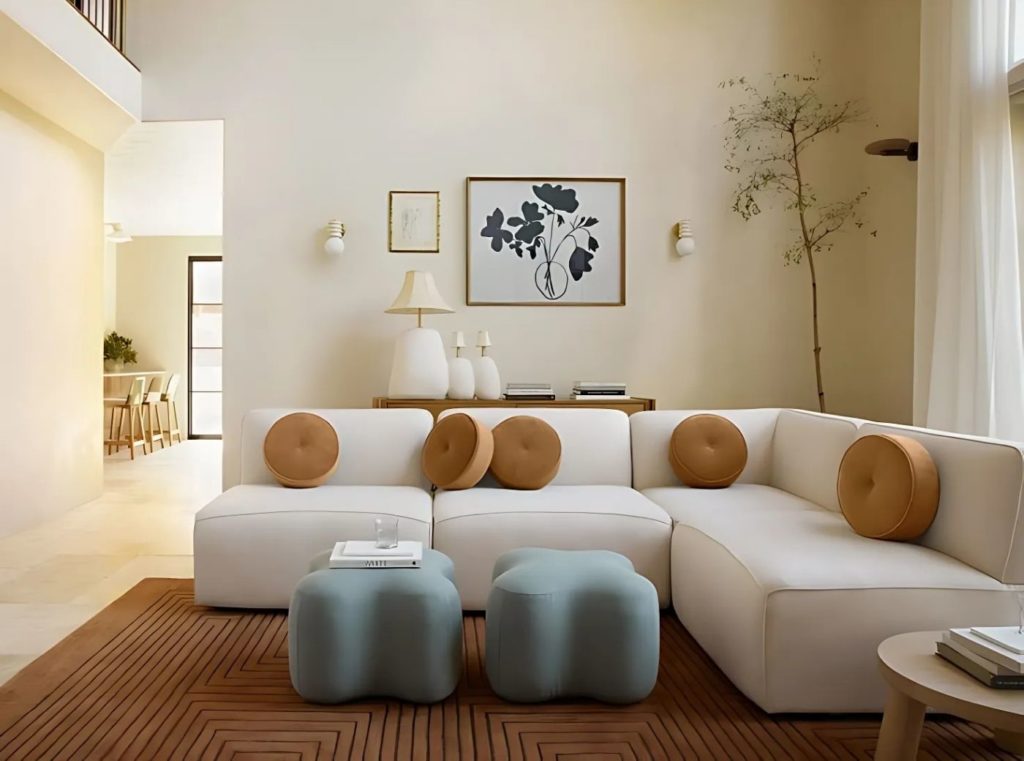
If you want to put more than one piece, experiment with the placement, and scale till you find one that looks balanced. Remember, as a general rule, eye level looks the most natural.
| Artem Kropovinsky, founder and principal designer at Arsight says, “Personalizing spaces is essential. The right type and size of artwork, for instance, or a little bit of green can turn a plain room into a home as opposed to just another house.” |
4. Picking Out Wall Colors First and Fabrics Later
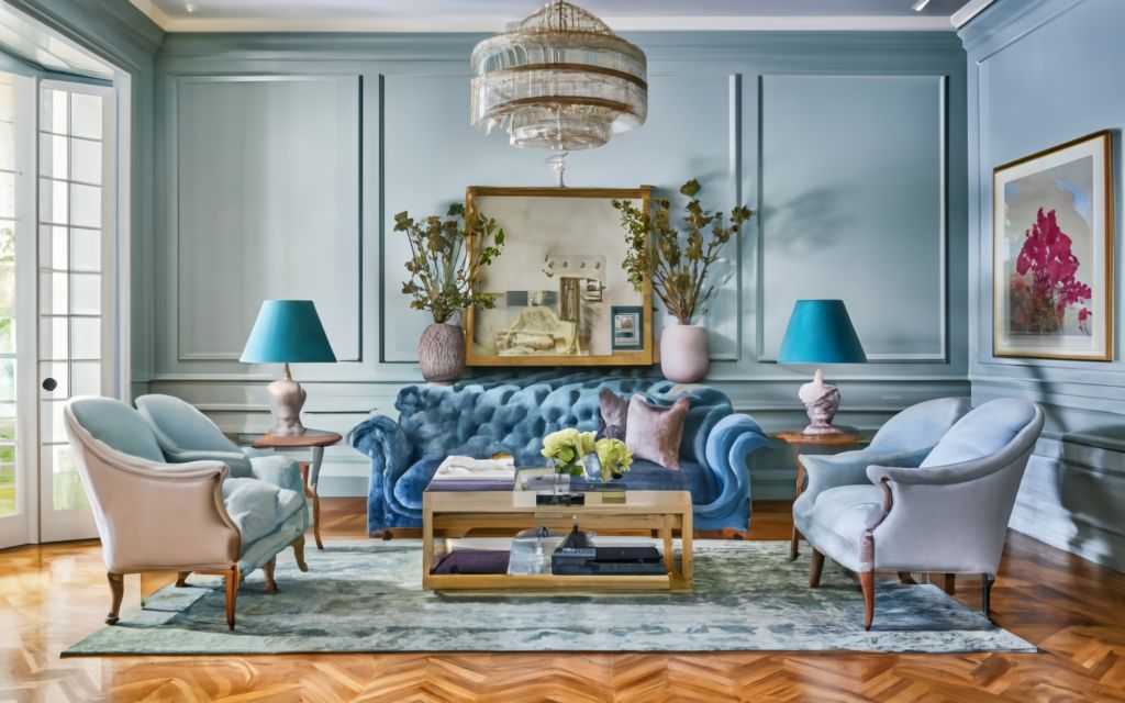
Loving that Robin-egg blue lacquer on your living room wall, but are now left with no other option than white to complement the wood used and the wall paint?
Unfortunately, this is a mistake many designers and homeowners end up making.
Many factors in home decor keep evolving and putting something as permanent as the wall color first is risky.
This is why we recommend you budget your buys and pick out variables such as fabric for curtains, rugs, sofas, and chairs first and then proceed to pick out a color for the walls from the shades in the material. It is also easier to find wall paint that compliments the room’s fabric, texture, and lighting than the other way around.
Read also – 15 Problems Most Interior Design Business Faces
5. Making Neutral Designs Bland
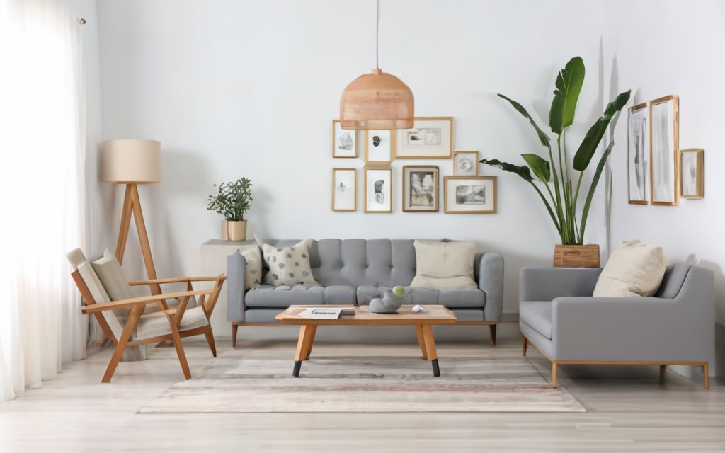
We love a Scandinavian interior that makes you all comfortable and snug! However, white is poised, empty is not.
Neutrals are chic but only when done right. If not, it can leave the living space feeling grim and harsh.
What makes Nordic designs cozy is the layering of warm colors and textures. All neutral furnishings with white walls and no warmth end up looking insipid and unfinished.
Bring in some accessories and artwork. Throw some paint colors like Cook’s Blue for some zing! So pick up some colors, and splash them on the rugs, pillows, curtains, and maybe even a few shelves, just not all together.
Read also – Color Theory in Interior Design
6. Following Trends Without Adding a Unique Touch
Image Credit: aryacandles.com
Pinterest brings the latest design trends to our fingertips. However, it also brought along the movement of cookie-cutter interiors where all spaces started to look similar and forgettable.
It may be easier to copy a Pinterest board as is, but it will not speak to you. Adding your personality to your home is what will make it truly personal and meaningful. Like gardening?
Add that rug from the time you went holidaying in Turkey to your master bedroom. Make your home tell your story!
To get the most curated house that is all you, learn to take it slow. Add pieces as and when you fall in love with one. As we said before, interior design is an evolving process. Let it grow with you.
| Artem Kropovinsky, founder and principal designer at Arsight says, “Being unique makes you distinctive. Incorporating bits of your personal touches into even separate tasks will give you a distinctive flavor that is attractive to the people of art.” |
7. Not Prioritizing the Focal Point
A room without a focal point floats about with no corner or scene to catch your interest for a long time.
A focal point doesn’t just elevate the beauty of a room, it anchors your room. A focal point is a space from which all other activities of your room radiate.
A visually prominent feature in an open plan helps center the attention and make the room feel connected. A large piece of artwork, paneled walls, animated wallpapers, or a large indoor tree are some foolproof ways to create a focal point in a room design.
Read also – How to Choose the Right Marble to Design Marble Countertops?
8. Avoiding Multi-Layer Lighting
Image Credit: unsplash.com
Lighting can make or break a room. So starting with plenty of natural light, make sure to equip a room with adequate, well-planned secondary lights next.
Lighting being left as an afterthought or last-minute haphazard addition is the biggest mistake you can make.
Another mistake is using cheap fixtures with no dimmers or installing lighting that’s just enough to provide basic brightness. This results in a glaring bright or dimly lit dull house with no ambiance.
Lighting is as much aesthetic as it is functional. The trick is to layer lights to form soft glowing pools of light. A balanced and creative installation of ambient lighting like table lamps, task lighting, and accent lighting ensures a comfortably lit, beautiful home.
| Artem Kropovinsky, founder and principal designer at Arsight says, “Lighting is the backbone of interior decoration. Through a careful process of blending natural and artificial lighting, we create just the right ambiance while enhancing important features.” |
9. No Space Between Furniture
Leaving gaps between furniture and walls makes the room airy and light.
A proper layout that centers the seating space with pathways around, lets the room breathe and makes the space look larger.
If you have a small living room, try separating the sofa and the wall with a floating shelf or console table for a break in space.
Read also – 10 Best Furniture Design Software
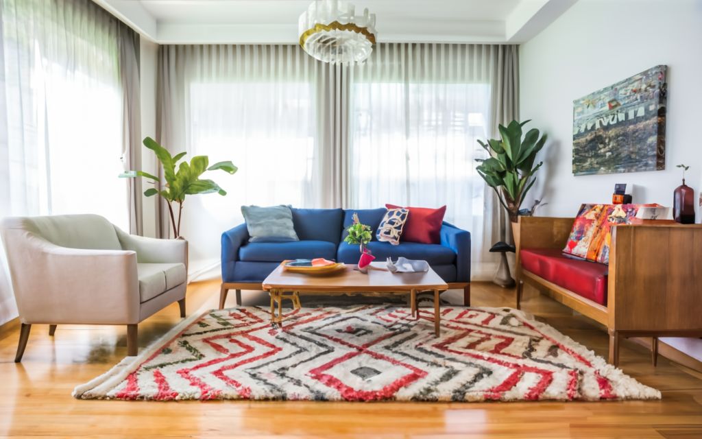
10. Installing a Rug that Doesn’t Match the Aesthetics
A rug is an integral part of your room décor. Getting it correct can uplift the allure of the entire room.
Choosing a rug that’s too small is not only a faux pas but also makes your room look smaller and messy. There are simple design tips that can get your rugs to flourish in any space.
Rule one is to make sure it’s the correct size. By this, we mean that rugs should come under the front half of every piece of furniture that rests on it in the living room.
Suppose you are late to the game and already own a gorgeous small rug. Fret not, for there are ways around rule one. Taking the carpet right back to the “sofa wall” makes it an intimate part of the seating layout and not of the whole living.
Assuming it’s even smaller, all’s not lost still. Hero your coffee table with the rug under it for a centerpiece in the room!
Read also – 9 Best Studio Apartment Floor Plan Layout and Decor Ideas
11. Overdoing Metals and Layers
Who doesn’t love metallic accents? But it is easily possible to overdo metals.
While a chrome floor lamp can look dashing, pairing it with a chrome chandelier, chrome coffee table legs, and chrome accessories is displeasing.
Too much metal, unless it’s warm like brass, can take away the warmth from a room, making it clinical and austere. However, natural and organic materials like lines and jute interspersed with metals can tone down the rigid aura.
Read also – 23 Living Room Divider & Partition Ideas For 2024
12. Improper Space Planning
Image Credit: archisoup.com
You found a gorgeous accent chair from your local thrift store. You are excited, you are going green, and you couldn’t be prouder. But then, you reach home to find that it completely upsets the scale of your room.
A big part of a successful interior design process is planning; this includes accessing your floor plan and measuring the remaining elements of your home.
A new piece of furniture should not just fit, but be comfortable to use and leave adequate space around for movement. This can save you precious time and money.
Read also – The Average Bedroom Size for Master Bedroom
13. Picking Form Over Function
Form follows function is a distinguished architecture principle that finds application in interior design too. the rule of thumb dictates the outer aesthetics of an object should be in line with its purpose or use.
A home design that’s right out of Architectural Digest may earn you plenty of praise and envy too, but if it doesn’t enrich and facilitate your daily life, it’s pretty much a waste of resources.
How you intend to use the room should determine picking the furniture, paints, accessories, and every other room element. Your client may come to you showing tons of Pinterest photos for inspiration and want to get them all for their home. It’s up to you to show them how certain elements blend in, and others don’t.
| Samantha Odo, Real Estate Sales Representative & Montreal Division Manager at Precondo says, “Showcase before-and-after transformations, and let your work speak for itself. I’ve had clients who were initially skeptical about certain design and decor choices, but with the right design tweaks, prioritizing function over form, they ended up not just satisfied but genuinely thrilled with their investment.” |
14. Overlooking Tiny Details
A simple decorating mistake that can easily be avoided is the lack of attention to detail.
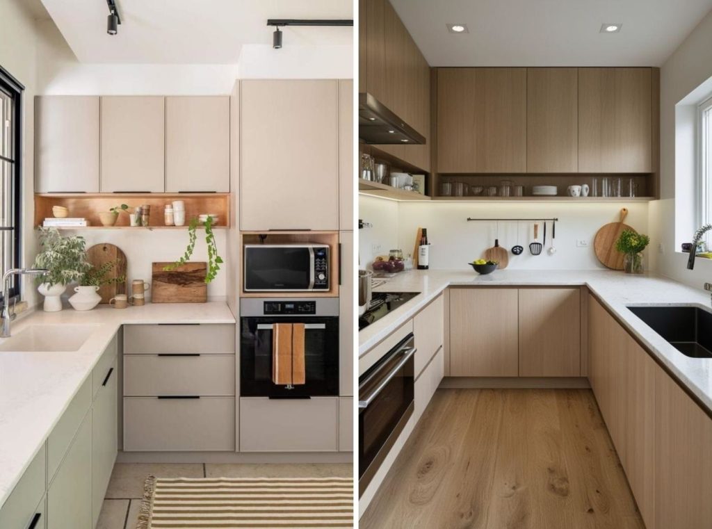
A beautifully crafted, fully functional kitchen will fall flat on its face if fitted with ugly, mismatched fixtures.
Similarly, minutiae like curtain tie-back, well-chosen switchboards, placement of dustbins, knobs on drawers, throw pillows on the sofa, etc., can be easily overlooked but will adorn the house delicately if paid attention to.
Read also – 35 Best Bedroom Color Schemes and Ideas for Your Bedroom in 2024
15. Drenching the Entire Home in One Color
Your dream home must reflect who you are.
However, if you are crazy about blue, we don’t condone covering every available surface of your room in shades of the sky. A matchy color palette is a dated trend that we hope never comes back.
Mixing and matching styles are fun and add depth and interest to your space.
It also makes it easier to get a new addition or replace an old one. Just make sure you maintain a balance to stop your home from looking at a gallery opening.
Read also – The Guide to Choosing the Best Bathroom Wallpaper Designs & Ideas for 2024
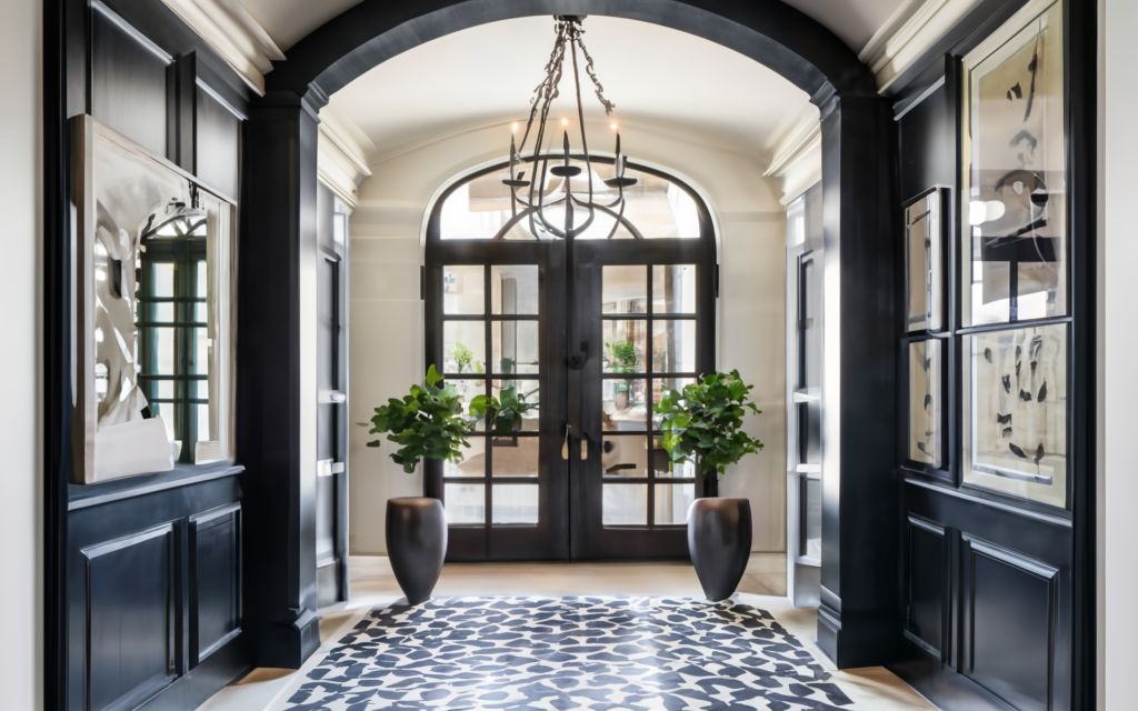
16. Forgetting the Importance of the Entryway
An error many designers make when working in a home is underestimating the importance of an entryway.
An entryway is the first thing your guests see when they enter the house and the last thing they take away when leaving. So give this alcove the loving it deserves.
Hang a handsome art piece complete with stellar overhead lighting. Throw a plush area rug down. If your entryway has a mudroom shelf and storage, make sure you give them a suave revamp and fit them with some sleek accents.
Remember, the entryway sets the mood for your entire home.
Read also – Top Interior Designing Software Tools to Learn in 2024
17. Compromising on Aesthetics for Budget
Buying cheaper pieces for your home may not always be the most frugal.
For one, if you fill your home with ratty furniture sets, they will need to be swapped out sooner due to regular use and wear. However, a good quality item will last you years.
Similarly, instead of filling up your space with inexpensive goods, consider investing in a single, worthy piece.
This is where those above slow living pictures in; let your home waiting for you. Keep an eye out for good bargains, yard sale finds, and antique stores, and collect accent pieces gradually. Grow together!
Read also – Building an Open Concept Kitchen Living Room in 2024
18. Inadequate Planning and Preparation
Image Credit: newnorth.com
We have already seen how planning is essential for purchasing the correct size of furniture pieces. However, this is not limited to the size of furniture alone. Often designers and clients are at discord due to improper communication and organization.
Often designers and clients are in discord due to improper communication and organization.
Planned and organized furniture placement and house layout offer a smooth flow of movements, a winning color scheme, cohesive design styles, and improved functionality.
Irrespective of the size or scope of a design project, proper planning about requirements, timeline, budget, preference, etc. will lead to frictionless project completion.
| Gunita Kuļikovska – Ķiesnere, a renowned architect and tech entrepreneur says, “ I once visited the Venice Biennale of Architecture, and interviewed architects around the world, to which I found that in fact, some of the biggest changes were requested by clients during the last phase of construction, or after the buildings were completed. As a designer, it hurts more than failed expectations. This disappointment can be avoided with proper planning and timely execution.” |
19. Getting a Heap of Pillows in Every Furniture
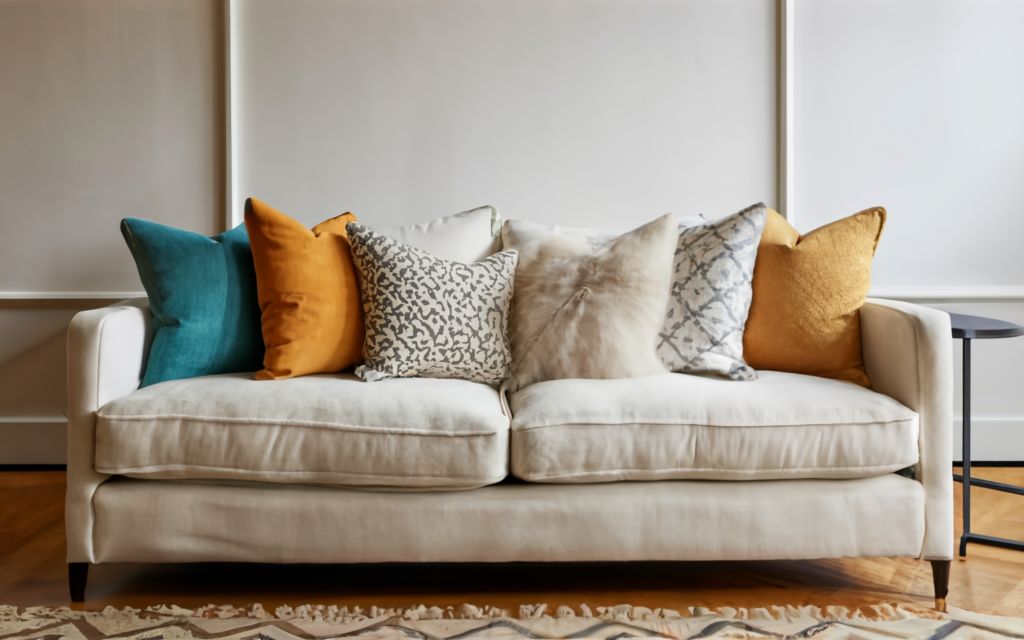
Who doesn’t love plump, cloud-like pillows? But how much is too much?
While you can take some liberty with the pillows placed on the bed, it’s better to stick to minimal numbers when it comes to the sofa.
The trend of piling pillows on sofas and armchairs has thankfully ebbed away, leaving our seating clutter-free once again.
By leaving the sofa looking sleek, the throw pillows are free to shine on their own. This is also a place where you can indulge in a few exquisite throw pillows.
Read also – 10 Best Free 3D Modeling Software of 2024
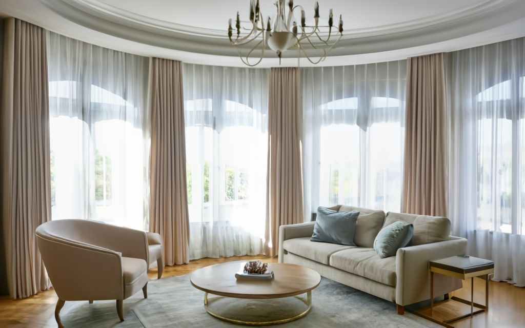
20. Overdoing Draperies
Curtains play a crucial role in the luxurious softening of the rooms. But they are also super functional. This is why there are many ways window treatments can go wrong.
Hanging draperies at the right level are essential to make the room look tall and spacious.
Some cut the curtain length at the sill level of half windows, making the window look shabby and even smaller. However, curtains that are too long trail along the floor miserably, making them look droopy.
We love old-school glamor. But done incorrectly, curtain pelmets can look dated and drab. So it’s prudent to stick with concealed or a soft pelmet at the most.
Image credits: All images featured in this blog are AI-generated or created using Foyr Neo, an advanced interior designing software.
Conclusion
Now that you know which mistakes to avoid and steer clear of, go ahead, ideate freely, experiment, and come up with stunning designs that are truly personalized, creative, soulful, and super functional. You’ll not only be a client’s dream designer, but you will also become their builder’s favorite designer. Prepare pretty, practical, and ready-to-build designs using Foyr Neo in a few minutes. Sign up for our 14-day free trial today!
FAQs
How to maintain visual harmony in a room?
Balance bold patterns with neutral elements and incorporate them strategically as accents rather than dominating the space.
How to Prevent Over-Spending on Your Design Project?
One of the most common mistakes people make in interior design is not budgeting effectively. An interior design cost calculator can help you determine the total cost of your project by factoring in materials, labor, and other design elements. Using a cost calculator will ensure you avoid over-spending and help you stick to your budget while achieving the look you desire.
What materials and finishes should I prioritize to avoid a dated look?
Opt for timeless materials like natural stone, wood, and metal finishes, avoiding overly trendy options.
How to prevent mismatched furniture styles from clashing in a space?
Stick to a cohesive design theme or mix complementary styles intentionally for a cohesive look.
What to do when designing a small space?
Avoiding oversized furniture, utilizing multifunctional pieces, and employing light colors and strategic lighting techniques can create an illusion of spaciousness in a small room.
How can I make sure the furniture I choose fits well in my room?
Measure your room carefully to know how much space you have. Then, consider the size of the furniture pieces you already have or plan to buy. Visualize how everything will look together in the room to ensure it’s not too big or too small for the space using visualization software like Foyr Neo.

