Neutral Paint Colors
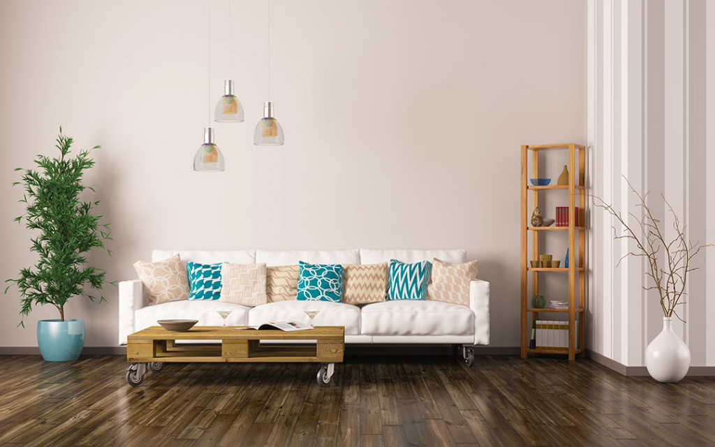
Having a home renovation done is nothing less than a challenge in several parts. While significant elements of renovations are easy, the fresh choice of paint can pose a considerable headache. While some prefer vibrant colors, such as purple, teal, or green undertones to keep the tempo up, the minimalists will go their neutral ways. They like things more subtle and subdued.
Neutral colors are underrated. There is a striking sense of sophistication they ooze when done well. A few years ago, such settings were considered more of a snooze fest and bland, but today people have gleefully accepted that having gray or a beige undertone is anything but boring.
While neutral would technically mean something without color, the undertones make them distinguishable. Interior designers can also mix and match a myriad of neutral tones depending on where they are being used, and the overall feel the client is looking to achieve.
This article discusses the 20 best neutral paint colors for interiors.
Read also – How To Choose The Exterior Paint Colors for A House?
Image Credit: mydomaine.com
Why are people leaning towards neutral?
Neutral paint colors are making a comeback in the last few years. From the cool grays of the past, the world is moving towards warm neutral shades for interior spaces, such as rich greige, creamy whites, and warmer grays. There is also the shift towards beige being the common undertone.
Cool neutrals today have undertones of green and blue, with warmer neutrals shifting towards yellow undertones and a mix of red or orange ones. An ambiance without natural light would be better suited to the latter allowing them to compensate for the same.
Neutral colors exist because they are calming and are more welcoming. These are also considered timeless and can seamlessly be integrated with additional elements without much tinkering. In addition, it allows homeowners to showcase lavish furniture and textures, which are often overlooked if you go for a vibrant undertone for paint.
In addition, people often tend to get bored with vibrant hues, but neutral undertones will seldom go out of fashion. They work as an investment allowing you to use it for a long time while adding the requisite elements as time passes. It means homeowners can stick to the existing color scheme for longer and save on time and resources while not sacrificing aesthetics and ambiance.
Read also – The Psychology of Colors in Interior Design
Best neutral paint colors for interiors
Now that you have chosen to go the neutral way, you must understand that you can do better than opting for the same color for your dining room and the living room.
When you start, you may believe that you can choose any shade of taupe, off-white, gray, or beige, and you are good to go. But once you start delving into the range available, you will realize you have merely scratched the surface with these shades.
Neutral undertones, even though seemingly similar at first glance, are very versatile, and you will need a lot more than guesswork to get them right. For example, using bright white in your living room can light up the overall setting, whereas using the same for your entryway can throw people off. It is more about understanding the synergy of colors and spaces and working accordingly.
So, without further ado, here are the 20 best neutral paint colors for interiors.
20 Best Neutral Paint Colors for Interiors:
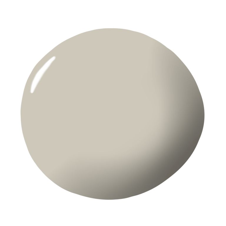
1. Manchester Tan by Benjamin Moore
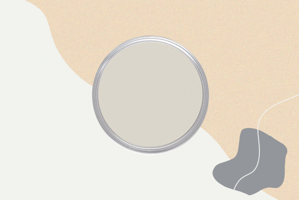
The Manchester Tan by Benjamin Moore falls in the category of chameleon colors. It can fit across scenarios and mixes white and gray undertones. The natural color pairs well with a combination of Monterey White and Georgian Brick or New Hope Gray and Floral White.
Image Credit: benjaminmoore.com
2. Paean Black by Farrow & Ball
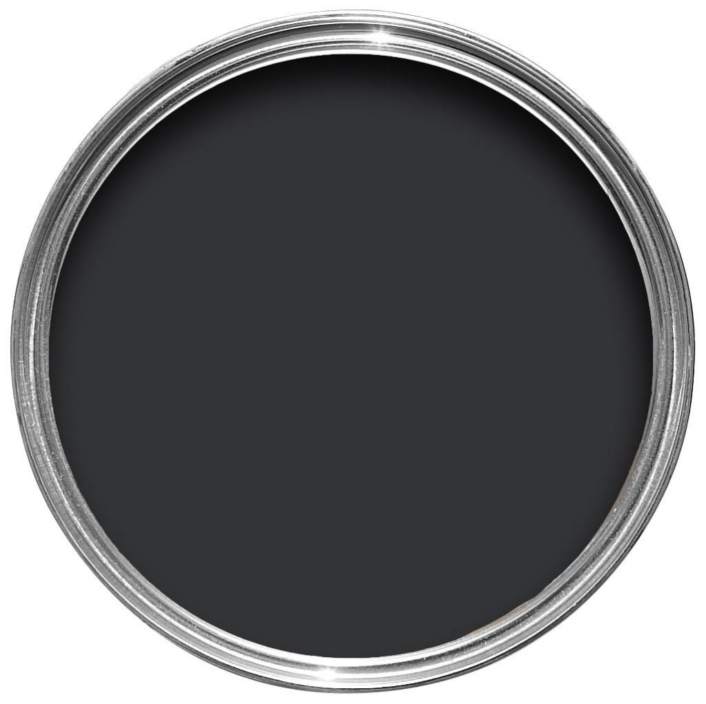
The Paean Black by Farrow & Ball is a deep color essential to highlight your other design choices. It works excellently for home décor and can be used for ceilings and crown moldings to augment the overall feel and give a velvet-like texture to the place.
Read also – How To Design Your Dream House?
Image Credit: farrow-ball.com
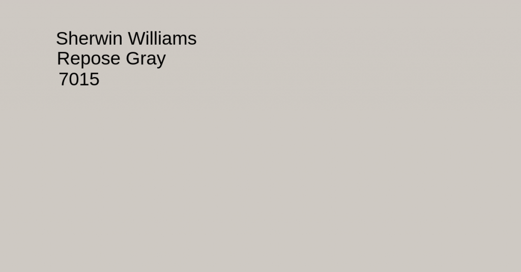
3. Repose Gray by Sherwin-Williams
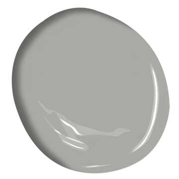
If there is one neutral paint that has constantly been a part of color trends in recent years, it has to be Repose Gray by Sherwin-Williams. It is a warm gray color using a mild green and purple undertone. These values enable homeowners to utilize it across an interior design portfolio.
Image Credit: sherwin-williams.com
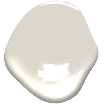
4. Balboa Mist by Benjamin Moore
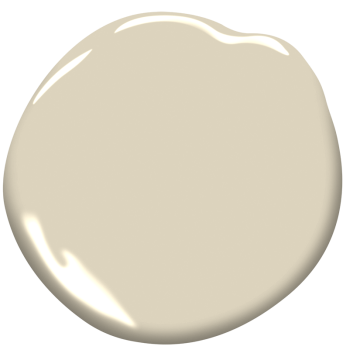
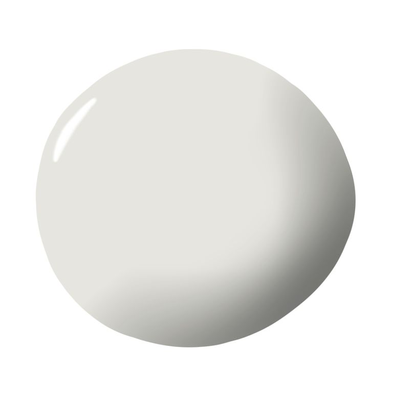
A part of the Off-White Color Collection, the Balboa Mist is a versatile wall color that fits equally in serene and dynamic spaces. The overall whitish tone with a high LRV value enables it to reflect a good amount of light.
So, you can use it across dim or well-lit interiors. Interestingly, if you look at its swatch, it seems more like a light, neutral greige paint color. But it actually works like a chameleon color, and the final shade display depends heavily on the ancillary elements in its surroundings.
Read also – Interior Design Basic Concepts, Elements and Principles
Image Credit: benjaminmoore.com
5. Revere Pewter by Benjamin Moore
The Revere Pewter by Benjamin Moore is a light gray interior paint that is more inclined towards being a light to a mid-toned shade of color. The interior designer proudly states that it is one of their top-selling gray paint colors and goes perfectly with a combination of Copley Gray and Fog Mist or Shadow Gray and Amherst Gray.
Image Credit: benjaminmoore.com
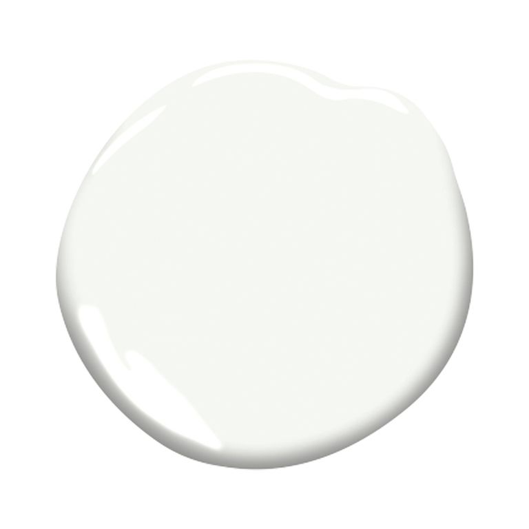
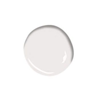
6. Chantilly Lace by Benjamin Moore
The Chantilly Lace is defined by the interior designer as a “clean and easy hue meant to evoke a sense of pure silk, soft linen, and simpler times.” It is a neutral white shade known for its ability to present an image without being too overwhelming in most scenarios. The white paint has a lustrous finish, and its ability to showcase modern homes with the right amount of brightness makes it an excellent choice.
Read also – 15 Best Celebrity Homes for Design Inspiration
Image Credit: benjaminmoore.com
7. Agreeable Gray by Sherwin-Williams
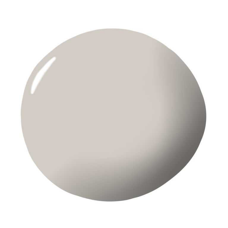
The Agreeable Gray by Sherwin-Williams is its most popular paint offering and is the mother of all greiges. It works well with cool tones to prevent the room from looking too cold or too violet. It looks similar to the beige color but heavily incorporates elements of gray and beige for optimum impact. The neutral tone works well across interior spaces, such as bedrooms, living rooms, and more.
Image Credit: sherwin-williams.com
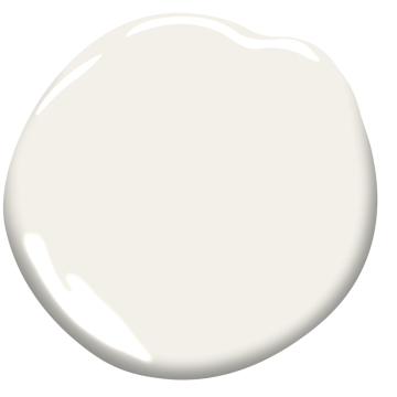
8. White Dove by Benjamin Moore
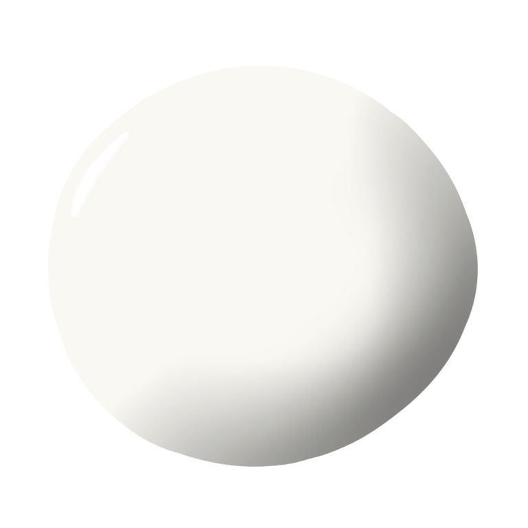
The White Dove by Benjamin Moore is a designer’s favorite neutral paint. It is a timeless shade that is light and luminous and goes well with a combination of Cheating Heart and Silver Lake or Yukon Sky and Horizon Gray.
The paint is known for its versatility and can be used for trims, walls, and other millwork with ease. As for its undertones, it has a touch of gray, ensuring that the final result is perfectly neutral and off-white while not inclining too much towards cream or yellow.
Read also – 10 Most Popular Types of Interior Design Styles
Image Credit: benjaminmoore.com
9. Smoke Embers by Benjamin Moore
The Smoke Embers shade by Benjamin Moore is a part of the Classic Color Collection. It has six different shades, enabling it to be a part of DIY projects and find relevance in interior design. The shade is considered perfectly gray and is a culmination of 1680 different hues that give it an attractive finish.
Image Credit: benjaminmoore.com
10. Neutral Ground by Sherwin-Williams
The Neutral Ground by Sherwin-Williams is one of the darker neutral tones with an LRV of 70. It has a creamy appearance, and its lighter tone enables it to shine across conditions and lend a sense of balance irrespective of where you use it. It tends to have beige and yellow undertones and can be an excellent addition for north and south-facing walls.
Read also – 9 Amazing Master Bedroom Ideas
Image Credit: sherwin-williams.com
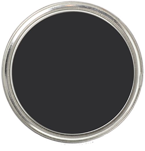
11. Tricorn Black by Sherwin-Williams
The Tricorn Black by Sherwin-Williams is a perfect, neutral matte black paint color that makes you fall in love with blacks all over again. It belongs to the elegant and saturated color palette that oozes sophistication.
The matte finish further helps augment its overall value. But given it is a bold one, you must be careful with its usage and be judicious in your approach for maximum impact. It has an LRV value of 3, rare for a neutral paint color.
Image Credit: sherwin-williams.com
12. Applesauce Cake by PPG
The Applesauce Cake by PPG is different from most neutral colors. Most of us think of neutral being either beige, gray, black, or white, but this is a subdued yellow. In its representation, it runs the gamut from an understated tan to warm honey, depending on how the light falls on it.
Read also – 20 Best Interior Design Tips To Decor Your Home
Image Credit: ppgpaints.com
13. Atrium White by Benjamin Moore
The Atrium White by Benjamin Moore is a part of the Off-White Color Collection. It has an LRV value of 87.04 and is a compilation of 152 white and off-white colors. It is a neutral paint color with the ability to cool tones of natural color when thrown at them.
Image Credit: benjaminmoore.com
14. Snowbound by Sherwin-Williams
The Snowbound is a unique but underrated color paint from the house of Sherwin-Williams. Unlike most pure white swatches, this one has no blue or yellow undertones. It lets you enthrall the crowd by posing a clean and blank canvas and allowing other elements in your dining room or living room to shine.
Read also – 5 Ways that Interior Design Influences Your Mood
Image Credit: sherwin-williams.com
15. Platinum Gray by Benjamin Moore
The Platinum Gray is one of the best neutral paint colors for interiors from the house of Benjamin Moore. It is a classic, mid-tone gray, inclining towards the French gray. The shade pairs impeccably with warm yellows and would even go well with the combination of Coral Dust and Ballet White or Hushed Hue and Gray Wisp.
Image Credit: benjaminmoore.com
16. Timeless by Clare
The Timeless by Clare is an off-white neutral paint shade with creamy undertones. It has an LRV of 83 and works well in places with good natural lighting. It is one of the classic paints quickly adapting to an evolving design style.
Image Credit: clare.com
17. Cornforth White by Farrow & Ball
The Cornforth White by Farrow & Ball is a highly versatile neutral paint color that doesn’t incline towards being too warm or cool, making for a perfect backdrop. The grayish tone makes it perfect for entryways and living rooms, depending on what you pair it with. Even though neutral, it is ideal for clients looking for drama and something that is yet easy on the eyes.
Read also – 20 Common Interior Design Mistakes To Avoid
Image Credit: farrow-ball.com
18. Silvery Moon by PPG Paints
The Silvery Moon by PPG Paints is a tarnished white paint shade with a khaki undertone. It has a pale, gray feel, making it perfect for exterior trim. Even though the color packs a punch in itself, it seldom fights with other shades and instead allows them to shine.
Image Credit: ppgpaints.com
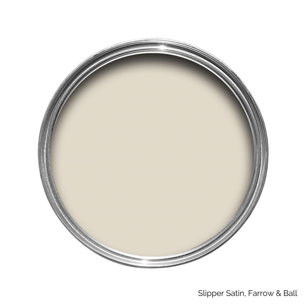
19. Slipper Satin by Farrow & Ball
The Slipper Satin by Farrow & Ball has a chalky white hue and belongs to the off-white category. It gets its name from the silk used in traditional ballet slippers. If you have darker, old white woodwork, Slipper Satin would be an excellent coating to achieve a sophisticated look.
Image Credit: farrow-ball.com
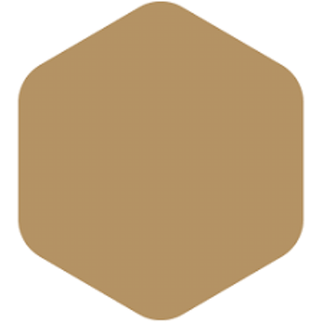
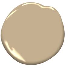
20. Lennox Tan by Benjamin Moore
The Lennox Tan is a warm, gold shade from the house of Benjamin Moore. It offers an enriching yellow undertone, allowing for a perfect balance between traditional and modern outlooks on neutral paint color ideas for interiors. The Lenox Tan goes well with Hampshire Gray and Gray Mist or Westcott Navy and Milkway.
Read also – Differences between Traditional Homes and Modern Homes
Image Credit: benjaminmoore.com
Try the best neutral paint colors for interior design with Foyr Neo
When building a home or planning to renovate it, you must get the color tones right beforehand. No one would like to plan, un-plan, and re-plan their house décor multiple times, and the choice of paint plays an integral role in how your home looks from the inside. Add to that, there is a multitude of neutral color paints challenging to distinguish and gauge. So, you would require more than manual planning to get it right.
With Foyr Neo, you get 3D software to create and tinker with interior designs easily. It is a complete tool for all your interior design projects, allowing you to shorten the overall time to get the final plan right.
Plan your interior design with Foyr Neo today.

