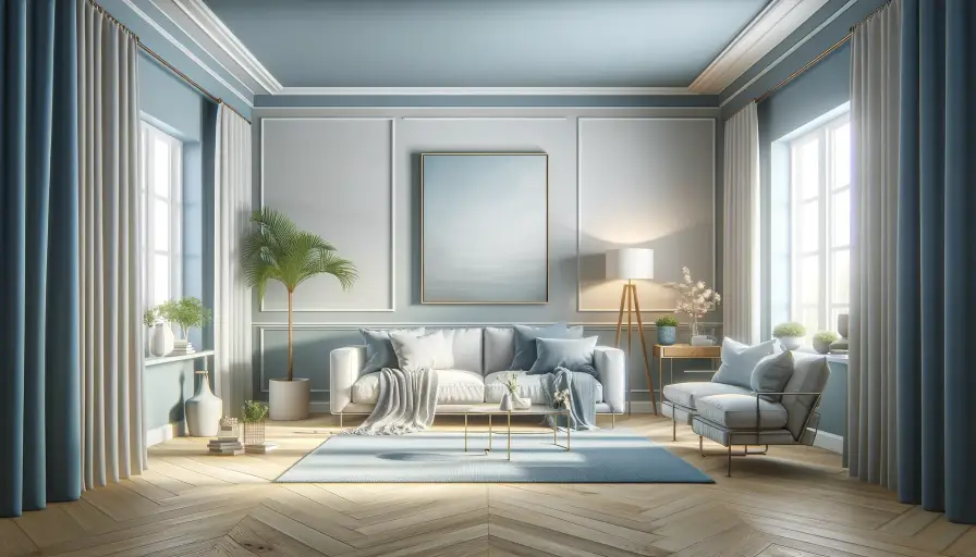
3D Rendering Issues
Imagine a plush bouclé thrown across your lap as you sit in a womb-chair in your mid-century modern styled living room with a twist of wainscoting as you sit at the dormer window! If a few of the words above stumped you, you are not alone.
Why Interior Designers Generate 3D Renders?
A vast number of homeowners feel lost when experts passionately explain new ideas for your dream home. Does a contrived patina finish to enhance your foyer mirror? What even is that? Enter powerful 3D rendering software! Deeper and richer details are now conveyed easily.

Image Credit: unsplash.com
Oftentimes industry jargon confuses the clients. And sometimes words, and even technical drawings for that matter, fall short. This oftentimes leads to a discord between clients and designers during the execution process.
Building a house involves money, time, labor, teamwork and lots of creative thinking. Hence the room for mistakes have to be carefully kept at a minimum.
The accuracy of 3D renderings and visualizations makes design tangible. It helps the clients, walkthrough and sees themselves in their possible future homes right away.
It builds trust in the designer capability to carve out their dream house. The client not only has seen their home before production but also collaborated on and approved it.
This is why 3d visualization is key. The result is a satisfied client and a faster approval process and a boost in business for the designer.
How Interior Designers Generate 3D Renders?
Starting from conceptual sketches to technical drawings and finally, to photorealistic images, there are a lot of skills necessary in 3D designing. Designers model 3Ds that match their clients’ wants and likes and craft a scene from their planned house.
Image Credit: pinterest.com
However, most 3D software also requires in-depth industry knowledge. After numerous back and forth, the design is pinned down and the final model is assembled in a 3D modeler software. It is then exported to a rendering program or plug-in to render the image.
The out-put is a jaw-dropping, living and breathing image of your home.
3d visualization and rendering is a compelling marketing tool, as the clients can grasp clearly furnishing styles, texture, finishes, color schemes etc., placed into real-life space. Once these clients are reassured of the design by the realistic renders, the project generally progresses with little hick-ups.
But before we reach happily ever after, the 3D models, renderings and visualizations beg to be created. Designers encounter numerous issues and mistakes daily that demands speedy resolution.
Read also – 3D Modeling vs 3D Rendering
14 Common 3D Rendering Issues:
1. Time, Money & Skill
Large firms have dedicated teams, professional state-of-the-art computers, powerful and expensive software that render stunning visuals, walk-throughs and animations for them on demand. This however be beyond the reach of individual designers, small firms, freelancers and students.
3D rendering engines often time offer only exorbitant annual subscriptions which means a huge upfront commitment. Not to mention, each year newer version releases, which may mean paid updates or a reinvestment.
With intricate settings, superfluous customization, an inefficient user interface, and hampering materials, mastering this software take time and patience and scores of skill.
The more detailed your model, the more complex your render process. And chances are, the application will conclusively crash. This can be extremely taxing when working on rigorous projects.
The money, time and resources required to master and create such hyper-realistic renders through complex engines can be put to better use.
Finally, while clients enjoy a life-like visual representation of their homes, not many prefer to pay their exorbitant costs, which renders the whole process extravagant.
Read also – Best Computer for 3D Modeling and Rendering
2. Art of Bouncing
Light bouncing is how a main point of light is “bounced” or redirected off of multiple objects like the ceiling or adjacent walls. This makes the original source light less harsh giving you an evenly scattered, soft throw.
Image Credit: unsplash.com
In the real world, the sun and other unlimited sources of light, reflect off every surface in multiple directions, making our environment look cinematic.
Render machines use indirect lighting or global illumination to mimic this effect in a 3D render. Shadows are partially lit by nearby objects that are already bouncing light. More the light source, the softer its spread.
However, an increased number of light bounces means higher render times. While skipping on light bounces leads to dingy, flat images, too many light bounces create unsightly glares.
Figuring out the exact number for vivid lighting of the subject is always tricky.
Read also – Best 3D Modeling Software
3. Textures Tales
Everyone can readily call to mind the silky smoothness of a Pashmina or the coarse grains in a hemp rug.
Real-life is rife with objects that are different to touch. It’s of utmost importance that this tangible aspect of the physical world is translated into in 3d modeling. This is achieved through HD quality materials and textures. Texture quality impacts the end result, without which a photorealistic rendering is absolutely impossible.
Image Credit: claytongrayhome.com
High texture quality again means longer render periods. Neglecting texture quality makes the scene look plastic and inanimate.
On the other hand, nothing is perfect in actuality. Adding dents, rounded edges, smudges, dust particles, etc., makes the objects more engaging. This means extreme attention to detail, long hours, artistic vision and enthusiasm to craft something phenomenal. Designers and artists on a time crunch can rarely afford all of the above.
4. Global Illumination Flickers
Once Global illumination (GI) is applied, materials that are lit in a scene multiply. While this brings more energy into your design, issues like color bleeding and flickering crop up.
When using bounce sources in a scene, we have to make sure the color quality of light is not compromised. Naturally, a yellow wall bouncing light casts a faint yellow-tinged light. This is referred to as color bleeding and needs to be corrected.
Image Credit: pinterest.ch
Similarly, in a video clip when the lights reshuffle, every frame is calculated separately. Thus, there occurs a phenomenon called flickering, meaning the lights and shadows change in each shot.
Both these issues exact massive cranking of GI settings, like shadows, fallout speeds, sun amount etc., which can be tricky and arduous.
Read also – 15 Best 3D Rendering Software Alternatives
5. Wrong dimensions and placing of architectural elements
Proportions of 3D models are decisive in making interior design visualizations look credible and rational. The human eye can quickly identify any disharmony.
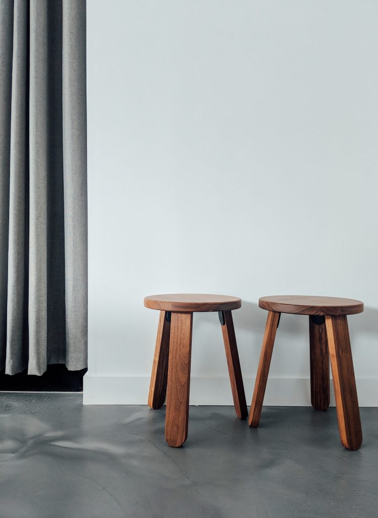
Image Credit: unsplash.com
For example, if the scale of a bed in the model is too large, the client may perceive it to be high and voluminous. But, when it’s finally planted in flesh, he may lament about it too cramped and unfulfilling. What was simply a lack of attention, now spawns feelings of deceit and discredit. This is hugely damaging to the image of the designers.
Hence artists must be wary of the real-life dimension of design elements at every step of the way. Here, the availability of a reliable library of 3D models at one’s disposal becomes crucial.
Read also – 20 Common Interior Design Mistakes To Avoid
6. Lack of polygons in 3D models
3D models should mandatorily be well-made and of high quality. A CG model is made up of tiny blocks called polygons that are essentially a mesh of small shapes like triangles, cubes, and spheres.
Image Credit: cgifurniture.com
A high-poly object looks more tailored when rendered. However, any error made during the 3D modeling stage will show up later in 3D rendering. Hence uncomplicated polygon geometry, incorrect numbers, will give a smooth, photorealistic visual output without lagging the render process. Picking such refined models demands expertise and a keen eye.
7. Be careful about the Reflection
Isn’t everyone guilty of taking a quick peek at themselves on passing a mirror! That dainty, elusive shadow on your window just as the first rays of sun filter in? All magic of reflection.
This everyday wonder is most challenging to achieve in complex rendering machines. Too much reflection and you have ballet studio mirrors in your scene. A too little reflection and it’s a fake and sloppy blur of shapes.
Image Credit: casaone.com
In the real world, we see reflections in almost every glossy, metallic or mirrored surface. To get reflections right in a 3D render many factors such as reflection planes, gloss, roughness, tint, lighting etc., come into play. Fumbling is easy. As always, proficiency to run such rendering engines is vital.
Read also – How 3D Rendering Can Increase Profits in Interior Design Business?
8. Being Over Advanced
Pioneering CG software today makes it possible to shape larger-than-life, stunning, unearthly renders in architecture and interior design. However, a futuristic Hollywood-issue 3D render can possibly flop. Unless the brief expressly states so.
Having too many ultramodern components, lighting, and materials can seem impersonal to the clients. Startlingly avant-garde elements to which clients cannot relate become a disturbance.
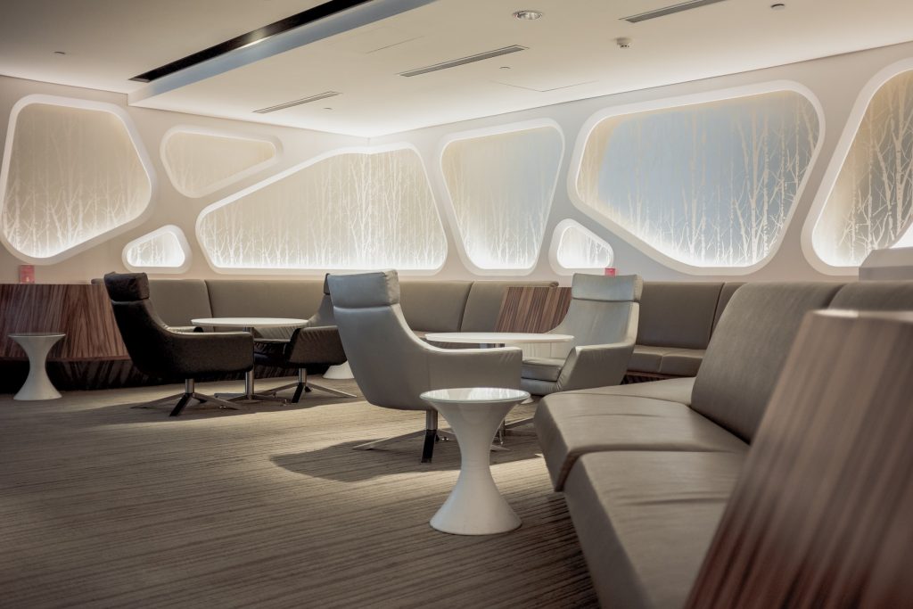
Image Credit: themify.me
Extensive modernization can easily make the clients skeptical as to the feasibility and practicality of the project, making them hesitant to invest in the design. They may be suspicious of the designers’ motives to fleece money by wasteful means.
So, while proposing cutting-edge design is condoned, the 3D visuals and renders should be in line with the client’s disposition, the purpose of the space, and the requirements submitted.
Read also – 15 Problems Most Interior Design Business Faces
9. Design is too simple
Realistic 3D rendering should feel like looking at a slice of life frozen in frame. The crackling fire in the fireplace and the chemistry between the sunbeam and the dust-particles floating lazily around the room.

Image Credit: unsplash.com
A photorealistic 3d render is like a conversation within an image that we can hear. There are layers of texture, play between lights and shadows.
Designers or artists sometimes consider these additions overrated and they couldn’t be more mistaken.
An image that is buzzing with activity, impresses the clients and gives them an insight into how their life will be like in the house. They feel confident in the attention to detail and are appreciative of the inputs on how to use the designed spaces in daily life.
An over-simplistic room with bare bookshelves, plain windows and unadorned tables look underwhelming. It makes the designer look dispassionate about the project probably leading to loss of business.
So, go ahead shuffle those chairs and pull one away from the table!
Read also – 12 Best 3D Visualization Software
10. Wrong perspective
The wrong perspective can be equally damaging as the wrong dimensions. Even the most vivacious scene with exquisite furniture pieces, harmonized color palettes and engaging narrative can fall flat in the face of the wrong perspective.

Image Credit: unsplash.com
Along with regular eye-level shots, creative camera angles can add interest to the best features of the design.
Only the right perspective can make a 2D rendered image look like a 3D scene. Distorted render can gut the depth of field, leading lines, special relations between objects in the room, vanishing points etc. However, mastering the camera settings in a render engine is imperative for producing intensely dramatic shots that bowl over any potential clients.
Read also – 10 Essential Tools for Interior Designers
11. Conversion Errors
Conversion errors during 3d modeling and rendering are a common occurrence. Few software takes care of both, sculpting and successfully rendering a model.
Hence almost everyone turns to different software for both processes as per their preference. Sometimes a final editing a photo editing tool like Adobe Photoshop or Adobe Lightroom may also be used for a polished final output.

Image Credit: digiterati.com
But different programs customarily run on different formats, which means the files have to be converted when exported from one software to another.
Frequently, this causes loss of data, and time, the disorder in scale due to different dimension units, broken or missing reference files etc.
Lately, many programs are able to read different formats, but the hassle of moving the file back and forth between software stays the same.
12. Fly-through View instead of Creating Scenes
Creating HD live-motion clips of the rendered scene can outdo photorealistic images. Fly-through views are popular for their unproblematic coverage of the entire building.
Yet, they can get monotonous and the fleeting moments may not be capable of grabbing the viewer’s attention for long. It also fails to capture valued interiors niceties.
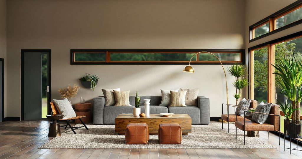
Image Credit: unsplash.com
On the contrary, a video walkthrough that takes the client through every room, particularly at eye level, is like experiencing virtual reality. Auto-illumination, where a light switches on or off, doors and drawers fly open and the chatter from the 3D characters come into focus, lends powerful thrill to the 3D video.
13. What You See Isn’t What You Get
Assuming you are willing to tackle the above-mentioned pitfalls, it still needs immense comprehension, skill, and long hours of practice to try and get an absolutely photorealistic rendering. Even then a visual rendering cannot hundred percent simulate the sensations and emotions of the real world.

Image Credit: pinterest.com
However accurate and powerful a CG render engine, the sun will not perform like the earth’s sun, and the leaves on a tree will not flutter as with the same casual grace as live ones.
While we can come delightfully close, the graphic card, color variations, resolutions etc., on different screens will present the image and animation differently. This can hamper the project if incorrect hues or finishes are inadvertently conveyed to the client.
14. 3D Bond
This little morsel of digital magic is definitely influenced and gets the clients to cede over the project enthusiastically to designers. However, this is also exactly where it gets perilous. The enamored clients protest against the slightest inconsistencies to the finalized 3d renders.
They would become fixated on little details and complain when samples didn’t exactly match the 3D rues Kelly Finley of Joy Street Design, a California-based design practice.
The smallest inconsistencies can at times get the clients peeved. Kesha Franklin of New Jersey-based firm Halden Interiors muses, “I started to feel that renderings had become my lock and key.” 3D renderings thus can quickly become blinding when it comes to creativity and spontaneity.
Conclusion
While these errors and concerns are fixable, they plague the creative community universally. When Foyr Neo launched, we were emphatic about eliminating as many major roadblocks as possible.
With converting 2D plans into 3D models made easy by a simple trace tool and revolutionary AI features like smart docking, auto-lighting, and powerful cloud rendering, the learning curve is practically zero. This is also why compared to traditional rendering software, Foyr Neo takes half the render time for strikingly photorealistic renders.
It also boasts of an exhaustive library of customizable 3D models that can simply be drag-dropped into your designs. No more same, old boring prototypes! As if this weren’t enough, we also house some of the world’s finest bespoke interior pre-set, ready to be used when you are!
Thus, for the first time ever, from inception to completion, Foyr Neo provides a one-stop-shop solution to 3D designing! With flexible pricing that accommodates everyone, even the most basic plan offers branding, unlimited projects and texture uploads, and unlimited access to the library. Forget spending laborious hours and big bucks 3D visualizations. Foyr Neo is here to stay and save the day!

