Most of us have an affinity towards specific colors when it comes to our interior spaces, based on what comes naturally to us or after research. But did you know that there’s a process for understanding colors and pairing them well?
If you’re an interior designer or look at design as a hobby, this is a crash course in color theory for home design. So go on, get that color palette right!

What is Color Theory?
The color theory derives from the color wheel. That’s right; it isn’t just a randomized palette of colors.
Specific definitions, guidelines, and rules in visual arts allow designers to communicate with their users by appealingly mixing colors. In other words, color theory is the science behind which colors go well together and the art of putting them together.
The color wheel was developed by scientists and artists and has also been attributed to Sir Isaac Newton (the ROYGBIV colors). Artists and designers learn about colors to create a proper framework and foundation for their artwork or design. The comprehension of the color wheel is the basis for the color theory.
Read also – 11 Amazing Home Decor Trends
How Color Theory Helps in Home Design?
When it comes to home design, understanding color theory helps with color harmonization. It becomes imperative to choose the right colors as the hues can influence moods, add to the ambiance, and affect how a person feels.
Colors play a role in human psychology and emotions to a considerable extent. People often design various parts of their homes in different color schemes to create varied ambiances and moods. For example, they use lighter colors to create a calm and open feeling or darker colors to make a bold statement.
It can be stressful and exciting while deciding a color scheme for interiors. It’s important for Interior designers to have an excellent grasp of the color wheel.
Read also – 5 Ways That Interior Design Influences Your Mood
8 Color Theory Basics for Use in Interior Design
Here are eight color theory basics essential for any project.
1. Color Wheel
- The color wheel is a visual representation developed by Sir Isaac Newton in 1666, illustrating the relationships between primary, secondary, and tertiary colors.
- It is structured with 12 core colors arranged in a circle, demonstrating how colors interact and can be combined to create harmonious palettes.
- Understanding the color wheel allows designers to employ various color harmonies, such as monochromatic, complementary, and triadic schemes, to guide their color selection process in interior design.
- The use of the color wheel aids in making informed decisions about color combinations, contrasts, and overall harmony within a space, contributing to effective interior decorating.
- Color theory, which encompasses the principles behind the color wheel, informs designers of how colors evoke emotions and influence perceptions in interior environments.
Primary Colors
- Primary colors are fundamental hues that cannot be created by mixing other colors together, serving as the building blocks for all other colors in the color spectrum.
- The three primary colors are red, blue, and yellow.
- Each primary color possesses unique characteristics; for instance, red is known for its vibrancy and warmth.
- Understanding primary colors is essential for interior designers as they provide the foundation for creating secondary and tertiary colors.
- The color wheel, which includes the primary colors, is a crucial tool for making informed decisions about color combinations and overall harmony in design.
Secondary Colors
- Secondary colors are created by mixing primary colors, resulting in hues like green, orange, and purple.
- The perception of secondary colors is enriched by their relationship with the primary colors used to create them, influencing their emotional effectiveness in design.
- Secondary colors play a crucial role in interior design as they help balance and enhance the overall aesthetic of a space.
- Understanding secondary colors is essential for interior designers as it allows them to craft harmonious color schemes that meet their clients needs.
- The interaction between secondary colors and their placement within a space significantly impacts the energy and ambiance of the room.
Tertiary Colors
- Tertiary colors are formed by mixing a primary color with a neighboring secondary color on the color wheel, resulting in a more nuanced and complex range of colors.
- There are six tertiary colors, each positioned between a primary and a secondary color on the color wheel.
- The creation of tertiary colors adds depth and subtlety to the overall color spectrum, enhancing visual appeal in various design contexts.
- Tertiary colors include combinations such as yellow-orange, red-orange, red-violet, blue-violet, blue-green, and yellow-green.
- Understanding tertiary colors allows designers to achieve a broader range of tones and shades, which is crucial for crafting visually appealing compositions in interior design.
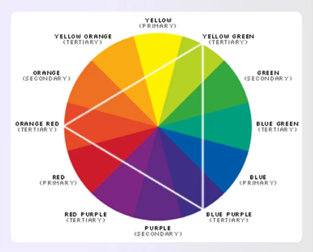
Image Credit: study.com
2. Color Schemes
- The seven color schemes include Monochrome, Analogous, Complementary, Split-Complementary, and Triadic, each offering distinct approaches to color selection in design.
- A Monochrome color scheme involves using different shades of a single color to create visual interest and contrast within a space.
- The Analogous color scheme features two to three colors that are adjacent on the color wheel, providing mild contrast and a cohesive look.
- Complementary colors are pairs of hues that are located opposite each other on the color wheel, creating high-contrast combinations that are visually striking.
- Achieving a successful color scheme in any room design layout also requires careful consideration of color proportions, commonly expressed through the 60-30-10 rule for balancing dominant, secondary, and accent colors.
Monochromatic Color Schemes
- Monochromatic color schemes involve using variations of a single color, including different shades, tones, and tints of the same base color, to create a sense of unity and simplicity.
- Utilizing a monochromatic color palette in interior design can evoke a harmonious and calming atmosphere throughout a room.
- An example of a monochromatic scheme might include a combination of blue and indigo, illustrating how nuance can enhance a color arrangement.
- This approach is effective for creating a unified, timeless look that can be easily incorporated into any home design.
- Monochromatic colors are particularly useful in interior design as they provide cohesion while allowing for personality through variations in hue.
Analogous Color Schemes
- An analogous color scheme consists of colors that are next to each other on the color wheel, creating a sense of cohesion and harmony.
- Common examples of analogous color schemes include combinations like blue, blue-green, and green.
- Using an analogous color scheme can result in a calming effect, making it well-suited for peaceful spaces in interior design.
- Interior designers often favor analogous colors for their ability to create a harmonious effect without relying heavily on neutrals.
- The use of analogous colors allows for smooth transitions between hues, enhancing the overall aesthetic of a space.
Complementary Color Schemes
- Complementary colors are defined as pairs of colors that are located opposite each other on the color wheel, resulting in high contrast and vibrant looks when used together.
- Examples of complementary color pairs include red and green, blue and orange, and purple with yellow.
- Using complementary colors in interior design creates an energizing and visually interesting color scheme that can enhance the overall aesthetic appeal of a space.
- The split-complementary color scheme utilizes a base color along with the two colors adjacent to its complementary color, providing high contrast with less tension than a standard complementary scheme.
- To create a complementary color scheme effectively, it is recommended to favor one of the colors or use both as accents against a neutral backdrop for balance.
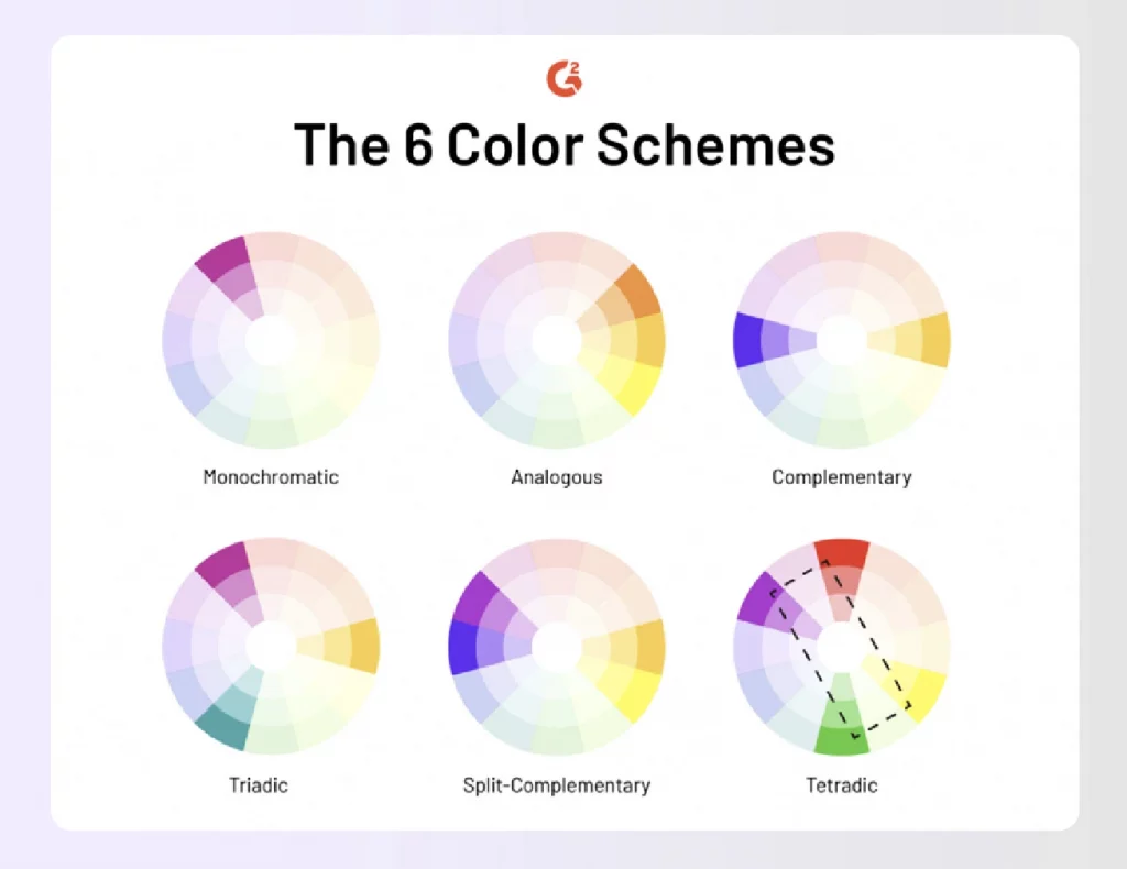
Image Credit: g2crowd.com
3. Color Temperatures
- Color temperature plays a crucial role in interior design, with cooler hues like blues and greens promoting a calming atmosphere, while warm colors such as reds, oranges, and yellows generate energy and vibrancy in a space.
- The placement of a color on the color wheel, particularly its proximity to blue and yellow, determines its temperature classification as either warm or cool.
- Neutral colors, including shades of beige, gray, whites, and blacks, serve to provide balance between warm and cool colors, offering an unobtrusive backdrop in interior designs.
- The combination of warm and cool colors in the right proportions can yield balanced and harmonious color schemes, effectively influencing the desired mood of a space.
- Understanding the psychological impacts of warm and cool colors is essential for designers, as these colors can significantly alter the ambiance and emotional response of a room.
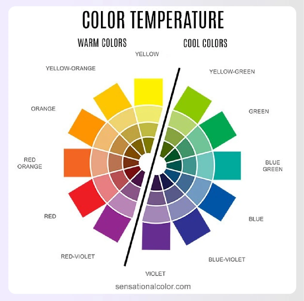
Image Credit: sensationalcolor.com
4. Color Combinations
Adding any three primary spectral colors (red, green, or blue) to any other color, along with white, creates a color combination. Creating combinations involves the color wheel, starting with the primary, and moving to secondary and tertiary colors.
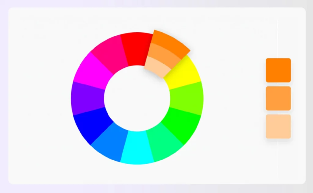
Image Credit: canva.com
5. Psychological Effects of Colors
Did you know that colors evoke emotions, influence moods, and set the tone?
Colors and Emotion
- Colors profoundly affect our moods, with cooler hues promoting relaxation and warmer hues generating energy.
- Red is often associated with strong feelings such as excitement, anger, or passion, while yellow tends to evoke joyful emotions and optimism.
- Research demonstrates that colors can influence consumer behavior, with blue interiors being perceived as more likable compared to orange interiors.
- The emotional impact of colors can create peaceful environments or stimulate creativity, affecting how individuals feel within a space.
- Excessive use of certain colors can diminish their emotional power, highlighting the importance of moderation in color application.
Influence on Mood
- Blue and green hues are favored for creating calming spaces, generating a harmonious effect that contributes to a sense of tranquility.
- Strategic color combinations in interior design can shape emotions, influencing whether a space feels peaceful or stimulates creativity.
- Red is commonly associated with strong emotions such as anger or love, while yellow is linked to feelings of joy and happiness.
- Research indicates that colors can significantly alter consumer perceptions and behaviors due to their strong emotional impact.
- The use of color in interior spaces can not only enhance visual aesthetics but also affect how people feel and behave within those environments.
Impact on Space Perception
- The way color is combined within a space significantly influences both the general mood of the environment and the comfort level experienced by individuals in that space.
- Color perception can change based on the texture and finish of surfaces, with glossy finishes making colors appear lighter and less intense, while rougher textures tend to darken hues.
- The psychology of color serves as a critical element in interior design, guiding designers to select hues that invoke specific emotional responses and constructive atmospheres.
- Using neutral colors creates a balanced backdrop that enhances the perception of other colors, patterns, or textures without dominating the overall design.
- The relationship and harmony of colors across interconnected rooms or open-plan layouts play a vital role in how the entire space is perceived, emphasizing the importance of strategic color choices.
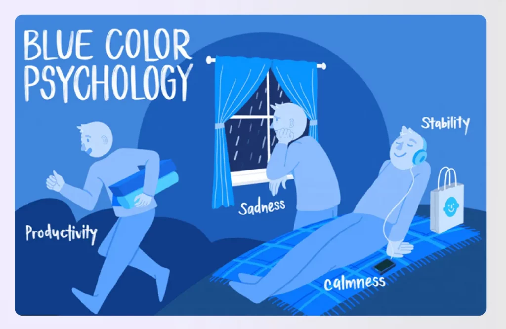
Image Credit: verywellmind.com
6. Color Context
According to color context, color has different meanings in various settings. Therefore, colors can evoke diverse feelings and emotions and have different implications in various contexts.
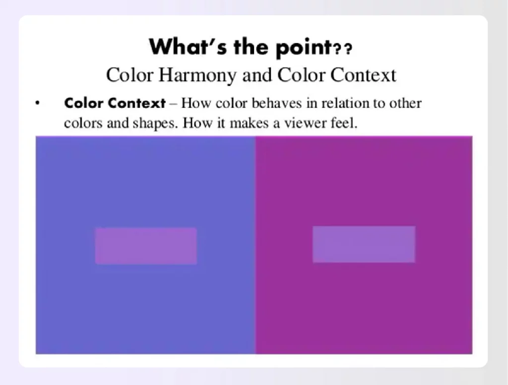
Image Credit: slidesharecdn.com
How successful a color scheme ends up depends entirely on the context. This context includes physical space and the psychological mindset to create the perfect atmosphere.
7. Color Mixing
As an interior designer or a homeowner looking to spruce up their home, it is vital to know what colors go well together and how to derive more shades from the base of each color.
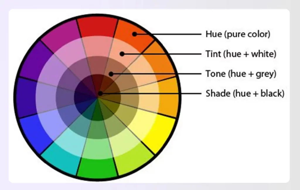
Image Credit: pinimg.com
- Hues: Hues refer to colors on the color wheel.
- Tones: The proportion of black and white added to a color saturates it and creates a tone.
- Tints: When you add white to a color on the wheel, it lightens the color, giving it a pastel or less intense shade. This lightening of color is referred to as a tint.
- Shades: Adding black to a hue on the color wheel gives the color a shade. Shades depend on the proportion of black added to a given color.
Read also – Bohemian Interior Design Style
8. Square Color Scheme
A square color scheme uses four shades of colors evenly spaced on the color wheel. Each square color scheme will comprise a primary and secondary color and two tertiary colors, irrespective of their positioning on the wheel.
The intensity of the chosen colors may vary depending on whether the colors picked are bold or neutral. Like the triadic color scheme, interior designers typically try to achieve an equal variety of warm and cool colors by selecting a dominating shade and three shades that accent the dominating shade.
Read also – 14 Best Living Room Interior Design Ideas
10 Tips to Use Color Theory Basics for Interior Design
1. Pick any color
That’s right; pick a color, and begin!
Use color psychology to understand the client’s requirements or the ambiance that the space needs. Once you pick a color, then use the color wheel to choose a complimenting color.
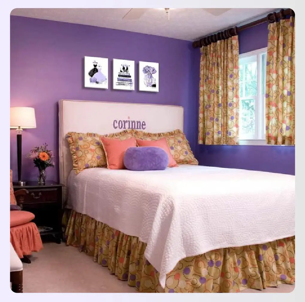
Image Credit: sndimg.com
2. Pick a color scheme from the largest pattern or element in the space
Many interior designers pick colors based on patterns or elements available within a space.
For instance, if a large pattern is red or pink, they’d go with colors that complement it.
Read also – 14 Best Fireplace Decor Ideas
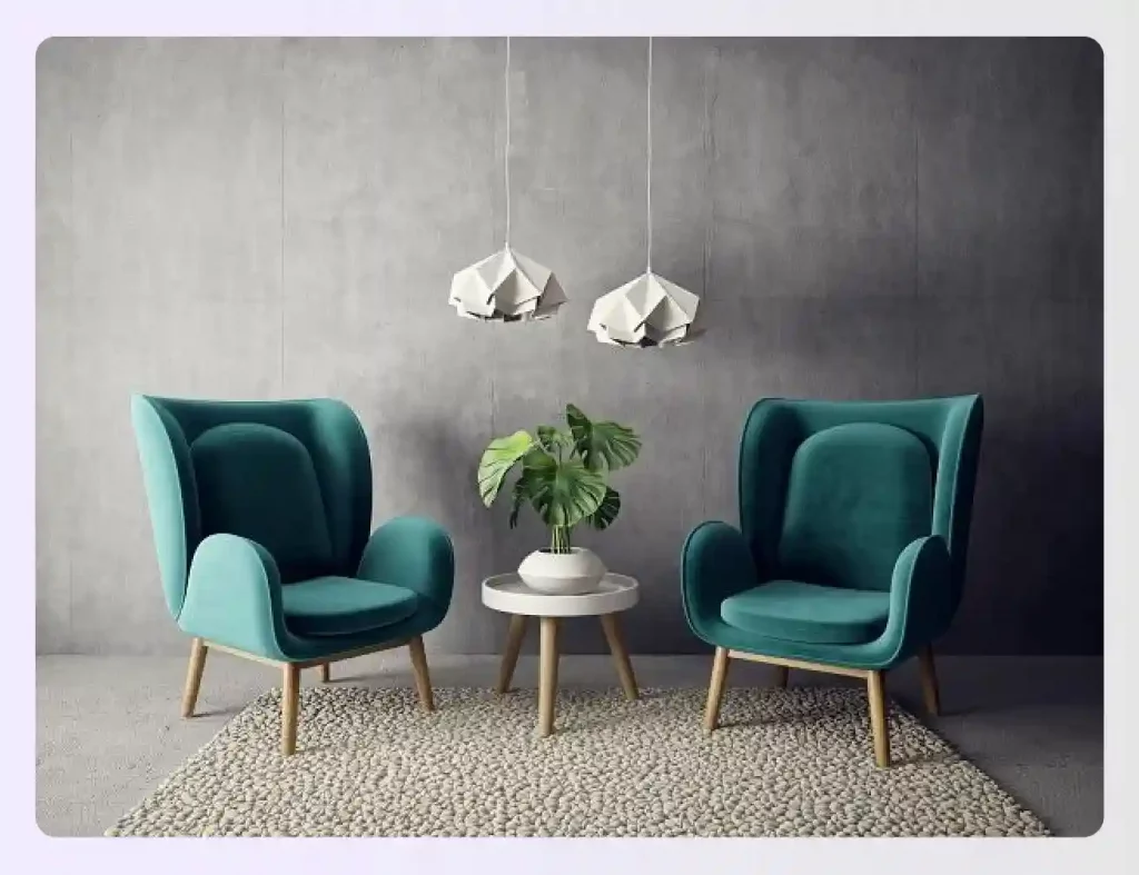
Image Credit: business-standard.com
3. Dark to Light — Vertically
Many interior designers use the dark to the light method in a vertical manner across a space or room. This approach generally means using darker colors for the floors and medium and lighter tones and shades for the walls. This strategy gives the area an enlarged illusion.
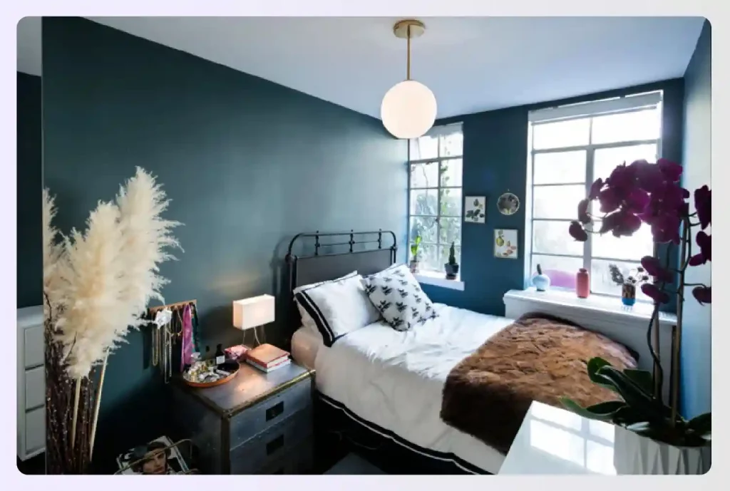
Image Credit: nymag.com
4. Refer to the Color Wheel
The color wheel is an interior designer’s best friend! The color wheel provides excellent help when determining, which colors go well together. If you’re confused about which colors suit or complement each other, use the tips discussed above.
Read also – Expert Tips for Modern Home Office Design
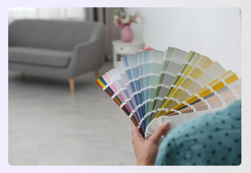
Image Credit: mymove.com
5. Don’t be afraid to go Gray!
Grays are considered some of the most trendy neutral colors. They work well with various interior styles: modern, victorian, plush, simple, etc. You can also pair grays with contrasting pop colors.
Read also – Types of Interior Design Styles
Image Credit: sndimg.com
6. The 60-30-10 rule
- The 60-30-10 decorating rule suggests that to create a balanced and visually appealing interior, 60% of the space should be covered in a dominant color, 30% in a secondary color, and 10% in an accent or contrasting color.
- This rule helps to bring focus to the design while also creating contrast and visual interest within a room.
- Adhering to the 60-30-10 rule aids in maintaining harmony among the different elements present in a space.
- The dominant color typically features prominently on walls, while the secondary color often applies to upholstery, with the accent color reserved for smaller accessories.
- Using the 60-30-10 rule can enhance the overall design and atmosphere of a room, ensuring a cohesive look.
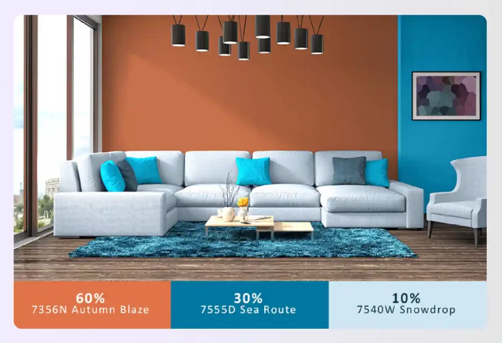
Image Credit: squarespace-cdn.com
7. The Contrast Between Warm & Cool
As an interior designer, you can never consider neutral colors as dull! Neutral colors help provide a sense of balance and harmony to a surrounding and can be paired well with warm and cool tones. For example, pair grays with warm honey tones.
Image Credit: sndimg.com
8. Monochromatic Looks
Small spaces tend to work wonders with monochromatic looks. For example, if a bathroom or study space is small, consider using a single color and deriving its shades to paint the area.
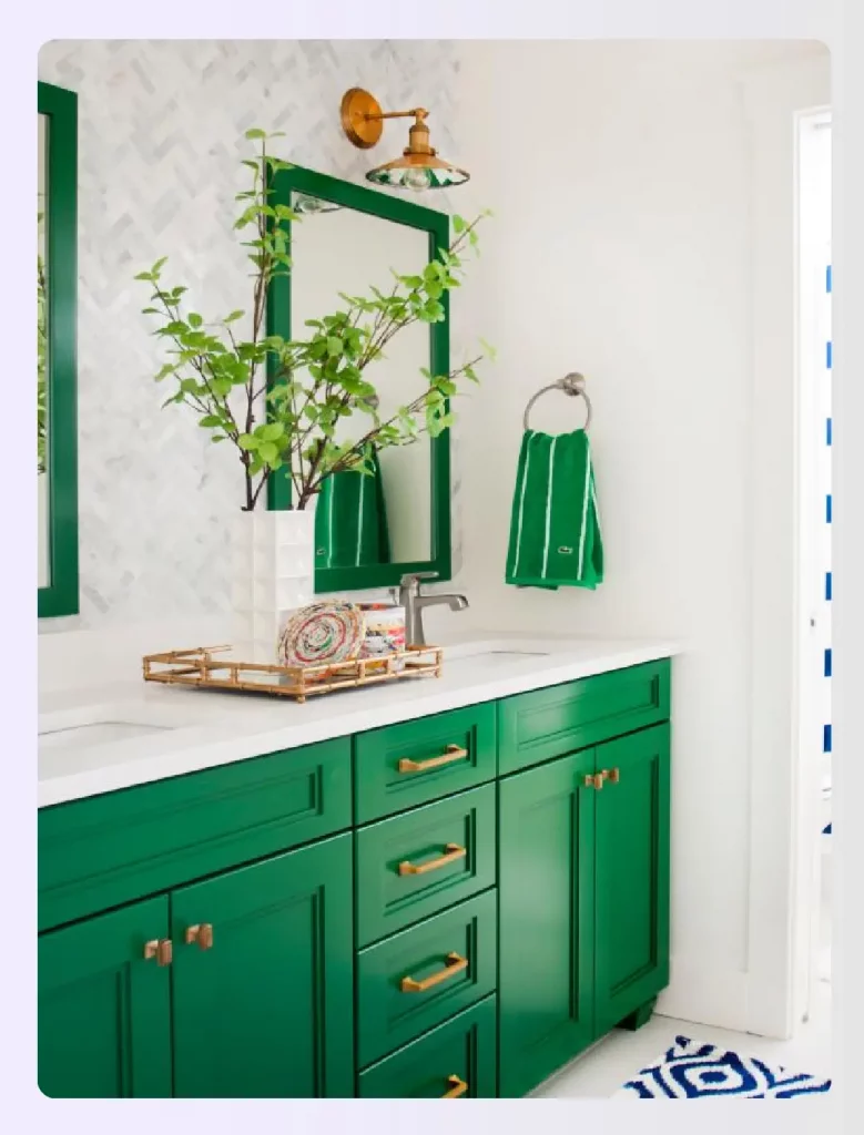
Image Credit: sndimg.com
9. Be Inspired by Personal Style
What differentiates one home interior from another — the way one decorates it. Take inspiration from your client’s style to decorate. Assessing individual styles helps to arrive at color combinations and understand the color context.
For example, personal styles can range from modern pop to subtle victorian influences — use these ideas to develop a color palette for dining or living rooms.
Read also – Best Traditional Living Room Ideas
Image Credit: hearstapps.com
10. Use Color Based on Emotions
Many interior designers pick colors based on emotions. As discussed above, different colors have different emotional connotations and influence the ambiance and mood of a space. For example, darker shades of purple are associated with richness and royalty, whereas lighter shades of blue are associated with calmness.
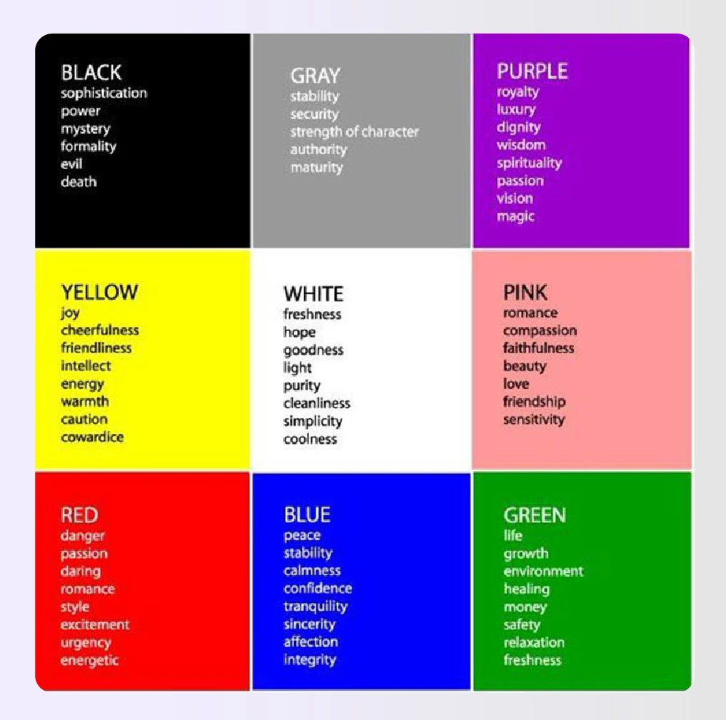
Image Credit: netdna-ss.com
Conclusion
Ever thought colors could have so much significance?
Color theory is highly essential and valuable to understand how to put colors together. An interior designer spends considerable time learning how to use the color wheel to their benefit. Effectively using the color wheel expertly to combine colors in the right context and create the perfect color palette for each room and space within a home, immensely benefits anybody.
Are you excited to put colors together?
Now that you’ve mastered the color theory, it’s time to delve into the infinite world of colors!
If you have the right business tools, each stage of the interior design process will be easier and more efficient. Foyr Neo is a one-stop-shop for all your design needs. The multifaceted design software has so many features to choose from that it makes it easier to visualize your design ideas more effectively.
- 60K + ready to use products
- Build Floor Plans, edit in 3D
- Drag and Drop Interface
- 12K Renders in minutes
Furthermore, it doesn’t take up a whole lot of space due to its incredible cloud computing feature. It saves time and money on licensing. Anyone can create absolutely remarkable home designs with these design tools. Foyr Neo is currently available for a 14-day free trial, allowing you to explore the potential of infinite creation.

Frequently Asked Questions (FAQs)
1. How do you use color theory?
You can use color theory by creating a color wheel comprising primary colors, mixing them to create secondary colors, and then mixing primary and secondary colors to create tertiary colors.
2. How do interior designers use colors?
Interior designers refer to the color wheel to pick colors that best emote and influence their clients’ requirements. They choose warm and cool tones in a way that enhances space aesthetics and best attracts related elements.
3. How is a color theory used in character design?
The primary consideration in character design is using complementary colors that help create a sense of balance and harmonization.
4. What is the 3 color rule in interior design?
The 3-color rule is a simplified version of the 60-30-10 guideline. It involves selecting a dominant color for 60% of your space (walls), a secondary color for 30% (furniture), and an accent color for 10% (decor). Foyr Neo’s tools can help you visualize this balance perfectly.
5. What is the basic color theory for beginners?
For beginners, start with the color wheel: primary (red, blue, yellow), secondary (green, orange, purple), and tertiary colors. Learn simple schemes like complementary (opposites) or analogous (neighbors). Visualizing these on a tool like Foyr Neo makes understanding the color theory basics much easier.
6. What are the 7 types of color theory?
The seven key color harmonies are: Monochromatic, Analogous, Complementary, Split-Complementary, Triadic, Tetradic, and Square. Each offers a different approach to creating a balanced palette. You can explore and apply all these schemes to your 3D models when you are designing with Foyr Neo’s intuitive platform.
7. What is the best color combination for interior design?
The “best” combination depends on the desired mood. Timeless pairings include blue and white for a coastal feel, or grey and yellow for modern cheer. Experimenting is key, and Foyr Neo’s real-time rendering allows you to test unlimited combinations instantly to find what works for your design.

Nichole Samuel
Interior Designer
 Goddess Interiors LLC
 www.goddessinteriors.com