Interior design is a work of art and science. You cannot have one without the other if you want to create a beautiful living space for your client. Years of study are required to understand the significance of floor plans, room layouts, furniture placement, choosing decor, and more. But the most important aspect of this mind-blowing profession is learning about color ideas, and how to effectively utilize interior design software to bring those ideas to life.
A good interior design implements a flawless home color scheme. Simply choosing the interior paint colors is not enough. There are various factors to take into account starting with:
- What is the purpose of the room that needs painting?
- Do these rooms receive natural light?
- Who will be the occupant of the room (if it is a bedroom) and what are their reactions to certain colors?
- What is the type of paint finish that fits the vibe of the room?
- What interior color schemes are best for the common areas such as the living room, dining room, parlor, patio, halls, and foyer?
Answering all these questions is vital to understanding how to produce a cohesive color scheme that resonates with the homeowner. A well-curated home color palette requires a keen understanding of light, proportion, and emotion. The right color combination can make an older home feel refreshed or help preserve its original architecture while adding a modern flair.
An interior color palette is a meticulous and well-thought-out selection and strategic placement of colors that revive the occupants of the house. This visual language of colors dictates people’s influence and experience in that home, setting the tone for the entire home.
Also, Read: 20 Ways To Add Color To Your Home Without Painting
20 Top Interior Color Schemes for Your Home
Here are 20 inspiring interior color schemes that can add distinctive character and mood to any living space.
1. Moss Green + Tan + White
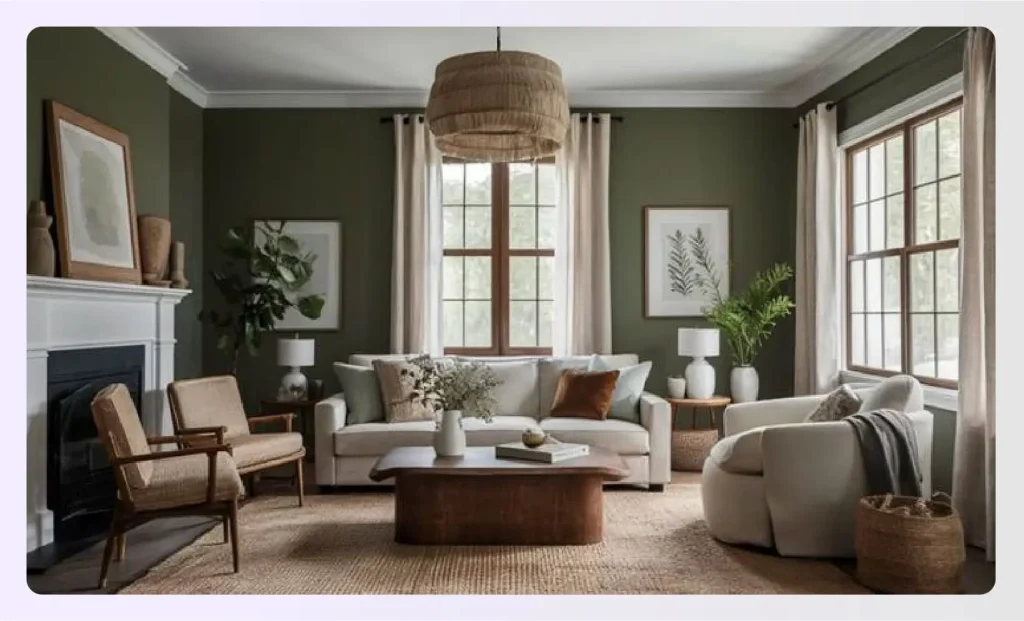
For nature lovers, there’s no combination as perfect as moss green, tan, and white. Natural textured fabrics like linen, burlap, hemp, etc., are brilliant complements to this palette.
You can further dramatize this combo by adding lush greenery and nature-inspired artwork. The Sherwin Williams moss green has been a cult favorite for good reason as it offers an earthy calming feel that reflects the cool end of Mother Nature. This rich, delicate, and classy combination is here to stay.
Quick Read: How To Choose The Exterior Paint Colors for A House?
2. Gray + Sand + Blue
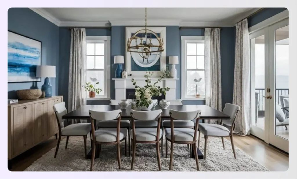
If you are looking for a pacific coast or nautical vibe that’s not overdone, this blue combo with gray and sand is a foolproof designer combo. The ocean blue adds serenity, while gray and sand bring balance. This palette delivers a calming feel ideal for dining rooms or living areas in classic homes.
This palette is instrumental in designing interiors that have a sophisticated, modern, yet easygoing air. The dining room and living room can seem welcoming when donned in this palette.
3. Hunter Green + Red
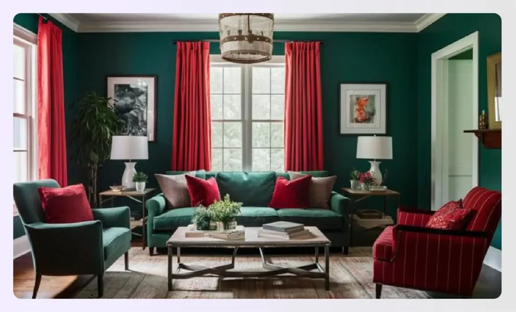
Not for the faint-hearted, this pairing creates equal parts drama and nostalgia. When paired with dark wood and earth tones, it evokes an older home’s vintage warmth with a golden orange feel. It’s a foolproof palette that channels rich tradition with a modern twist.
4. White + Pops of Color
White paint is literally a blank slate on which your imagination can run wild! Pops of energetic primary hues, perhaps a citrine orange vase or teal mural, can instantly elevate the space. Every element gets highlighted against warm whites or airy neutrals, creating the perfect background for personalization.
However, overuse may get chaotic. Instead, use this in a kids room or farmhouse designs where soft neutral paint colors balance playful details. Master bedrooms, or any bedroom for that matter, can be personalized with this approach using thoughtfully curated bedroom color schemes.
Suggested Read: Bohemian Interior Design Style for Colorful Decor
5. Blue + Neon
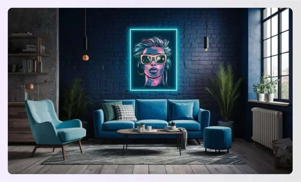
An unconventional choice that gives your space graphic edge and modern flair. Neon highlights create an energetic primary hue effect against dark blue which is perfect for a lounge or bar area. Pair it with a crisp white couch or light oak furniture for contrast.
6. Light Blue + Emerald
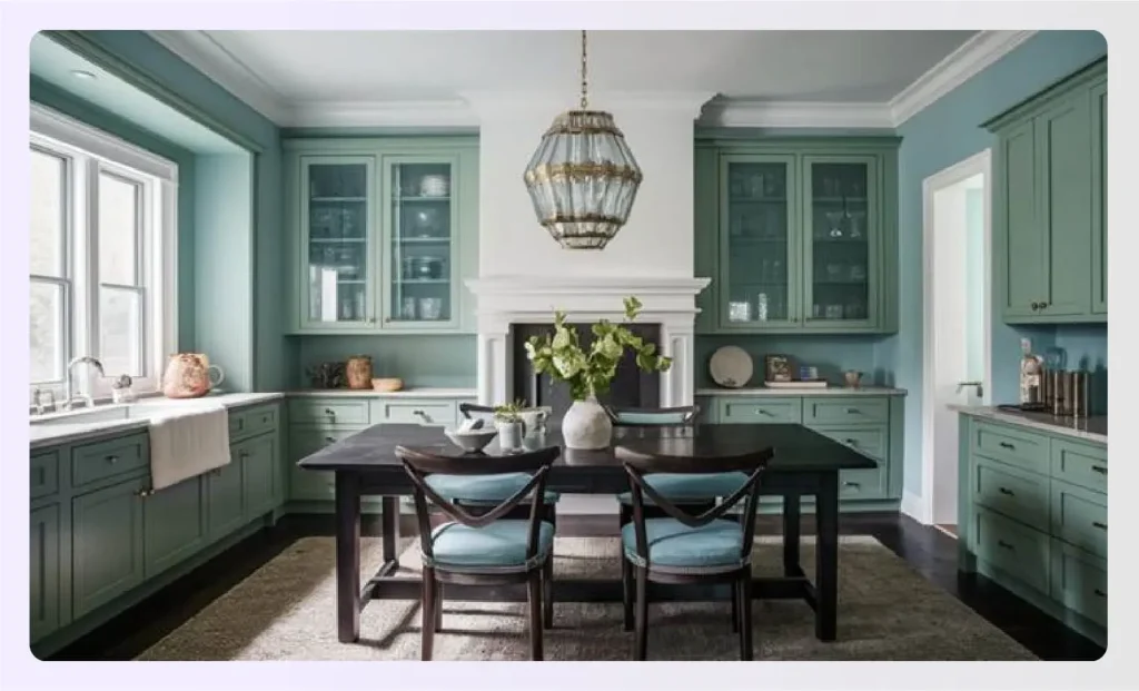
Soft blue combined with emerald green is timeless. Designers, including Havenly designer Kelsey Fischer, recommend this curated color palette for its versatility in modern homes. The look is inspired by color trends from Sherwin Williams, giving both sophistication and a calming feel to kitchens and dining spaces.
Softer shades of blue paint with the opulence of emerald green is pure elegance! The Benjamin Moore Emerald Isle has been a long-time favorite of designers. These room colors give off a serene albeit confident trail. They can be comfortably used to adorn cabinetry too.
7. Blue + Grass Green

Two cool tones, like blue and green, can bring the cool forest green of the outdoors inside. Ideal for homeowners seeking a comprehensive shortcut to nature-inspired interiors, this combo works best in open-plan spaces where the whole house feels refreshed and cohesive.
8. Blue + Beige
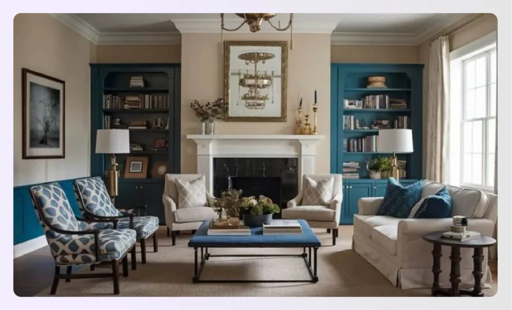
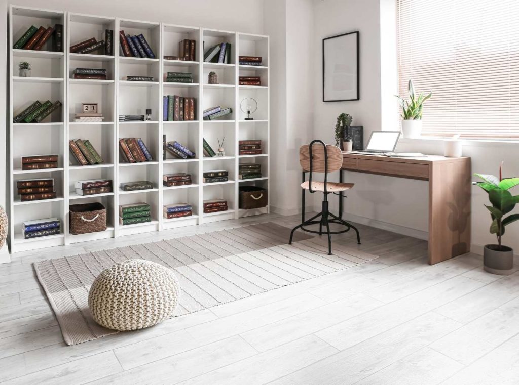
Blue lends clarity, while beige provides grounding offering the best possible way to maintain a neutral base. This home color scheme works beautifully in classic homes, offering elegance and warmth with foolproof palettes designers love for office or study areas.
9. Gray + Brown
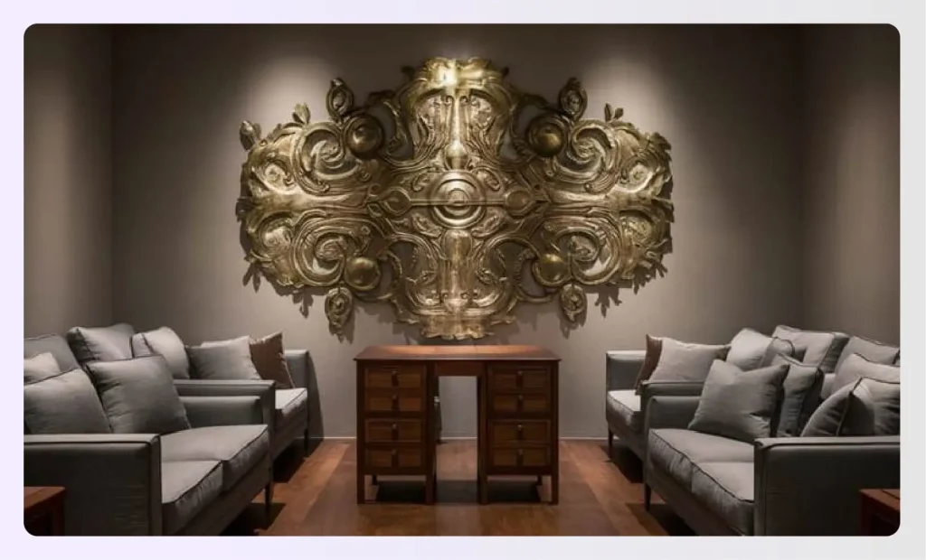
Opt for rigidly neutral colors like gray and brown for highly intense focal points. This combination works best when you want to highlight a brass or bronze statement piece of artwork.
10. Black + Red

It pays to be brave! The drama unfolds in oodles when there is a medley of red and black. This combination packs a punch and is perfect for focal points in dens, parlor rooms, hallways, and stairways. It envelopes the room and its inhabitants with a ferocity that cannot be tolerated by all!
11. Gray-Green + White + Black
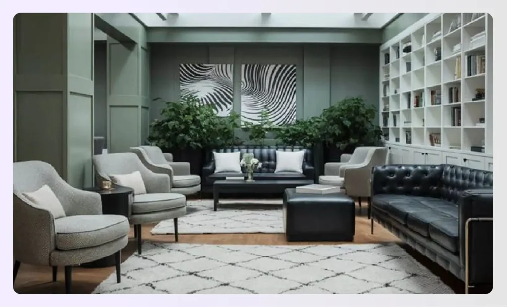
To incorporate nature into the interiors more formally and subtly, go for the contemporary gray-green, white, and black combo. While grayish-green and white add a smidgen of crispness to the room, black anchors the rest of the elements.
12. Blue + Gray + Taupe
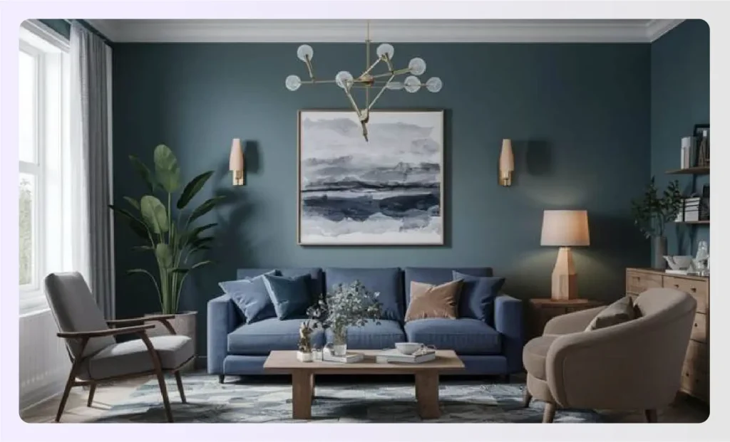
Colors in a room can largely influence our mood. Universally, shades like gray and blue are restful, while taupe is a warm color with a cocooning effect.
13. Black + Navy
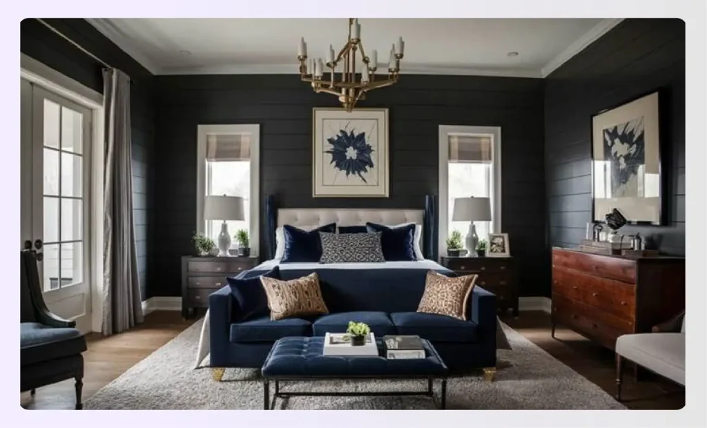
It is a common misconception that neutral shades are boring and monotonous. Two heavy hues such as black and navy can be combined to create a sumptuous stately appearance. A classic for masculine energy, these go well in dens, master bedrooms, and even kitchens.
14. Emerald + Tan
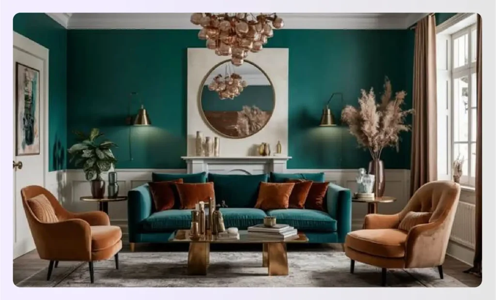
Jewel tones like emerald can be burnished in a glossy finish. They bounce light around and instantly lift spirits. Add to it the earthiness of tan, and you have a room makeover! As a bonus, let the color seep onto the soft furnishings in plush textures like velvet.
15. Forest Green + Light Gray
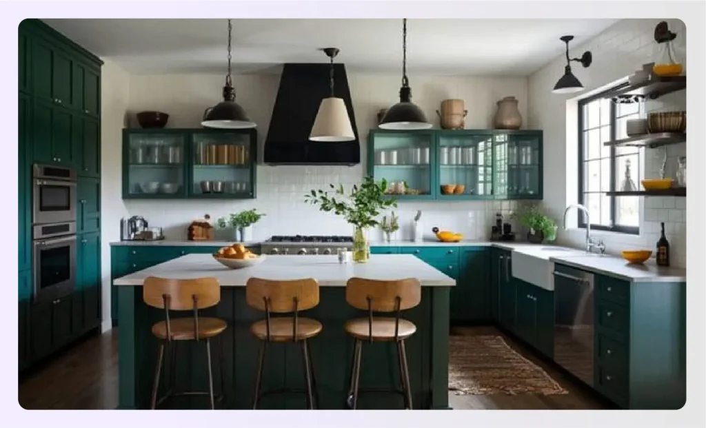
When paired with a buoyant hue like light gray, vibrant colors such as forest green become perfect options for wall paint in open areas. These interior paint colors fit seamlessly into various kitchen color schemes, with cabinets in darker shades complementing lighter walls. Add to it some vintage fixtures and lights, and you are golden!
16. Yellow + Gray
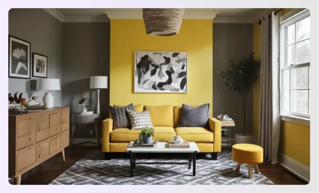
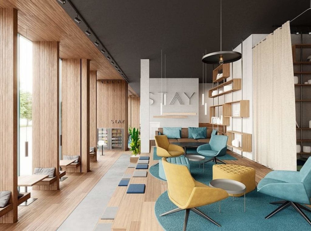
Yellow is the most stimulating wall color on the color wheel. The happy-go-lucky yellow seem mysterious when paired with a moodier subtle gray. This combination feels fresh and can work wonders in nurseries and playrooms as well as the living room or breakfast nook.
17. Pink + Green
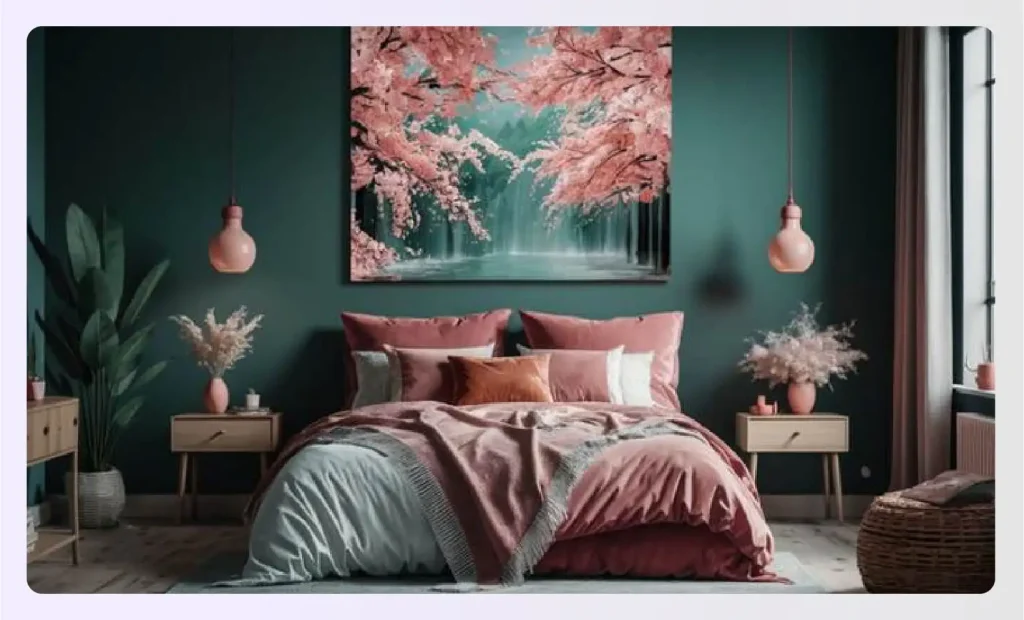
Have you ever wondered what happens if we take two deep colors and blend them together? The combination of pink with green immediately impresses and can breathe new life into a bedroom or living room.
The vibrancy and warmth of pink pop out against the natural aspects of green, much like cherry blossoms, making the room seem more lively and it is summer all around the year.
18. Blush Pink + Black
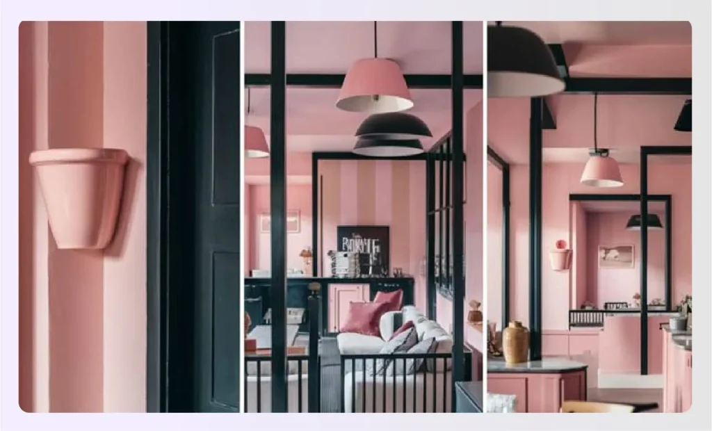
One more modern practice is pairing a dark color with a pastel shade, e.g., the soft Pink Cup from Farrow & Ball and black. The warm playfulness of pink is comforting and flattering, while the dark contrast of black is the missing touch of suave.
19. Black + White
Classic black and white are the favorite colors in interior design color schemes for ages. No matter how you use it, this combination seldom goes wrong. You can use either color on the walls and furnish the room with the other or add them in radial patterns around the room to create vibration and rhythm.
20. Blue + White
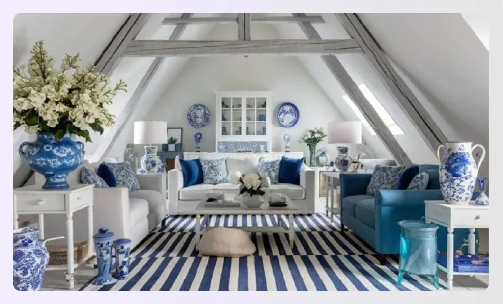
Depending on the interior style, blue and white can play the roles of modern and elegant as well as carry rustic DIY and plain on its shoulders. One of the most straightforward combinations to use, it is an evergreen merger.
Types of Interior Color Schemes for Houses
When creating an appealing color scheme, it is vital as a designer to let your creative juices flow. But it’s not always necessary to reinvent the wheel. There are tons of pre-existing color palettes that you can play with for a rejuvenating effect.
These can also be a good foundation for you to build advanced color schemes if the homeowners have a penchant for certain shades or a negative reaction to colors that you need to avoid.
Let’s consider some of the typical interior color schemes we have seen.
1. Complementary Colors
Colors located at the opposite ends of the color wheel are termed complementary colors. The concept of a complementary color scheme is to bring out the character of the contrasting color.
The rule of thumb for implementing a complementary color scheme is to use one subtle and one dominant color to avoid undertones or overtones.
2. Split Complementary Colors
If the client is looking for dramatic effects during the home makeover, the split contemporary color scheme involving alternating the primary colors is your best bet.
For bold nuances, you can choose a primary color, then complement it with the two immediate shades on either side. This dramatic effect can help you create a unique statement as a designer, especially when creating sectionals or focal points.
3. Monochromatic Colors
In this age of minimalism, monochromatic shades are widely popular. They basically consist of one primary color complemented by all its shades and hues. The swatches are entirely based on altering the value of the primary color with saturation to develop nuanced tones.
4. Analogous Color Scheme
They are also called analogous color scheme which involves colors that sit next to each other in the color wheel. For example, blue paired with teal and bluish violet. It’s a great way to introduce variety and to keep transitioning from one color to the next. Gives you a soft and subtle color scheme. No combination should feel jarring when you choose this color scheme. This is suitable for anyone who wants to safely experiment with color palette creation.
5. Double Complementary Color Scheme
Under this scheme, you have two sets of opposing complementary colors in the same palette. The further away they are, the more aggressive the overall look will be. Choose accordingly, and visualize several times in your tool before finalizing, so your choice is final and works well.
6. Triadic Color Scheme
This color scheme involves choosing three colors that are of equal distance from one another in the color wheel, and those form a triangular pattern. That doesn’t mean they have to be bold and dramatic. If you want a soft and subtle palette, choose the lighter tones of the colors, and create a homey look.
7. Square Color Scheme
Take the triadic formation a bit farther by choosing colors that form a square on the color wheel. Ensure there’s a lot of room between the colors, so you know you’re going for this very color scheme. This color scheme is usually used in commercial designs because it is eye-catching, attention-drawing, and dramatic. Infact the boldest color scheme ever.
Why Your Home’s Interior Color Scheme Is So Important?
Although it seems simple, picking an effective color idea can make all the difference when creating a stunning interior design for your clients. Warm colors, cool colors, and muted colors, all have different effects on the mood. There are several advantages of establishing a good color scheme, but let’s take a closer look at some of the most critical aspects to consider.
Sets the Mood and Atmosphere
Color has a direct impact on emotion. The psychology of colors in design shows how warm colors like red and orange create energy, while cool tones like blue and green foster calm. Your interior color scheme is the primary driver in setting the desired mood for each room, whether it’s a tranquil bedroom or an energetic living area.
Creates Visual Cohesion and Flow
A well-planned palette connects different rooms, creating a seamless flow throughout the home. Using a consistent base color or repeating accent colors in adjacent spaces makes the entire house feel unified and thoughtfully designed. This is especially critical in open-concept floor plans where interior color schemes define different functional zones.
Can Make Spaces Feel Larger (or Cozier)
Strategic color choices can alter the perception of a room’s size. Light, cool, and neutral interior color schemes reflect more light, making a small space feel larger and more open. Conversely, dark and warm colors absorb light, which can make a large, cavernous room feel cozier, more intimate, and more inviting.
Direct Reflection of Your Personal Style
Ultimately, your home’s interior color schemes are a form of self-expression. They are the backdrop for your life and a reflection of your personality. Whether you prefer the minimalist appeal of a monochromatic palette or the vibrant energy of the Bohemian Interior Design Style, your color choices tell your story.
Quick Read: The Psychology of Colors in Interior Design
How To Choose an Interior Color Scheme for Home?
Choosing the perfect interior color scheme can feel overwhelming, but a structured approach simplifies the process. Follow these steps to find a palette you’ll love for years.
Step 1: Get Inspired
Inspiration can be derived from anywhere. It could be a picture your clients love or one of the many popular interior design styles. Look at your favorite artwork, a patterned rug, or even a piece of clothing. Anything that appeals to the eye and sparks joy in the heart can be the foundation of your interior color schemes.
Step 2: Use the 60-30-10 Rule
This classic design rule provides perfect balance. Your interior color scheme should be composed of three colors: 60% is your dominant color (mostly walls), 30% is your secondary color (furniture, curtains), and 10% is your accent color (pillows, decor, artwork). This formula ensures the palette is balanced and not overwhelming.
Step 3: Consider Your Natural Light
Natural light has a fantastic effect on every color. You must factor in the effects of natural light when planning your interior paint colors. A color can look completely different in a bright, south-facing room versus a darker, north-facing one. Always test your swatches on different walls and observe them at various times of the day.
Step 4: Think About the Connection Between Rooms
Consider how your interior color schemes will flow from one room to the next. You don’t have to use the same colors everywhere, but they should feel related. You can carry an accent color from the living room into the dining room as a dominant color to create a sense of harmony and intentional design.
Step 5: Test, Test, and Test Again (The Power of Swatches)
Never commit to an interior color scheme based on a tiny chip. Paint large swatches on your walls or use peel-and-stick samples. Even better, create a mood board with your paint colors, fabric swatches, and material finishes. This planning helps you achieve the desired goal and prevent unwanted errors.
Recommended Read: 15 Best Ways To Increase Natural Light In Your Home
How to Use Color Schemes?
Use a design principle called ‘rhythm’ to blend different colors in the color scheme. Repeat the colors in the space in obvious ways, such as throw pillows, accent walls, pillows, and flower vases. You can also use the undertones of the different colors.
|
Nick Lewis, an interior designer and stylist says, “When you start to repeat shapes, colors, patterns, and textures in the space, it makes the entire space look cohesive. Of all these ways, blending color schemes to bring cohesion is the easiest, and the most effective of all. You just need to know how to combine different color schemes.” |
See how you can pull all components of a room together by evenly spreading and repeating colors in the scheme over and over again. Rhythmic repetition visually pulls the space together.
Visualize different interior color schemes in Foyr
While it’s natural to be excited to try all these interior color schemes and convert the space into a visual masterpiece, things can get messy and complicated if you get the colors wrong. Getting the client’s nod of approval on the swatches before putting any color on the walls is always better.
To help you with the challenge, you can always take the help of a powerful rendering software such as Foyr Neo. Add different elements like home decor and furniture from the extensive library of blocks and models available at your disposal.
You can then try out the various color schemes on the model. Finally, render a super realistic visual to see how the room would look after executing the ideas! Sign up for a 14-day free trial to up your color game!
Frequently Asked Questions
How can I choose a color scheme that suits my style?
To choose a color scheme that suits your style, start by identifying your preferences and the mood you want to create. Consider your favorite colors, and look at your existing décor and personal items for inspiration. Use interior design color schemes to guide your choices, ensuring they align with your style, whether it’s modern, traditional, or eclectic. Experiment with home color design tools or mood boards to visualize how different house color schemes interior can bring your vision to life.
How do I incorporate bold colors without overwhelming the space?
Incorporating bold colors without overwhelming the space involves balancing them with neutral tones and using them as accents. Choose one or two bold colors from your interior design color schemes and apply them strategically on feature walls, furniture, or accessories. Keep the primary elements of your home color design, such as walls and large furniture pieces, in more subdued shades. This approach ensures that bold colors enhance your house color schemes interior without dominating the room.
What are the latest trends in interior color schemes for 2024?
The latest trends in interior color schemes for 2024 emphasize natural and earthy tones, muted pastels, and deep, rich hues. Home color design is leaning towards warm neutrals like beige and terracotta, complemented by cool shades such as sage green and soft blues. Bold accent colors like deep navy and emerald green are also popular. These trends reflect a desire for calm, comfort, and a connection to nature in house color schemes interior.
How do I match my furniture to my color scheme?
Matching your furniture to your color scheme involves coordinating colors and styles. Start by selecting a base color from your interior design color schemes and choose furniture pieces that complement this palette. For a cohesive look, consider the undertones in both your furniture and your home color design. Use fabrics, finishes, and accessories that echo the chosen house color scheme’s interior, ensuring everything works harmoniously together.
How do lighting conditions affect my color scheme?
Lighting conditions significantly affect your color scheme, altering how colors appear throughout the day. Natural light enhances true colors, while artificial lighting can warm or cool them. When planning your interior color schemes, test paint samples and fabrics under different lighting conditions in your home. This helps you understand how your home color design will look in various light settings, ensuring your house color schemes interior remains consistent and appealing in all lighting conditions.
What is the 3 color rule in interior design?
The 3-color rule, also known as the 60-30-10 rule, is a fundamental guideline for creating balanced interior color schemes. It states that 60% of your room should be a dominant color (e.g., walls), 30% a secondary color (e.g., furniture, curtains), and 10% an accent color (e.g., pillows, decor). This prevents any one color from being overwhelming.
What is the 3-5-7 rule in decorating?
This is a grouping principle suggesting that objects arranged in odd numbers (like 3, 5, or 7) are more visually appealing and dynamic than even-numbered groups. When decorating a shelf or coffee table, for example, try grouping three objects of varying heights, or five. This concept helps create interior color schemes and decor arrangements that feel natural and less staged.
How many colors should be in a room when decorating?
Most designers recommend using three to five colors in a single room’s interior color scheme. The 60-30-10 rule provides a great three-color framework. You can expand this to five by adding two more accent colors in small doses. Using more than five can make the space feel chaotic, while using fewer than three can sometimes feel flat or monotonous.


