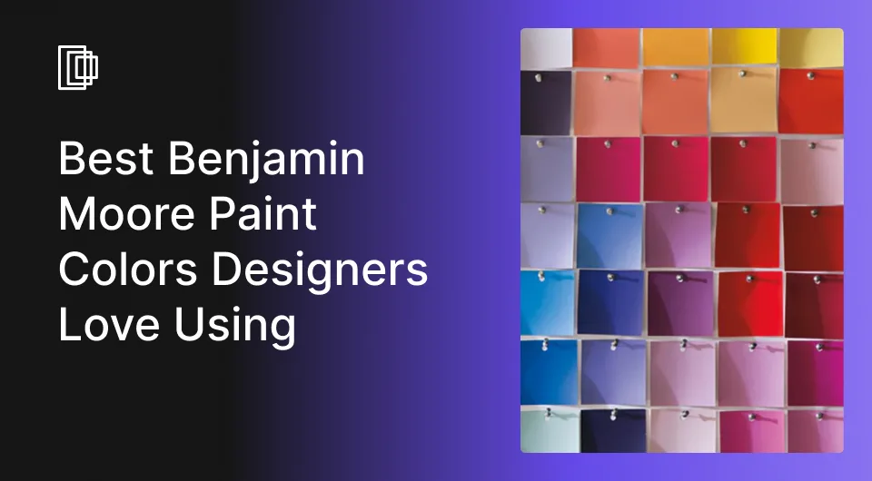
You’re about to choose the perfect color for your dream client’s home design project. They’ve shown you countless Pinterest saves and want the very best on their walls. You’re puzzled—you search everywhere for inspiration, flipping through Sherwin-Williams and Farrow & Ball color books. If you want to discover the go-to colors that designers love to use on walls—and how to match them seamlessly with the interior style of the space—you’re in the right place.
We’ve put together 9 Benjamin Moore paint colors that designers absolutely adore all over the world and keep them as lifesavers when their client asks for the best paint color that’ll blow their minds. Dig in, we’ve got the best of Benjamin Moore in a nutshell for you.

What Should You Consider Before Choosing a Paint Color?
1. Lighting
The first factor you need to consider is lighting. The same color will look different when you see it in natural light, overcast daylight, and artificial light. You need to take into account which direction the space faces, as the East-facing rooms receive bright light in the morning and dim down by evening, and the West-facing rooms are cooler in the mornings and brighten up for the golden sunset. North-facing rooms have a certain warmth and adequate lighting throughout the day while South-facing rooms remain slightly dim at all times.
Pro tip: Paint on different corners of the room that receive different levels of sunlight throughout the day, to assess how the color looks and behaves with changing light exposure.
2. Vibe You Want to Create
How the client wants to feel in a particular space, to make it their own haven – a relaxing nook, focused work zone, or a fun play area, is your starting point for your color contemplations.
It is without a doubt, proven that colors have a profound impact on our emotional health, so you’ll want to take this seriously.
| Warm, cozy, and inviting | Warmer tones |
| Cool, crisp, and sophisticated | Cooler tones |
3. Think About Undertones
The overtone, or the obvious color you see when you spot a color is only a part of it. The undertone, or the minute mix of different colors is present in every color Benjamin Moore has, and they’re super-important, especially when you’re talking about neutrals. Well, what colors are we talking about exactly? The popular neutral paint colors and their undertones – off-white, grey, greige, beige, and black.
Read also – How Much Does It Cost To Paint The Interior Of A House?
Top Colors to Choose For Your Next Project
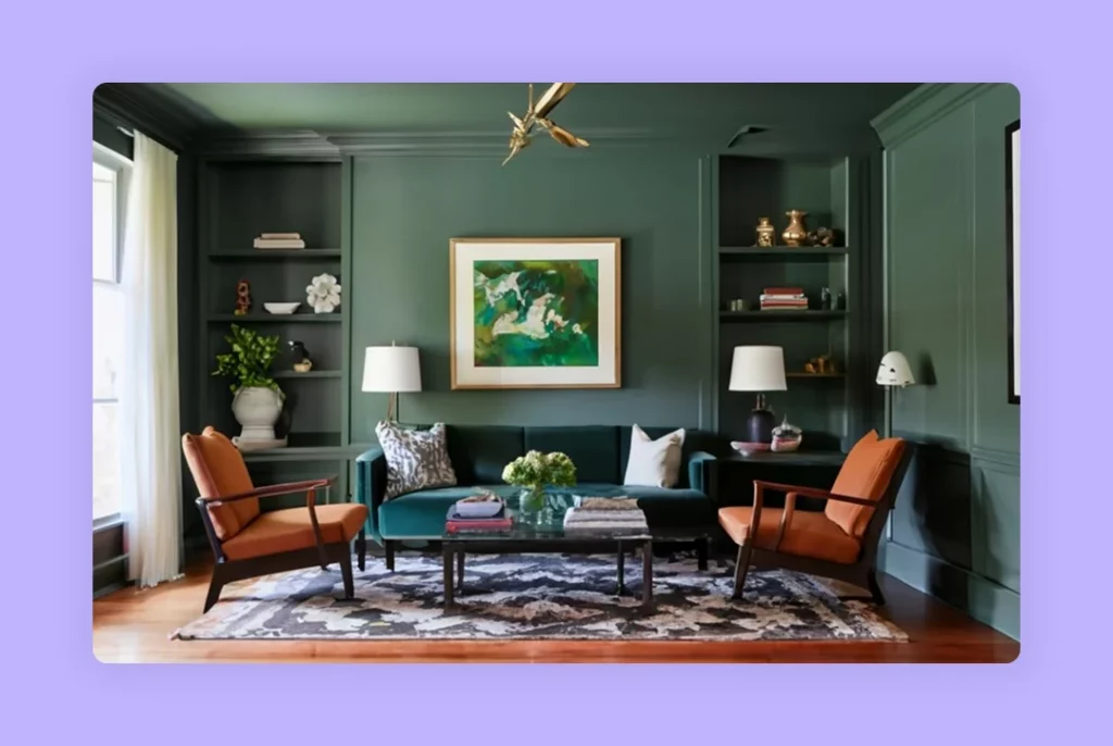
1. Revere Pewter
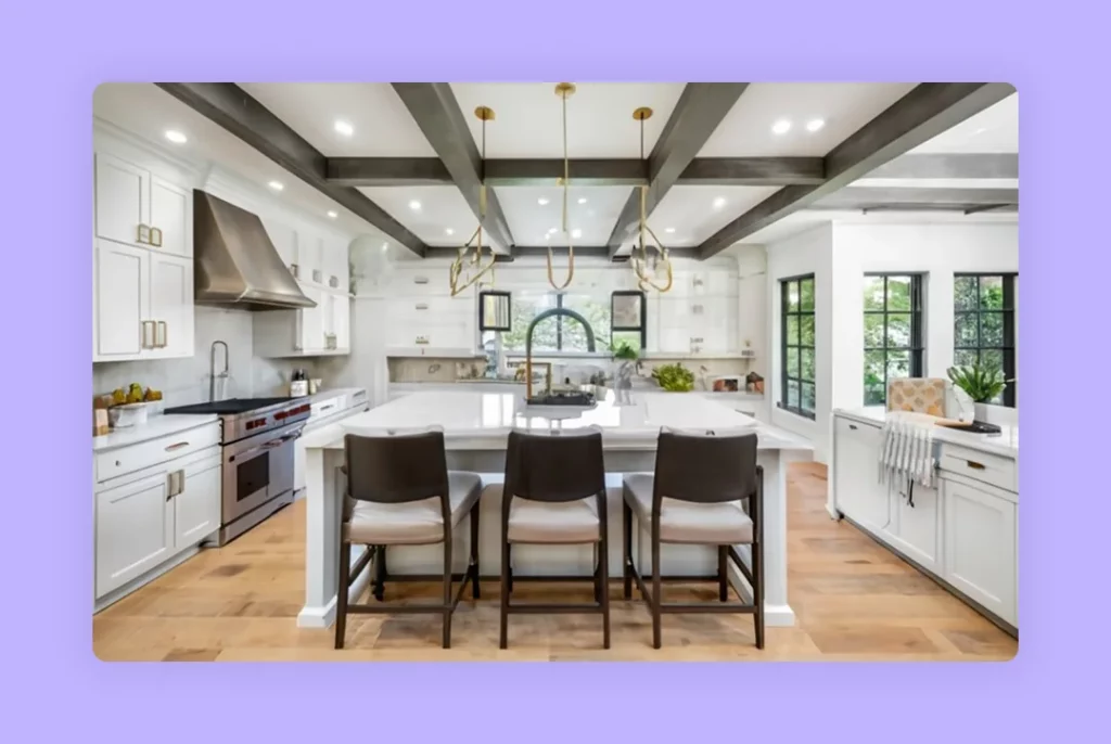
Revere Pewter is a highly versatile and balanced paint color. This warm white color emits mid-tone vibes, making it ideal for a variety of color schemes and palettes. It’s a go-to choice for any interior design style, acting as a bridge to seamlessly blend different hues within a scheme. Being a lighter mid-tone, it adds brightness to spaces while serving as a transitional shade between warm and cool tones.
People generally tend to gravitate toward lighter colors inside their homes, especially in the predominant areas, and that’s one of the reasons why this color is a hot favorite for homeowners and designers alike. There are certain lighting conditions and flooring, which can give an impression that the color has a green dominance in it.
A white color pairing you can make confidently, alongside Revere Pewter is the Vanilla Milkshake. It can exude a dark-white vibe. The color has a stark contrast when compared to Revere Pewter.
A lighter color pairing for you is reliant on a subtle grey-blue undertone which will help Revere Pewter feel a little warmer – Horizon. Cool, soft grey by nature, it’s a clean slate that brings you away from the pool of related warm colors. When used together, they can bring out the best in each other.
| Artem Kropovinsky, founder and principal designer at Arsight, explains, “Revere Pewter is a greige color that works in almost any room. By this, I mean that it does not get overly grey or brown because there is still a certain warmth to it which can be used with both modern and traditional furnishings.” |
2. Wenge
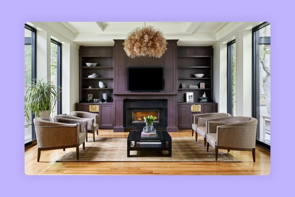
Has a wooden tone to it. Wenge is a part of the Affinity Collection Benjamin Moore released a while ago, and has a rich look to it. Easy to incorporate anywhere at home. The color is on the darker end of the spectrum and has a deep, rich chocolatey touch, with slight hints of black and purple.
One of the great things about Wenge is it doesn’t overwhelm the space or make it dingey. The color looks stunning if you have good natural lighting and beautiful artificial lighting. You can use this color anywhere you’d love to use black, off-black, or brown, like on a kitchen island, accent wall, or an accentuated dining room color, or an exterior paint color for the front door, or garage door.
A lovely color to pair with Wenge is White Heron, from the Benjamin Moore range of colors. It’s clean and white, with a slightly cool color cast, to accentuate the warm tinge in Wenge. If you want a little more depth, go for Cloudy Gray, which is a white version but also has a trait of light brown, which blends in well with Wenge.
Read also – How Interior Designers Choose Wall Paint Colors for Interiors
3. Mt Ranier Gray
It is a mid-tone paint color, on the lighter end of the spectrum, but not so pale that you wouldn’t notice it on the walls, and not so dark either. That’s one of the reasons why its designers love it. It’s a grey that has an icy blue undertone. Being a fairly desaturated color, it is neutral. One thing to note is that seems cooler in North-facing rooms, so be sure to check the color in different lighting conditions.
Use it generously across a lot of different spaces in your home, its versatility gives itself to the ambiance you’re going for. If you’re all for a sleek, cool color, Mt Ranier Grey is the main color for you. Paint it across the hallway or the living room, bathrooms, bedrooms, and dining rooms. If not, use it as the secondary color.
It’s a beautiful color, so go ahead and pair it with something equally amazing. Consider Ice Mist, which is a popular Benjamin Moore cooler white. It’ll add a subtle hint of coolness to the super-cool Mt Rainer Gray, especially if you’re using White on the trims and Blue-gray paint colors on the walls. Fancy a darker option, you’re all set with Intrigue. It’s gray with a green undertone with a tenderness to it.
Our preferred pairing option is Love Affair, a glorious mix of burgundy red, a little bit of brown, and maybe a touch of purple as well. Rich, deep, and exudes a luxurious vibe effortlessly. Pair it with Mt Rainer Gray and you’re in for a treat.
4. Salamander Green
An awesome deep green by Benjamin Moore. What’s interesting about the color is how it can be interpreted as both green and blue. It may look like an off-black to some people, so be sure to experiment with paint swatches in different corners of the room to give a holistic picture of the color. As you expose it to light, the undertones become prominent.
It’s a ravishing door color, it can work as an accent color, fireplace mantel wall. It’s green at its core, but has a certain amount of blue in it, which makes it lean toward the side of teal, a deep aquatic blue-green if you will.
To do justice to the rich color it is, you can consider pairing it with warm colors, in the form of tans, such as Lenox Tan, to give it a timeless look. If you don’t want the depth that Lenox Tan gives, go for its close alternative, Shaker Beige, which is a tad creamier, and has a sandy outlook. It’ll suit dimly lit spaces and sit well with Salamander Green.
If you’re working with a client who doesn’t want to stop with one dark color, but perhaps wants to experiment with two complementary but classy dark wall colors that don’t overwhelm the onlooker, you shouldn’t think of anything other than Dinner Party. Slightly lighter than Salamander, and with hints of brown and purple, the color looks sophisticated. Use Dinner Party as an accent color, and your client will love it.
For the trims, molding, and door frames, opt for Oxford White. It plays into the main color’s green side, by having a touch of warmth in the trim color.
Read also – How to Pick the Perfect White Paint Color for Your Space
5. Hale Navy
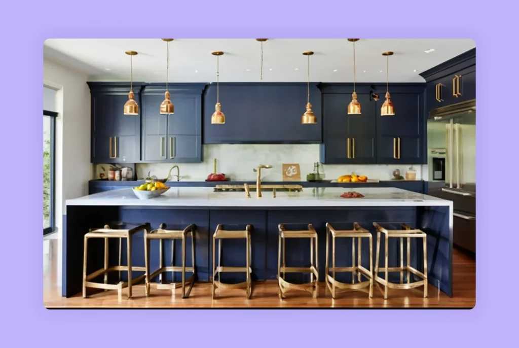
Designers like James, the famous designer and YouTuber of the Paint People channels call it the quintessential navy blue of Benjamin Moore. It’s a great color to paint on kitchen cabinets, to use with Benjamin Moore Chantilly Lace oc-65 . There’s an aura of timelessness about this color. It’s classy and rich and makes any space look palatial.
Be sure to use this color where there’s plenty of lighting, either natural or artificial, or a fine mix of both. Otherwise, it can look super-dark, and have a gloomy, or closed impact on your mind. This rule doesn’t apply if you want to use this color for painting cabinets, as they have a natural sheen to them, on account of the material they’re made of.
But, if you’re using it on a wall, go for a matte finish or an eggshell finish at best. If you lean towards more sheen, you can find it looking garish. Trim colors for this exuberant color have to be slightly mellow, to balance the overall look. Set your heart on Cheating Heart, to complement Hale Navy, if you want a dark, charcoal grey. Works well if you use it on doors.
| Artem Kropovinsky, founder and principal interior designer at Arsight says, “A timeless classic that can be used as an accent wall, or statement piece such as a “Hale Navy”. This means that it has a rich, deep hue which adds elegance and depth to any space. It is suitable for all styles of decor.“ |
6. Wrought Iron
A true slate grey. It doesn’t come off as black but is a great choice for underlit spaces. A popular designer’s favorite, Wrought Iron is loved for its black-like nature, and naturally, it’s one of Benjamin Moore’s top-selling colors. It has a softness to it, and can sit in as a beautiful contrast with other colors, without owning the entire space like black does.
It has a deep gray undertone. It sometimes is believed to exhibit the softness of a blue undertone. If you want to edge it out, bring in incandescent lighting settings in the room. You can suggest this color for the front door, or garage door to make a compelling statement.
Use it generously on exposed ceiling beams, accent walls, and interior doors to have a contrasting look if you have a white trim. Bring in this color in areas that you have reserved for quiet contemplation, or relaxation, like a mancave, reading room, home theatre, bedroom, etc.
When we talk about pairing this charismatic color, you may go in for bold choices, like Sugar Cookie, which is a very light, off-white color with a creamy, buttery look. Gives you the much-needed jump from dark to light. Harness this combo when you’re painting a well-lit room with plenty of natural light.
If you use it in a cool room, you run a risk of wiping out the warmth from Sugar Cookie. If that’s not your piece of cake, opt for Peanut Butter, a color you can use sparingly as accents, along with White Ice for the trims. Just the right drama you need in a serene room.
Read also – How To Paint A Room? 15 Steps To Painting A Room Like A Pro

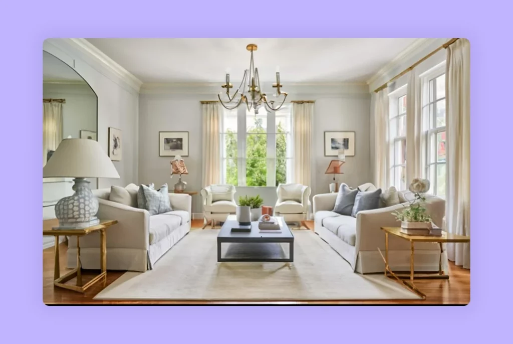
7. Calm
A stunning off-white interior paint color. If you have a bright room, it can wash out the color of your room. However, if you have a room that’s too dark, Calm can make it more dingey, chalky, and dull, owing to its undertones. Headscratcher? Not really. It’s a slightly warm neutral grey, with a smidge of a purple undertone. If you don’t like purple as such, it’s best if you stay away from Calm.
One of the best attributes of Calm is its subtlety. It has a calming effect on space due to the balance it brings when paired with any color. One of the light color pairings you can make is Whitestone, a crisp grey with a stark change in the undertone and deeper than Calm. It’s silvery, airy, and opens up any space.
When used in bathrooms properly, you can create a sanctuary-like feeling without investing too much. Throw in the color in hallways too. If you want a darker complementary color, go for Wrought Iron.
8. Swiss Coffee
Makes any space look classy and comfy at the same time, that’s why it’s one of Benjamin Moore’s best-selling colors of all time, alongside White Dove. It has just the right amount of creamy, yellow-based warmth that looks soft and elegant. Doesn’t come off as too-white or obnoxious, and yet it doesn’t have a ton of color that’s going to stray away from its essence.
It has a subtle softness that’s pleasing to the eye. Goes exceedingly well with natural wood tones, and organic materials in the space to give a home-like feeling. Easy to maintain, coexist with fluorescent walls. You can color drench the space with Swiss Coffee color on the walls, and continue to the ceiling and trim as well.
Wicker Basket, a relatively new color of Benjamin Moore, has 5-6 colorants that make it nuanced. Makes the space organic. It isn’t as bright as true wicker but is a subtle mid-tone. When you place plants near the color, they really stand out.
Pinelands, a darker, richer color that looks like mellow forest green. It’ll be an accent color to Swiss Coffee since it’s a pretty saturated color. An interesting mudroom color, hallway, and dining room to use with Swiss Coffee.
Read also – How to Install Mural Wallpaper: A Step-by-Step Guide
9. Caliente
Caliente is the Spanish word for ‘hot’, and this color really lives up to its meaning. It’s not a true red and it has an orange-red undertone. It doesn’t look like the red you spot at a stop sign or a road sign. The orange gives it a homey, inviting look.
When you’re planning to pair Caliente with fixed elements such as furniture and cabinets, you may want to understand how it looks. An oak grey wood flooring goes very well. Berige carpet flooring may not work together because Caliente is a clean color and beige isn’t. Red cherry wood again, fits in with Caliente.
If you have an open-concept floor plan and you want to bring contrast to your space, you may want to pair the main color with Swiss Coffee. Accent walls can be of Caliente and they can turn your space around. If you want to paint your kitchen walls in Caliente, you could Snowfall white.
If you want to bring in red accents for your kitchen island, paint it in Caliente and paint your walls Snowfall White. For an earthy dining room, go ahead with Clay Beige for the walls and add Caliente as an accent wall.
| Artem Kropovinsky, founder and principal interior designer at Arsight says,” The color Caliente which seems to be a very high-intensity red with some warmth that balances its intensity so we do not get overpowered by it. Caliente adds an instant pop of color to a room when painted on accent walls, furniture pieces, or just as decorative accents.” |
How Can You Pick the Right Color Using Foyr Neo?
Now that you know what other designers love and swear by, it’s time for you to experiment with what works in your client’s space, choices, and needs and get the best color in its ideal shade.
How do you do that, without accidentally overdoing or underdoing it? You do it right with advanced visualization software like Foyr Neo.
With Neo, you can:
- Choose from a wide range of colors: Neo’s updated material library is rife with the entire range of colors all predominant paint brands use including the 2024 color of the year predictions, so you don’t have to forego your creativity or the style you’re going for one bit.
- Customize the main color and fixtures in any color, from any brand: Be it a chaise lounge, ottoman, or simple table lamp, hyper-personalize your decor by choosing from 60,000+ 3D materials in the material library. Anything you want in any color, shape, pattern, texture, or form.
- Adjust lighting and view colors from all lighting conditions: Colors behave differently in different light settings, so put on light modes of sunrise, sunset, cloudy day, rainy, and winter climatic conditions, along with artificial lighting, and check how colors interact with other elements in the space.
- Switch between colors without glitching: As you sift through colors, you don’t want the design to pixelate, or your laptop to crash. Our cloud engine keeps you going and maintains a smooth workflow for you.
- Take photorealistic renders in minutes: You’re on the client’s premises giving them a presentation, and the client wants to see a different color combination right now. Change it, take renders and it’ll finish rendering in a few minutes. Right in time for you to get instant feedback and proceed to the next.
What are you waiting for? Sign up for Foyr Neo’s 14-day free trial right now.
FAQs
What design styles work particularly well with the richness of Wenge in Benjamin Moore’s palette?
Wenge is often embraced in modern and transitional designs, where its dark brown undertones contribute to a sense of sophistication and warmth.
What are the popular applications of Wrought Iron in interior design, beyond wall colors?
Wrought Iron is often used for cabinetry, furniture, and accent details, adding a touch of drama and sophistication to various design elements.
How does Swiss Coffee differ from traditional white paint?
Swiss Coffee’s subtle warmth distinguishes it from pure white, offering a softer and more inviting option for interiors, especially in homes with ample natural light.
How does Salamander Green contribute to biophilic design, promoting a connection between interior spaces and nature?
Salamander Green, resembling botanical hues, aligns with biophilic design principles, fostering a connection with nature and promoting well-being.
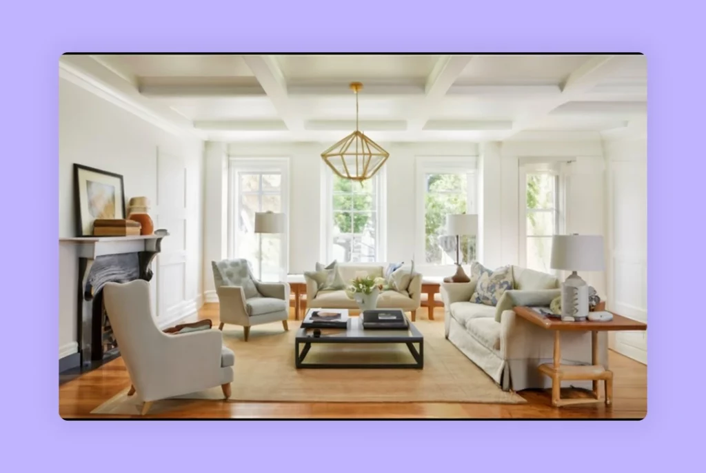
In what design contexts does Revere Pewter shine as a backdrop for showcasing artwork and decorative pieces?
Revere Pewter’s neutral tones make it an ideal backdrop for displaying art and decor, allowing the colors and textures to stand out without overpowering.
What is Benjamin Moore’s most popular color?
One of the most popular Benjamin Moore paint colors is Revere Pewter, loved for its balance of warmth and neutrality. Its versatility makes it suitable for multiple styles, from modern to traditional, and it pairs beautifully with whites and greys.
Is Benjamin Moore paint better than Dulux?
Benjamin Moore is often preferred for its durability, vast color palette, and depth of finishes. While Dulux offers affordability and accessibility, Benjamin Moore is seen as premium, especially for designers who value quality and nuanced shades.
Why is Benjamin Moore paint so expensive?
Benjamin Moore paint is priced higher because of its superior pigments, advanced formulations, and long-lasting finish. Its coverage requires fewer coats, reducing labour in the long run. For many designers, the consistency and quality justify the investment.
Which Benjamin Moore paint is best for interior walls?
Popular choices for interior walls include Benjamin Moore paint colors like Swiss Coffee, Hale Navy, and Calm. These shades provide timeless elegance, and when tested through Foyr Neo’s visualization tool, designers can identify the most fitting tones for each space.
Why do painters prefer Benjamin Moore paint?
Painters prefer Benjamin Moore for its smooth application, excellent coverage, and rich palette. The brand’s consistency reduces rework, making it a trusted choice for professionals handling residential and commercial projects with high-quality expectations.
How much is a gallon of Benjamin Moore paint cost?
A gallon of Benjamin Moore paint typically costs between $50 and $80, depending on the finish and collection. Premium ranges, like Aura, can be higher due to advanced formulations that offer enhanced durability and colour richness.
How many years does Benjamin Moore paint last?
With proper application, Benjamin Moore paint colors can last 8–10 years on interior walls. Durability varies depending on surface preparation, environment, and finish type. High-quality finishes maintain vibrancy and resist fading longer than standard paint options.