
White paint is crucial if you have a darker place as it acts as a reflective space, improving natural light. However, you need to compare different undertones of white paint and choose the correct option.
Whether you choose a warm white undertone or a pure white tone, it is essential to stick to the same for flowing, window treatments, and others.
But how to pick the perfect white paint color, and how do you pick one?
This is the ultimate guide to help you choose the perfect white paint color for your space and tips for selecting the proper shades of white. But before discovering how to pick the perfect white paint color, let’s understand the importance of using white paint for your interiors.

Understanding the Impact of White Paint on Your Interior
Understanding the impact is key if you want to know how to pick the perfect white paint color.
It establishes the mood for the room’s design theme and can create diverse effects when combined with suitable accents, furnishings, and artwork. It can make the space warm and inviting or give off a sleek, minimalistic feel.
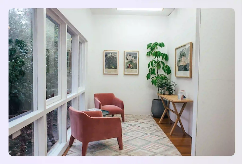
Image source – Pexels
Some of the key benefits of having white walls for your interiors are:
- White walls reflect light, making a small space feel brighter and more open. This is especially beneficial for apartments or homes with limited natural light.
- White walls are a blank slate, so you can easily change up the look of your space by adding different furniture, accessories, and artwork.
- A quick wipe-down with a damp cloth will do the trick. and your white walls will get clean in a jiff. This is a major advantage over darker colors, which can show dirt and stains more easily.
- White is a classic color that never goes out of style. This means you can be confident that your white walls will look good years later, if you maintain them properly.
- White can also be used as a pop of color in a room. For example, you could paint one wall white or add white accents to furniture and accessories.
The above benefits clearly indicate how white paint can impact your interiors. However, it’s important to understand that there is no single shade of white that is universally suitable.
There are numerous shades of white available, each with its own subtle undertones that may be gray, yellow, pink, or blue. So, choosing the right white paint for your space becomes important.
Understanding the Undertones
While choosing white paint, selecting off-white with a visible undertone can help hide flaws when painting walls. Testing the paint on the actual walls is also crucial, as white can look different in various lighting.
Another best practice to follow is to use different shades of white for trim, molding, ceilings, and doors or play with textures and finishes for added dimension.
But before you start choosing white paint from different undertones, understanding them is crucial. For example, there are cool undertones and warm undertones of white paint with stark differences that impact interiors differently.
Cool vs. Warm Whites
When it comes to undertones in colors, including whites, cool and warm undertones refer to the underlying hues that are present. Cool undertones typically have a bluish, pinkish, or purplish hue, while warm undertones tend to have a yellow, golden, or peachy hue.
Understanding the difference between cool and warm white paint can be helpful when selecting colors for various purposes, such as choosing a paint color or creating a cohesive color palette.
Neutral Undertones
Neutral white paints are undertones without any specific warm or cool undertones, making them an optimal choice for anyone who prefers a bright, clean shade of white. Sherwin-Williams Extra White (SW 7006) is a paint that comes without any distinct cool or warm undertones.
Read also – 30 Jargons and Other Popular Terms Used in Interior Designing
Testing for Undertones
Testing for undertones in white paint samples can be challenging as whites can have subtle undertones that might not be immediately apparent. One way to identify undertones in white paint samples is to compare them to a true white reference point.
For example, you can compare true white with green undertones; the difference will be apparent due to a greenish tint.
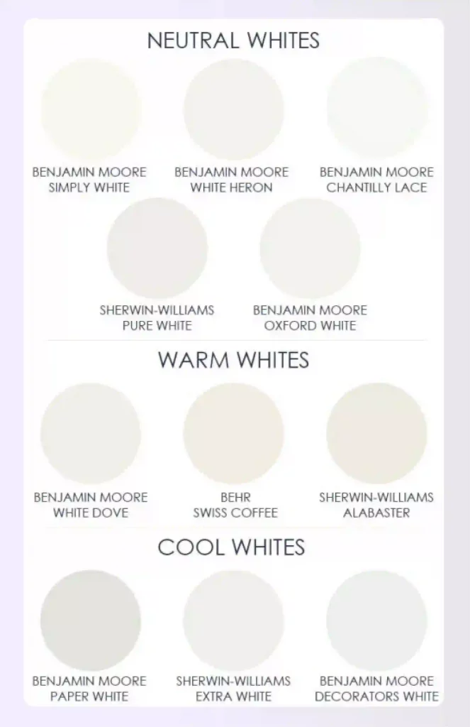
Image credit – Pinterest
True white tends to favor cooler undertones, while warmer undertones may give the impression of off-white or creamy hues. You can also try painting small samples of white paint on a wall and observe how they appear in different lighting conditions to determine their undertones.
Consider Your Space and Lighting
Your space and lighting play a significant role in any interior design decision, and this is particularly true when selecting paint colors, especially white.
Natural Light
Natural light, which comes in through your windows, can affect how colors, particularly white, appear in a room. For instance, rooms that face north get softer light, which gives a warmer effect – dark colors look darker, and light colors, like white, are more subdued.
South-facing rooms get the most intense light, causing a brightening effect on dark colors and possibly washing out light colors like white. Thus, the direction and intensity of the natural light can impact how white paint appears in your space.
Take the example of Benjamin Moore’s white dove. If your room receives north-facing light, Benjamin Moore’s White Dove can provide a gentle and soothing contrast to the cool light filtering in through your windows. However, White Dove may appear slightly warmer in tone in rooms with south-facing or west-facing afternoon light.
Read also – The Importance of Lighting in Interior Design
Room Size and Room Function While Choosing the White Paint for Your Space
The room size also matters when choosing white paint colors. Larger rooms can handle a variety of shades but consider that darker shades can make the room feel smaller. For smaller rooms, lighter shades of white can help make the space feel bigger and more open.
The room’s function is also a key to consider,
- Living Rooms and Bedrooms: White paint in these spaces can create a calm and relaxing atmosphere, providing a peaceful retreat from the outside world. It can also be a versatile backdrop for various decor styles and colors.
- Kitchen: White paint in a kitchen can make the space feel clean and fresh. It also helps enhance the perception of cleanliness as any dirt or stains are more noticeable, making it easier to maintain hygiene.
- Workspaces: White paint in workspaces can promote focus and concentration. It provides a clean and neutral environment, reducing distractions and allowing the mind to stay focused.
- Bathrooms: White paint can create a spa-like ambiance, providing a sense of purity and cleanliness.
Read also – Average Bathroom Size for Standard and Master Bathroom

Types of White Paint Finishes
Speaking of finishes, each of them offer different characteristics.
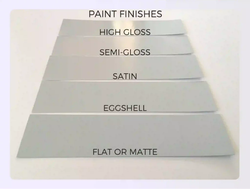
Image credit – Pinterest
Flat/Matte Finish
Flat or matte white paint provides a sophisticated and muted look that is perfect for living rooms or bedrooms. It is a versatile color that can be paired with a variety of other colors and styles. Flat or matte white paint can help to create a calming and relaxing atmosphere in a room. It is also a good choice for areas that get a lot of natural light, as it will not reflect the light as much as other types of paint.
Eggshell Finish
Eggshell, with its slight sheen, is a great choice for hallways or dining rooms. Eggshell paint is a great choice for hallways or dining rooms because it is durable and easy to clean. It also has a slight sheen that makes it look polished and elegant. Eggshell paint is a good choice for areas where you and your family spend more time because it is resistant to chipping and fading.
It is also easy to clean, so it is a good choice for families with children or pets. The slight sheen of eggshell paint makes it look more polished and elegant than flat paint, but not as shiny as semi-gloss or high-gloss paint. This makes it a good choice for hallways and dining rooms, which are often used for formal occasions.
Semi-Gloss/Gloss Finish
Semi-gloss or gloss finishes are reflective, making them suitable for bathroom or kitchen cabinets where moisture is a factor.
This is because the reflective surface helps to prevent water from spotting or streaking on the cabinets. Additionally, the glossy finish is easy to clean and maintain, which is important in high-traffic areas like bathrooms and kitchens.
However, it is important to note that semi-gloss or gloss finishes are more susceptible to fingerprints and other marks than other finishes. Therefore, they may require more frequent cleaning.
Testing Paint Samples
When testing paint samples for home decor, apply the ones you’re considering to each wall in the room, as the appearance can change based on lighting conditions.
Sample Application
Here are some tips for applying paint samples to the wall:
- Use a light touch when applying the paint sample. You can always add more paint if needed.
- Apply the paint sample in a few different areas of the wall to get a good idea of how it will look.
- Let the paint dry completely before making a decision about whether or not to use it.
- Consider the lighting in the room when choosing a paint sample. Some colors will look different in different lighting conditions.
- If you are unsure about which color to choose, ask a friend or family member for their opinion.
Observing at Different Times
Observing samples at different times and in various lighting conditions can help you to better understand their properties. For example, if you are observing a sample of a mineral, you may want to observe it in natural light, in artificial light, and under a microscope.
This will help you to see the different ways that the light interacts with the mineral and to identify any features that may not be visible in one type of light.
Comparison
You can use swatches available at the paint store to differentiate between different undertones like cool white, off-white, or bright white. When comparing different white paint samples, it is important to do so side-by-side in a well-lit area. This will help you to see the subtle differences in color and undertone between the samples.
It is also helpful to view the samples in different lighting conditions, such as natural light and artificial light, to see how they will look in different settings. Additionally, you may want to consider the finish of the paint, such as matte, eggshell, or semi-gloss, as this can also affect the overall appearance of the paint.
Popular White Paint Picks
Classic White
Classic white, antique white, and designer white all offer different vibes in spaces. Classic white brings a timeless, crisp vibe to a room, while antique white has a warm, slightly creamy look for a more classic and cozy feel.
Antique White
One of the most popular classic white is alabaster, used for centuries in carvings and plaster walls. You can also choose a cloud white or creamy white paint for your walls making it pop and adding aesthetic value.
Designer Whites
Designer whites, often favored by interior designers for their versatility, come in various undersides and levels of warmth and coolness to match different spaces and styles.
Another great pick is the decorator’s white which is quite bright with the slightest touch of a gray background. It’s a pretty white color that is excellent for trim, baseboards, doors, and cabinets.

Using Foyr Neo for Visualizing White Paint
Foyr Neo can be used to visualize different white paint colors virtually, helping you to explore the different options without having to apply them physically. You can experiment with different paint finishes to see how they interact with the room’s lighting conditions and furniture.
By visualizing this virtually, you can save time and resources, making Foyr Neo a valuable tool in the paint selection process. Using Foyr Neo, you can also visualize different viewing angles and its impact on your favorite white paint.
For example, you can use the Foyr Neo platform and visualize how white walls may impact the lighting for north-facing rooms. Similarly, there are endless possibilities with Foyr Neo’s platform.
Conclusion: Achieving Perfection with the Right White Paint
Choosing your wall color is always challenging as every space has a distinct character. However, choosing white paint for your space becomes complex due to several undertones and their impact. Understanding these undertones, the difference between soft whites and warmer white paint, and considering natural light becomes crucial.
You also need to consider the types of finishes, and the size of the room to choose the white paint for your space. Testing these paint colors is also important before you apply them to walls. This is where a platform like Foyr Neo can help you reduce the cost of testing white paint samples through visualizations.
Homeowners can test white undertones on walls virtually through Foyr Neo reducing the cost of repainting patches made for testing samples. Sign up today on Foyr Neo and empower the makeover of your space.

FAQs
What is the best warm white paint that doesn’t look yellow?
Some good warm white paints that don’t look yellow include Sherwin-Williams Alabaster, Sherwin-Williams Agreeable Gray, and Sherwin-Williams Simply White.
How to choose a Sherwin-Williams white?
There are a few things to consider when choosing a Sherwin-Williams white:
- The undertones of the white. Some whites have warm undertones, while others have cool undertones. Choose a white with an undertone that will complement the other colors in your room.
- The finish of the white. Sherwin-Williams offers a variety of finishes for their whites, from matte to high-gloss. Choose a finish that will work with the style of your room.
- The amount of light in the room. Whites can appear different in different lighting conditions. Choose a white that will look good in both natural and artificial light in your room.
Is pure white or extra white better for trim?
Pure white is a brighter white, while extra white is a more muted white. If you want your trim to stand out, choose pure white. If you want your trim to blend in more with the walls, choose extra white.
How do I choose a complementary paint color?
To choose a complementary paint color, use a color wheel. Complementary colors are colors that are opposite each other on the color wheel. For example, blue and orange are complementary colors.
What are the 3 best colors that go together?
Some good colors that go together include:
- White, black, and gray
- Blue, green, and yellow
- Red, orange, and yellow
What is the 60 30 10 decorating rule?
The 60 30 10 decorating rule is a guideline for choosing colors for a room. The rule states that 60% of the room should be one color, 30% should be another color, and 10% should be a third color.
What is the best white paint for walls?
The best white paint for walls depends on undertones and lighting. Popular choices include Benjamin Moore White Dove, Sherwin-Williams Alabaster, and Simply White. Use Foyr Neo to compare different shades of white paint virtually before finalizing.
Is white paint good for interior walls?
Yes, white paint is an excellent choice for interior walls as it reflects light, makes rooms look spacious, and complements any décor style. It also offers a timeless appeal that suits both modern and classic interiors.
How to choose a shade of white paint?
Consider lighting, room size, and décor before selecting a shade. Warm whites create cozy vibes, while cool whites offer a crisp look. Foyr Neo lets you test different shades of white wall paint virtually to avoid costly errors.
Why do painters not use pure white?
Pure white often appears stark or harsh under natural light. It can highlight imperfections and feel sterile. Painters usually recommend off-white or whites with subtle undertones for a softer, more inviting effect on walls.
How long does white paint last?
High-quality white paint for walls can last five to seven years with proper maintenance. Durability depends on finish type, exposure to sunlight, and room usage. Periodic cleaning helps retain the fresh and bright appearance longer.
What is the difference between White Dove and Cloud White?
White Dove has a warmer undertone, making it slightly creamier, while Cloud White appears brighter and crisper. The choice depends on your room’s natural light and the overall design mood you want to create.
When not to use White Dove paint?
Avoid using White Dove in spaces with strong yellow or warm lighting, as it may appear too creamy. In such cases, choosing a more neutral or crisp type of white paint for walls works better.