“Paint is the best tool to create the biggest impact you can in a room for the least amount of money, and it’s important to get it right.”
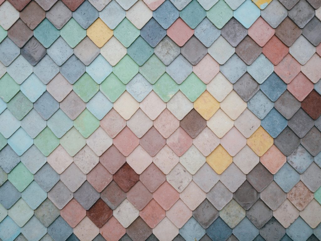
Colors have a profound impact on you. They affect your mind and body and leave a lasting effect on you in the long run. Colors painted in your home, where you spend most of your life and interact with the people closest to you are vital and need to reflect your personality, and character and resonate with the context of your home.
With the infinite color combinations that exist, it is easier to get lost in the maze. Luckily, we’re here to see things through and show you how you can go about picking paint colors for interior design and creating magic for your clients.
Scan the space for all possible designs and colors
Take into account the landscape on which the client’s home is situated, the colors used in the neighboring houses, seasons the landscape is prone to, temperature, illumination, openness of the space, be it a small space or a large one, circulation of air and light, number of occupants, etc. If the house is on a higher latitude, lighter colors will suit the home, as it receives lower sun angles.
These major criteria help you assess the possibilities of design and narrow down your color preferences.
Lighting and wall paint colors
The room you frequently use needs to get plenty of natural light and the colors you use in those rooms need to be well thought out, felt, and tested.
Bright rooms need to have neutral or toned-down colors. Bright colors in bright rooms will glare and be uncomfortable to look at. In the same vein, colors like yellow look different in a north-facing room, and radically different (warmer) in south-facing rooms.
| Pro tip: An important question to ask your client at this stage is whether they want a light airy space, or a cozy, dramatic room. This will help you gauge if they want a light or a dark room. |
Note that the color in a room with natural light will look different at the end of the day when artificial light is turned on. The colors you choose will need to agree with both scenarios, at all times.
Understanding the impact of wall paint colors on interior design
Colors exude energy and can impact our mood, and quality of life. You should also note that each color choice has a positive and a negative connotation, based on cultural perspectives. That’s why a harmonious paint color palette with the best shades of color would make a place feel pleasant.
Here are a few criteria you need to evaluate before determining the right color for it.
| Criteria | Meaning |
| Hue | Raw color |
| Saturation | How intense the color is |
| Value | How light or dark the color is and decides how much light is reflected back. |
| Tint | Adding white to a hue to make it lighter |
| Shade | Adding black to a hue to make it darker |
| Tones | Adding grey to a hue |
We’ll break down major colors and their potential emotional and visceral effects for you:
Green
If your client wants a fresh start, green is the clear choice. When exposed for a long time, certain shades of green may also signify stagnation.
Pink
It’s a relaxing and calming color that’s proven to ease your mood within 15 minutes. That’s why it’s apt for bedrooms, bathrooms, and spaces where you need to relax. It can also display playfulness and lightheartedness.
Blue
Blue stands for loyalty, stability, and calmness. Sometimes, the same color can also construed to signify depression and gloom.
| Did you know that Victorians painted their kitchens blue because they thought it was a color of cleanliness and that it would keep flies away? |
Yellow
Yellow stands for optimism, energy, and effervescence. It’s attention-grabbing in nature since our eyes tend to process yellow first, amongst other colors. It also denotes optimism, sunshine, happiness, and freshness.
Unless your client wants their home feeling too energized, stay away from using yellow on hallways and front doors. If you want yellow to be used in some way or another, consider using them as subtle mustard dots in a different paint color.
Black
It’s a colossal color that simply emanates sophistication and timelessness. It can be a risky color to pair with, as it tends to overtake the pairing color quickly.
Red
Is a rather extreme color that shows strong emotions such as passion, anger, danger, and energy.
Brown
An earthy, natural tone embodies the soil, and sand, and displays trust and stability.
What paint colors can you choose for each part of your client’s home?
Pick out 3 main colors and other secondary colors to decorate different areas of your client’s home. For example, if you have black cabinets in the kitchen, choose light grey countertops. For each room, ensure you have three colors/shades in the following proportion to create a smooth transition, be pleasant to the eyes, and spark interest.
| Color type | Percentage |
| Dominant color | 60% |
| Secondary color | 30% |
| Accent color | 10% |
Open-concept rooms
Neutrals are great for unifying two or more spaces. If your client has an open-concept kitchen and living room, go with neutrals, and add splashes of color wherever necessary. Use the same hues to maintain fluidity throughout. If your client wishes to change the look of the room after a few years, they can simply swap, or rotate furniture from other rooms and give it a fresh breath.
Read also – Building an Open Concept Kitchen Living Room in 2023: Everything You Should Know
Kitchens and dining rooms
- Red, when toned down a bit, is a fantastic color for increasing appetite, and can be used for dining rooms and kitchens.
- Yellow makes you eat more and agitates. A soft version of yellow is perfect for dining rooms.
- Given the clinical look light blue gives, stay away from using it in kitchens.
- Off-white kitchens look timeless.
- Go for green for kitchens. It brings a natural and sustainable feeling to the space. Dark green is great, minty green, also works fine.
- Blue wallpaper, accent, cushions, rugs, and fabrics when paired with orange appeal to the people in the dining area.
Read also – 35 Best Kitchen Color Schemes for All Types of Kitchen
Home office
- Blue for evoking concentration, and intellectual conversations.
- Bright red denotes success, passion, and hard work, which are integral feelings that drive thinking and action in the office space.
- If you want a lighter setting, go for nice warm white walls, with a black picture frame, and a desk facing the window, so your space illuminates well.
Read also – 15 Work From Home Essentials for Your Home Office Setup
Gardens
- Choosing paint colors of white, green, and purple colors for your yard and garden decor is a good idea if you want a classic, subtly impressive look. The only caveat is, that they are seasonal colors.
- To make a bold statement in the yard, go for purple and orange shades. Perpetual colors like neon yellow, red, and green resonate well with any season.
- The key is to figure out the details in the design stage itself using a tool like Foyr Neo, so your client is aware of how their garden will look in different seasons.
Bedrooms
- If your client has children who are quickly stimulated and take longer than usual to calm down, avoid yellow in their bedroom. Go for pastels and neutrals.
- Humble gold emanates happiness and sophistication, which can make a good choice for luxurious bedrooms.
Trending wall paint color schemes in 2023 and 2024
- Jewel tones, bright, and mid-tones are in vogue at the moment.
- Sweet embrace, delicious blossom pink
- Delicate pink and other comforting colors
- Bold colors, chromatic, and rich colors
- Golden yellow lilacs
- Sweet greens and blues for a calming effect
Common wall color mistakes interior designers make and how you can avoid them
Many designers don’t look at the right aspects when it comes to choosing colors. When presented with a range of confusing colors, the client hastily makes a decision, which doesn’t work out in the long run. Both these are costly mistakes that could end in the client repainting their home in a short while.
When you’re designing a dream home for a first-time homeowner, or repainting their home with a new color, keep in mind these points and avoid the mistakes most designers like you tend to make.
#1 Starting with the color before conceptualizing the layout of the house
It’s advisable to pick out the style of the house, context, and type of rugs, and evaluate the amount of light each room receives before whipping out the perfect color palette.
#2 Show the clients the paint decks and wait for the client to choose their colors
Truth be told, paint decks, with their wide range of colors, can be overwhelming, and it’s important to have options narrowed down before looking at paint samples.
#3 Painting the ceiling white, regardless of what color the walls are
Often we’ve seen homes with stunning wallpapers leave the ceiling plain white. Believe it or not, the usual reaction is to look at the ceiling that stands out from the colorful walls. A pro tip would be to paint the ceiling a color that complements the other walls.
#4 Not playing with paint finishes in a uniformly colored room
If you’ve used a single color throughout your room, and different (lighter and darker shades) of it, it might feel suffocating after a while. Go for different paint finishes(matte, semi-gloss, etc) in the same color, so the overall feel is boosted.
#5 Leaving the crease white
Your client’s builders might leave the creases white. But, if you can exactly point out where your accent wall ends, and starts, you’re doing it wrong.
#6 Wallpapering the insides of closets and garages
Don’t waste expensive wallpapers inside concealed places. Put it up on walls, especially the entry foyer which can give you a preview of the theme of your home and set the tone for your overall room feel. You can also wallpaper the bedroom ceiling, which is the first place you see when you wake up.
Read also – How to Install Mural Wallpaper: A Step-by-Step Guide
#7 Picking the same colored sofas and fixtures
If your client wants a neutral tone but wants a splash of colors as well, you can have bright, colorful accent pieces that you can move around after a few years.
#8 Not experimenting with undertones and neutrals thoroughly
Some undertones, especially grey with blue, give an industrial feeling that most people don’t like. Whereas, grey with a warmer undertone gives off a happier vibe in the long haul.
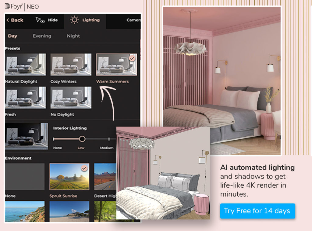
#9 Not considering the impact of lighting
Based on the furniture and lighting you have in the room, the looks of the undertone could change. This visual play can’t be seen from paint strips, paint chips, color samples or small paint swatches in the paint store.
You need to paint large patches on the walls with varying lighting and observe how colors, especially undertones, respond when they have light bouncing off of them. Have your client look at samples on the walls at the time of day when they are likely to use the room for a long time.
Read also – The Importance of Lighting in Interior Design
Understanding neutrals and undertones
Neutrals are colors that go with every color – beige, white, grey, ivory, and black. These colors work well with blue, red, green, pink, purple, and orange. They are timeless, pleasing to the eye, and good for the long haul. Neutral color schemes on the color wheel allow interior design objects to occupy a more dominant role.
| Did you know neutrals increase your home resale value because they give the look of a luxury home? |
That’s why when in doubt, you can advise your client to buy neutral-themed budget-friendly furniture, and then throw in accent, bright-colored pieces of furniture, or fancy add-ons later on. When colors have an undertone of warmth, they are more pleasant on the eyes when looked at in the long run. The best part is, neutrals blend in well with any style of furniture – French, country, traditional, modern, or contemporary.
Now that we know what neutrals are, let’s understand undertones. They are colors you see underneath neutral colors. There are 3 grey, 3 primary, and 2 secondary undertones, and 1 Toupe, that can be combined with different neutrals of different shades.
Cool and warm colors
Colors related to oceans, like blue and green are cool colors. They make rooms look larger. Those colors that signify fire, or light, like yellow, orange, etc, and warm colors. For a synchronized and symmetrical look, it is advisable to maintain your color palette within the same tonal and color family.
How can you help your customers choose their home interior paint colors?
Colors make us feel connected to ourselves and to others. They influence our actions and that’s why as a designer, you need to take an informed approach and guide your client with the apt choice for every space.
Here are a bunch of tried and tested steps to bring your customers close to picking the wall colors for their dream home.
- Ask to see your client’s wardrobe. Their favorite colors are a good starting point. They can be a source of color inspiration.
- See their Pinterest or social media saves to get a glimpse of their wishlist. Enquire the vibe they want to create – in the overall home, and in each space.
- If their wardrobe is eclectic, ask them to choose one or two groups from the following: Red and orange, Yellow and purple or Green and blue
- Once you arrive at their preferred color group, you can dig deeper.
- Assess the energy of the house and its saturation.
- When you’ve figured out the layout, and zones of each room, show paint samples of the shortlisted colors. For a clearer visualization, hop on Foyr Neo and show them how their haven will look in the color they chose.
- Each hue of each color has a certain energy tied to it. So, show your client different hues, and assess how they feel about each hue.
- You can also paint large samples of color on their home walls in a few places that receive different levels of light.
- After you have shown different colors to your clients, and combinations and tried them out with samples and lighting, narrow down the choices to 3 – to constitute your main color palette.
- Choosing interior paint colors containing the major hues is ideal, since, you can lighten or darken as you plan the furniture and fixtures from there.
| Pro tip: The darker, deeper colors on the paint strip of your client’s preferred color can go on casings and doors. While the lighter colors can be used as wall colors. |
How can Foyr Neo help you guide your clients in picking the right wall color?
Given the criticality of color and the major impact it has on your client’s psyche and the home ambiance, you need absolute precision in visualizing, designing, and applying colors to the walls and interior decor items. Testing, experimenting with the mood intended for the space, lighting conditions, purpose, occupants of the room and many more considerations make color visualization and design increasingly hard for you, the designer, and give an endless list of options for your client to decide.
To handhold your client into making the right choice, and giving them the home they’ve always had on their wishlist, you need a master mood board, interior design planner tool, and 3D modeling tool to bring the home to life with the best combination of colors possible.
Would you believe us if we told you Foyr Neo can help you do it? How you ask.
- Create or import floor plans, and determine the landscape, and spatial requirements with never-before precision.
- Carve out spaces, fixtures, materials, and furniture needed to make the space feel aesthetic and functional.
- Access a library of over 50,000 3D elements with a world of options, and simply drag and drop them into the design.
- Zoom in on every inch of the wall, test and pick the right paint colors, experiment with different lighting with the help of AI, spot errors, and fix them.
- Model the 3D design, and create hyper-real 4K walkthrough videos with astounding quality.
- Once your colors sit well on the walls and bring out the intended effect, render them and get the design readied in a few minutes.
Do all this and more for your clients and make their lives colorful with Foyr Neo. Try out our 14-day free trial and see the stark difference in your color suggestions before and after using Neo.
FAQs
Cut out a small chip from the wall, and take it to your nearest paint store to compare. If not, scan the wall with your phone and compare them.
Observe the main colors used in the living room, assess the properties of the adjacent room, and pick one or two colors that resonate with the space.
Absolutely. Use accent walls to bring attention to a focal point, a memory wall, or an iconic element and create a stunning impression.
No, not really. As long as the colors belong to the same color family, there’s no problem.
If someone doesn’t like colors, try light hues like taupe, muted greens, and bluish green to add character and get more depth.