Learn » Interior Design Concepts »
Colors have a deep impact on our psyche. We make conscious and subconscious decisions on how certain colors make us feel.
Before we delve into discussing the color trend forecast, read a real-life example of how wall colors influence emotions.
Patricia Thenisch says beautifully in her TEDx Talk, “As humans, we pick a favorite color by layering a meaning and a feeling to it, mostly taken from previous experiences.”
Patricia cites an incident where a restaurant had painted their walls grey-blue. They usually turned on the air conditioning as customers walked in.
As days rolled by, more and more customers began complaining that the temperature was too cold for them. As an experiment, they changed the wall colors to a shade of orange between persimmon and apricot, which is a warmer color, and retained the same air conditioning temperature. Surprisingly, customers stopped complaining.
This shows how colors can play on our mental state.
As you design your clients’ spaces with some of the 2025 colors of the year, be wary of the properties of your color choice, and fit the overall interior style and the impact they’re bound to create.
With that out of the way, let’s have a closer look at what color trends major brands have come up with, and how you can bring them home to your clients.
Color of the Year Predictions of Major Color Brands
Nick Lewis, a seasoned interior designer from Canada says, “The color palettes have been so warm now ever since the pandemic. So, this year there’s a pullback and we’re venturing to subdued colors.”
While most people in the design community thought this year’s color would be red, most color brands have gone with a mellow tone and it speaks to what the world needs at this point – calming down to nurture bonds with the self and the community.
Read also – How To Become a Certified Interior Designer Without A Degree in 2024?
1. Pantone: Peach Fuzz
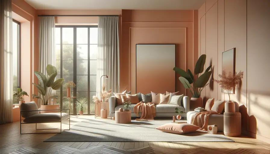
The color Peach Fuzz, a soft blend of pink and orange radiates warmth and healing. The Pantone Color Institute anticipates an increased interest in self-care in 2025 and hence a soothing color. Experts noticed that the world needs more nurturing, empathy, and compassion – most importantly oneself. Hence the spotlight on self-care. Peach Fuzz is a heartfelt hue that symbolizes caring, sharing, community, and the feeling of heartfelt kindness. It’s a soft peach nestled between pink and orange.
This color is not only warm and welcoming but also tactile, ideal for sparking creativity. As apparel, it enhances various skin tones, lighting up the face. In-home decor, its use as a fabric revitalizes and brings wellness and vibrancy to living spaces.
| Shiri Melody Miller elaborates how Peace Fuzz will be used, “Wall colors are making a serious comeback, and I think Pantone’s this year’s color is so warm and embracing that we’ll see many accent walls in this shade (for example, a main TV wall in the living room or the headboard wall in our bedroom) to create a homey and comfortable atmosphere.
Also, the color will dominate textiles (especially chairs, cushions, and curtains) for a feeling of softness and tranquility. And in kitchenware, it will add a twist to the world of cooking and baking. “ |
2. Benjamin Moore: Blue Nova
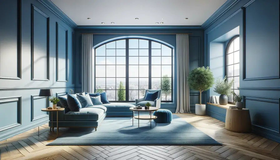
This year’s Benjamin Moore’s color palette is soft, balanced, and cohesive. Blue Nova is a gorgeous shade of royal blue, a lighter version of the bright colors identified last year. In case you’re going in for a monochromatic design a variation of mid-tone blue, you can pair Blue Nova with Polar Sky, which is a tinted version of the former color manufactured by the popular paint company.
Being in the family of blues, Blue Nova has the natural quality to reduce stress and bring a sense of calm and relaxation. When used in home decor, it creates a safe environment that gives your heart a familiar, relaxing feeling to nestle in the space.
Read also – How Much Does It Cost To Paint The Interior Of A House?
3. Behr: Cracked Pepper
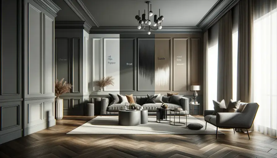
Cracked Pepper, a soft black with an LRV of 8, packs a punch. This rich, dark grey elevates spaces with its sensual neutrality. It shines on exteriors like doors and trims, or as an accent wall partnered with lighter hues. Its universal appeal avoids clashes but beware of a cool undertone in certain lighting. Show your client all angles!
This sophisticated shade loves a clean contrast. Pair it with Frost, an off-white (LRV 87), for a stunningly bright space. White trims and ample natural light amplify the drama. Craving warmth? Suede Gray, a taupe beauty, creates a cozy, earthy ambiance. Both pairings let Cracked Pepper sing!
4. Valspar: Renew Blue
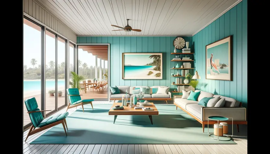
Looks turquoise and has a 1950s vibe to it. Gives off a retro look. Whether you want to go for a beachy vibe or paint it in a traditional setting, you’d be successful. Works well for houses in the coastal region.
Combine vintage colors with contemporary pastels/muted tones to create a harmonious aesthetic. Highlight the gorgeousness of Renew Blue in your client’s space with sleek furniture and minimalistic decor.
Read also – 8 Best Free Interior Design Software & Tools in 2024
5. Glidden: Limitless
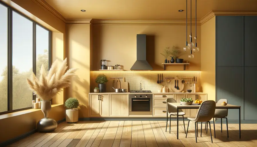
This honey-beige, golden, buttery shade is subtly stimulating, making it ideal for kitchen spaces. Its energetic character harmonizes beautifully with cooler blues. Versatile in application, it can either be a bold accent on walls or a complementary hue, always radiating liveliness. It embodies hope and joy, enhancing the mood with its fun and exuberant vibe. Particularly inviting as a wall color, it pairs exceptionally well with dark viridis colors, such as olive green, black, or off-black, creating a striking contrast.
However, given its stimulating nature, it’s advisable to avoid using this color in a child’s nursery, as it might make bedtime more challenging for both child and parents.
6. Sherwin Williams: Upward
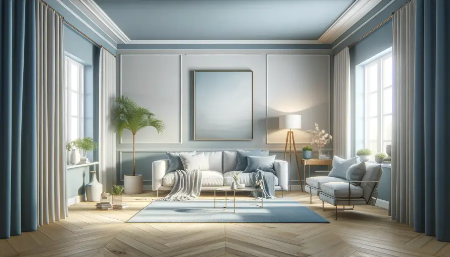
This color, with its major grey undertone, radiates tranquility and a breezy feel. With a Light Reflectance Value (LRV) of 57, it’s light and playful, reminiscent of sky blue, and brings a soothing touch. Used in interiors, it imparts a unique, fresh atmosphere, fostering calm, trust, and serenity, whether as a wall color or an accessory.
It pairs well with Drift of Mist (a classic neutral grey), Gale Force (a navy teal), Honeydew (a light, refreshing hue), and Palmleaf (adding a hint of gold).
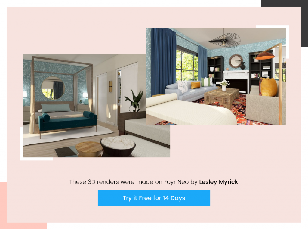
Image credits: All images featured in this blog are AI-generated or created using Foyr Neo, an advanced interior designing software.
Read also – 28 Best Wall Decor Ideas To Decorate Your Blank Wall
How is the Color of the Year Decided Every Year?
Every year the brands we spoke about come up with their choice of color for the upcoming year.
Research and brainstorming by color experts
Color forecasts are conducted months ahead by analyzing data and observing global trends. An expert team of designers and trend analysts collaboratively researches and sifts through over 2000 colors along with Leatrice Eiseman, the executive director to select the annual color for their brand.
This process captures the current mood, identifying a leading paint color and accompanying it with complementary shades. This creates versatile palettes, aiding consumers, designers, and DIY enthusiasts in choosing trendy, fresh colors.
Sue Wadden, the director of color marketing of Sherwin Williams says the company conducts annual forecast workshops every year, where they discuss macro-level design trends in automotive, fashion, consumer electronics, and architecture, and discuss how things will take shape in the coming year.
Color samples are made available for sale
After the color is announced, in a few weeks it trickles down to retail stores as color chips, peel-and-stick sheets, and paint samples. Make sure to get some of them to help your client visualize the color in their home.
Color variations are published as guidebooks for quick reference
Another asset you can use long-term is a color guidebook by Pantone or any other color brand. Offering tens of thousands of color options, it provides an extensive palette for client consultations in home decor. However, be mindful that frequent use can lead to oxidation of the guidebook. To ensure accuracy and stay current with trends, consider regularly updating to the latest edition.
Read also – How to Create the Best Architect Portfolio in 2024
What Happens After the Color of the Year is Announced?
Brands buy copies of the colors in various formats to make use of them in digital ads, billboards, merchandise, and whatnot. Earlier, the color of the year colors were communicated over the phone. This led to differences in understanding, and some manufacturing facilities of the same brand used different variations of the same hue in their product which affected their sales.
| Let’s take an example of Kodak cameras, as covered by the Wall Street Journal. Decades ago when Pantone announced the color of the year and Kodak wanted to use light yellow, they phoned up their branches and gave a verbal brief of how the color had to look. Each manufacturing facility perceived the color differently and produced different packages with different shades.
Ultimately, customers thought the lighter yellow boxes were the new products and the darker yellow boxes were old, dated ones. This affected Kodak’s camera sales that year massively. From that year on, Pantone Institute and others sell formulations of the color of the year in different formats to brands. |
Every format (billboard, furniture, artwork, clothing, digital ad, etc) has a different light reflective property and based on it, the color’s appearance would change. Formulations are adjusted to suit the levels of light reflections of different materials the brand would use the color on and sell to them.
Read also – Top 15 Latest Interior Design Trends in 2024
Where Can You See These Colors in 2025?
Everywhere you find an artist’s work or design trend, you can find these colors popping up. A few areas would include:
- Fashion merchandise, dresses
- Wedding color palettes
- Advertisements (digital and physical)
- Graphic design
- Cosmetics
- Home Accessories, and wallpaper brands such as Graham & Brown
- HGTV Homes
Role of a Design Tool in Deciding Colors for Your Clients’ Spaces
If you have a client who wants to introduce some of these colors in their home, you can do so confidently, provided they’re building from scratch.
In remodels, to avoid clashing with the existing style, add statement pieces in the desired colors and an accent wall for a pop of color.
But how can you decide where to infuse this color without spoiling the aesthetic? You visualize the new space with different possibilities in mind.
How? With a powerful design tool.
With an advanced tool like Foyr Neo, you can simply:
- Create or import your floor plans.
- Choose from 60,000+ 3D models in a huge variety of colors, shapes, and sizes from all major brands, including trending colors. Simply drag and drop them into your design.
- Don’t see a particular shade? Ask to create a custom model.
- Switch between 3D and 2D and rule out errors.
- Adjust lighting with AI, and preview under different natural and artificial lighting.
- Get a 360-degree walkthrough and render swiftly and seamlessly.
Anyone can use Foyr Neo and create designs that look highly professional and photorealistic.
Surprise your clients by bringing in elements in trending colors and take over your competition.
FAQs
It’s generally recommended to reserve the Color of the Year for smaller, interchangeable elements to maintain design flexibility.
Opt for lighter shades of the Color of the Year to amplify natural light and create an airy, inviting ambiance.
Yes, consider using it in outdoor cushions, planters, or furniture to seamlessly extend the design theme to exterior spaces.
Yes, balance it with neutral tones and use it selectively to create a welcoming and inclusive atmosphere in commercial spaces.
Timeless combinations include pairing the Color of the Year with classic neutrals like whites, grays, or deep earth tones for a sophisticated and enduring look.