Square bathrooms look easy to design. Four equal walls. Balanced proportions. Simple, right? Not exactly.
You can describe a 7×7 bathroom layout to a contractor, sketch a rough plan, and feel confident about where everything will go. Yet the real test of a layout only happens after installation.
If something feels cramped or awkward at that point, fixing it can be expensive. Really expensive.
In fact, square bathrooms are particularly prone to these issues. Corners quietly become wasted space. Door openings eat into valuable clearance. Toilets or vanities end up awkwardly positioned simply because symmetrical placement felt safe on paper.
I’ve seen the same mistakes so many times. And the truth is, square bathrooms don’t reward symmetry. They reward smart placement.
So, what actually works?
In this guide, you’ll find 16 square bathroom floor plans, organized by size. Each one with recommended dimensions, placement logic, and honest notes on when each layout works and when it doesn’t.

TL;DR – Quick Cheat Sheet for Square Bathroom Layouts by Size
Not ready to read through all 16 square bathroom layouts right now? Fair enough.
Here’s the quick version. Find your size, see what works, and jump to the section that applies to you.
| Room Size | Best Bathroom Layout | Why It Works |
| 5×5 ft | Corner shower or powder room | Keeps the center floor open so the space doesn’t feel like a cupboard |
| 6×6 ft | All-on-one wall or wet room | Saves on plumbing costs and frees up more usable floor space |
| 7×7 ft | L-shaped or opposite wall | Creates clear zones without wasting a single corner |
| 8×8 ft | Double vanity + separate shower | Enough room to finally separate wet and dry zones the right way |
| 10×10 ft | Full spa layout or private water closet | Now it’s less about fitting things in and more about making it feel intentional |
Now, if you need more detailed bathroom layout ideas, then I have added 16 ideas with designs for reference.
Small Square Bathroom Layout Ideas That Don’t Feel Like a Closet
Small square bathroom layouts are where most layout mistakes happen. And honestly, it’s not because people make bad choices. It’s because they run out of options fast and default to whatever fits.
The four bathroom layouts below are the ones I’ve seen actually work in tight square spaces.
1. The Corner Shower Setup
- Best for: Guest baths, studio apartments, small en-suites
- Size example: 5×5 ft or 6×6 ft
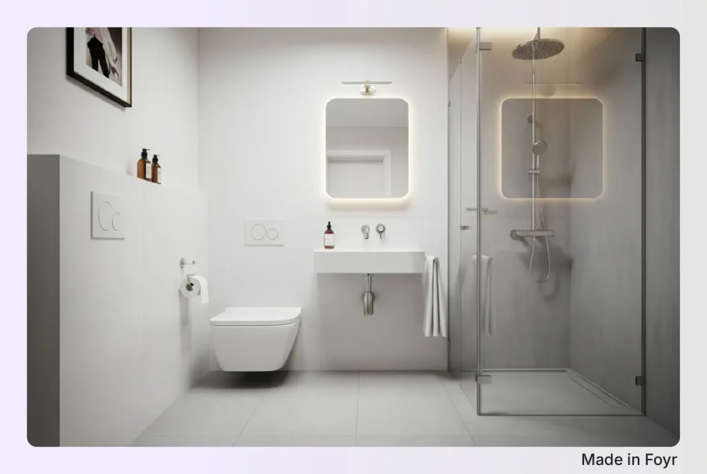
This layout has a corner shower diagonally across from the toilet, with a wall-mounted or floating sink on the remaining wall. This bathroom layout works because it keeps the center floor completely clear.
The key placement logic here is the shower going into the corner farthest from the door. This does two things. It keeps the wet zone out of the immediate sightline when you walk in, and it creates a natural path from the door to each fixture without any awkward sidesteps.
Protip: Go with a neo-angle shower base instead of a standard square one if you can. The clipped corner creates a more accessible entry angle, which matters a lot when you’re working in a tight space.
Pros:
- Maximizes center floor area
- natural traffic flow
- relatively straightforward plumbing
When to avoid it: If your door swings inward toward the shower, you’ll lose the clearance you just created. Either switch to a pocket door or flip the door swing outward first.

2. The All-On-One-Wall Bathroom Layout
- Best for: Narrow square bathrooms, budget remodels, rental units
- Size example: 5×6 ft or 6×6 ft
Everything (toilet, sink, shower) lines up along a single wall. It’s the least glamorous layout on this list, but it’s also the most practical one for tight budget and small space.
Why? Because keeping all your plumbing on one wall is the single biggest cost-saver in a compact bathroom remodel. No additional pipe runs, no extra labor, no surprises when the walls open up. The rest of the floor stays open, which in a 5×5 or 6×6 ft space is genuinely valuable.
The placement order matters, though. Shower at one end, toilet at the other, sink in the middle. This keeps the wet zone separated from the toilet and gives the sink a natural position between them. This is logical when you think about how you actually use a bathroom.
Pros:
- Lowest plumbing cost
- Maximum open floor
- Easy to execute
When to avoid it: If you want the new bathroom to feel aesthetic. This layout is efficient, not architectural. It works, but it won’t wow anyone.
3. The Powder Room Classic
- Best for: Half baths, guest powder rooms, high-traffic social spaces
- Size example: 5×5 ft
Toilet on one wall, sink on the opposite or adjacent wall. That’s it. No shower, no tub. Just the two fixtures a powder room actually needs.
I know this seems obvious, but I’ve seen people try to squeeze a shower into a 5×5 powder room and end up with a space that functions poorly as both. If the bathroom is genuinely being used as a half bath, commit to it. Two fixtures, done right, in a small square space can actually look intentional and clean.
The one design move worth making here. Go wall-hung for the toilet if the budget allows. It frees up 6–8 inches of floor depth, which in a 5×5 space makes the room feel noticeably less cramped. Pair it with a floating vanity, and you’ve got a visible floor on both sides. And that visual breathing room does a lot of heavy lifting.
Pros:
- Simple
- Low-cost
- Feels open when done right
When to avoid it: If guests will occasionally need a shower (even once in a while), a powder room won’t help much.
4. The Wet Room Layout
- Best for: Small full baths where shower space is non-negotiable
- Size example: 6×6 ft
A wet room removes the shower enclosure entirely. The floor is sloped toward a drain, the walls are fully waterproofed, and the shower area flows seamlessly into the rest of the bathroom. No curb to step over. No glass door is eating into your clearance. Just continuous floor space.
In a 6×6 ft bathroom, this can feel transformative. The absence of a shower box removes the biggest visual and physical barrier in a small square bathroom. And suddenly, the room gives a vibe of one cohesive space rather than a cramped box with a smaller box inside it.
The honest caveat: Wet rooms cost more. Expect 20%–30% higher than a standard shower remodel. Full waterproofing, correct floor slope, and careful detailing at every corner. Make sure you don’t try to cut costs here.
Pros:
- Maximum visual openness
- No clearance lost to the shower enclosure
- Genuinely spacious feel
When to avoid it: Tight budgets, or if the bathroom shares a wall with a bedroom, and moisture management is a concern.
You can also explore more small bathroom floor plans that can maximize your space.

Mid-Size Square Bathroom Floor Plans Where You Finally Have Choices
This is the average bathroom size range where most people actually have a functional bathroom to work with.
Why? Because it has just enough room to make proper layout decisions.
And honestly… This is also where I see the most indecision. Because when you have options, it’s easy to second-guess yourself.
Here are the six detailed small bathroom layouts that work best in this range.
5. The L-Shaped Fixture Layout
- Best for: Full baths, family bathrooms, shared bathrooms
- Size example: 6×6 ft or 7×7 ft
This layout places the vanity and toilet along one wall, and the shower or tub on the adjacent wall. That’s the L. Simple as it sounds, this layout does something most small bathroom layouts struggle to do. It creates two distinct zones without any partitions, walls, or additional square footage.
The wet zone (shower or tub) sits on one wall. The dry zone (vanity, toilet) sits on the other side. You walk in, and the layout just makes sense. There’s a reason this is one of the most commonly recommended configurations for square bathrooms in this size range. It uses the corner connection between two walls as a natural dividing point rather than wasting it.
In my experience, the mistake people make with the L-shaped layout is placing the toilet in the corner bend (right where the two walls meet). It ends up feeling squeezed and awkward. In this case, it’s always best to keep the toilet on the straighter stretch of the L, not tucked into the corner.
Pros:
- Natural zoning
- Open the center floor
- Works for both ¾ and full baths
When to avoid it: If your door placement puts you walking straight into the toilet. Always map the door swing first before committing to this one.

6. The Opposite Wall Setup
- Best for: ¾ baths, guest bathrooms, clean modern designs
- Size example: 6×6 ft or 7×7 ft
The idea here is straightforward: shower on one wall, vanity and toilet on the wall directly opposite. Two sides, clearly defined. Walk in, and everything has a place.
What I like about this layout is that it’s honest. It doesn’t try to do anything clever; it just creates two clean zones facing each other with a clear path between them. In a square bathroom, that central walkway feels surprisingly generous, even in a 6×6 ft space.
The placement detail that matters most here: keep the toilet closer to the door side of the vanity wall, not pushed into the far corner. This keeps the toilet from becoming the first thing you see when the front door opens. This is a small thing, but it makes a big difference in how the room feels.
Pros:
- Clean sightlines
- Logical flow
- Easy plumbing if both walls share a wet wall
When to avoid it: If the room is closer to 6×6 than 7×7, the walkway between the two walls can feel tight. You want at least 36 inches of clearance between facing fixtures.
7. Corner Shower + Floating Center Vanity
- Best for: Guest baths, design-forward spaces, smaller 6×6 rooms
- Size example: 6×6 ft
This one works by placing the corner shower in one diagonal corner, a floating vanity centered on the wall opposite the door, and a toilet tucked beside it. The vanity becomes the visual anchor of the room rather than an afterthought.
This bathroom layout works because it breaks the expected pattern. Most bathrooms put the vanity against the side wall and let the shower dominate. Centering the vanity opposite the door changes the hierarchy.
You walk in and see a clean, well-placed vanity with a mirror above it, not a shower enclosure. The corner shower sits in the background, doing its job without taking over the room.
Note: The floating vanity is non-negotiable here. A floor-mounted cabinet in the center of that wall will visually close the space. Keep the floor visible beneath it, and the layout looks more breathable.
Pros:
- Visually striking
- Clear focal point
- Shower stays out of the immediate sightline
When to avoid it: If storage is a priority, a floating center vanity gives you less cabinet space than a full wall-length unit would.

8. The Left-to-Right Rhythm Layout
- Best for: Full baths, bathrooms with a single entry door on the short wall
- Size example: 7×7 ft
This layout lines everything up along a single wall. Toilet on one end, vanity in the middle, and shower anchoring the far end. But of course, with enough width in a 7×7 space so that it doesn’t feel like a galley. The “rhythm” here is the way your eye moves across the room: low fixture, medium fixture, tall enclosure. It feels deliberate.
What makes this work in a square bathroom specifically is the width. In a narrow rectangular bathroom, this layout reads as a corridor. In a 7×7 square, the opposite wall is close enough to create a sense of enclosure without feeling cramped.
I’d recommend putting the shower at the far end of the door whenever possible. It keeps the wet zone away from the entry, and arriving at the shower feels like a destination rather than stumbling into it immediately.
Pros:
- Single plumbing wall keeps costs down
- Clear fixture hierarchy
- Works well with a window on the opposite wall
When to avoid it: In anything smaller than a 7×7, the center walkway gets too narrow to be comfortable.

9. The Tub-Shower Combo (The “Shub” Debate)
- Best for: Family bathrooms, homes with young children, budget-conscious full baths
- Size example: 6×6 ft or 7×7 ft
The tub-shower combo puts both functions into one fixture. This combo is also called a “shub” in design circles. Why? Because it divides opinion more than almost any other layout decision. And honestly, both sides have a point.
Now, in a mid-size square bathroom where you want both a tub and a shower but don’t have the square footage to separate them, a tub-shower combo is the most space-efficient solution available. One plumbing connection, one tiled enclosure, all four functions covered. For families with young children, it’s genuinely practical.
My take: if you have young kids or you’re designing for resale value in a mid-range market, do it. If this is your primary bathroom and you shower daily, seriously consider finding the space to separate them. Even a modest 32×32 inch shower stall and a compact soaking tub in a 7×7 room is a better experience than a combo.
If you are considering a tub-shower combo, then you might also like these 3/4 bathroom layout ideas.
Pros:
- Space-efficient
- Cost-effective
- Actually practical + usable for families
When to avoid it: Primary bathrooms where daily shower experience matters, or any design where you’re going for a premium feel.
10. The Symmetrical Mirror Layout
- Best for: Shared bathrooms, couples’ bathrooms, design-conscious spaces
- Size example: 7×7 ft
Two sinks. Centered on the vanity wall. Fixtures balanced on either side. This is the layout that makes a mid-size square bathroom feel considered rather than functional.
Symmetry in a bathroom is tricky. The key is that the symmetry should be in the vanity wall only. The shower and toilet on the other walls don’t need to mirror each other. In fact, forcing symmetry across all four walls in a square room usually creates awkward fixture placement. Let one wall be the symmetrical focal point, and let the rest of the bathroom layout be practical.
One honest note: a true double vanity needs at least 60 inches of wall space to feel right. In a 7×7 bathroom, that’s most of one wall. Also, make sure the door placement leaves that wall uninterrupted before committing to this layout.
Pros:
- Eliminates morning bottlenecks
- Strong visual impact,
- Works beautifully in square rooms
When to avoid it: For single-occupancy bathrooms, it’s overkill. Plus, you lose storage and counter space for no real benefit.

Large Square Bathroom Design Layouts Where Design Gets Interesting
At this size, the conversation shifts. Why? Because you no longer have to worry if everything will fit. But you need to worry about making it look pleasing and intentional.
And that’s a genuinely different design problem. More space means more decisions, and more decisions mean more ways to get it wrong.
These six layouts are the ones worth considering when you have the square footage to actually do something with.
11. Double Vanity + Separate Walk-In Shower
- Best for: Master bathrooms, couples’ bathrooms, primary suites
- Size example: 8×8 ft
This layout places a double vanity along one wall. So, you’ll need at least 60 inches of uninterrupted wall space for this to feel right with a separate walk-in shower on the opposite or adjacent wall. The toilet is tucked beside the vanity or in its own alcove.
The reason this layout works so well in a square room is balance. The vanity wall and the shower wall carry roughly equal visual weight, and the square footprint lets you stand at the vanity and have the shower directly in your sightline without it feeling like it’s crowding you.
One thing I’d flag from experience: people often undersize the walk-in shower when they go with a double vanity because the vanity takes up so much wall space. Don’t do that.
Also, a shower that’s smaller than 36×36 inches will feel like a punishment in an otherwise generous bathroom. If the double vanity means compromising the shower size, reconsider the layout entirely.
Useful resource: 5 cool Jack and Jill bathroom layout ideas for your home.
Pros:
- Eliminates morning bottlenecks
- Strong focal point
- Works beautifully for two people sharing a space
When to avoid it: Not suitable for single-occupancy bathrooms. Because you’re trading storage and counter flexibility for a feature you won’t use.

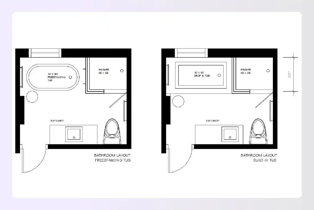
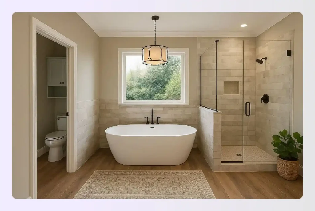
12. Freestanding Tub as the Focal Point
- Best for: Master suites, luxury primary bathrooms, design-forward spaces
- Size example: 8×8 ft or 9×9 ft
This layout centers a freestanding tub. It can be either truly in the center of the room or pulled slightly toward a feature wall. Plus, it has a shower, vanity, and toilet arranged around it in supporting roles.
The tub becomes the first thing you see when you walk in. Everything else is secondary. If the designer gets a good idea and does this right, it gives a square bathroom an unmistakably considered, almost hotel-like quality.
The placement question I get most often: Center of the room or against the wall?
My honest answer: against a feature wall almost always looks better in practice. A tub floating dead-center in a square room can feel exposed and slightly awkward unless the room is very large and very well-lit.
One practical note: freestanding tubs require floor plumbing. If you’re remodeling rather than building new, factor in the cost of running plumbing through the floor slab before falling in love with this layout.
Pros:
- Instant luxury feel
- Strong visual anchor
- Transforms a square room into a destination
When to avoid it: If the bathroom gets heavy, daily use and function matters more than aesthetics. Freestanding tubs are beautiful but they’re not the most practical bathing option.

13. The Private Water Closet Layout
- Best for: Shared master bathrooms, high-end primary suites
- Size example: 9×9 ft or 10×10 ft
This layout partitions the toilet into its own small enclosed space (usually around 36×66 inches minimum). It is separated from the rest of the bathroom by a wall and a door. The remaining square footage is given over to the vanity, shower, and tub.
Worth it or overkill? I’d say it depends entirely on who’s using the bathroom. For couples sharing a primary suite, a private water closet is one of those upgrades that genuinely improves daily life in a way that’s hard to quantify until you have it. For a single-occupancy bathroom, it’s probably not worth sacrificing the square footage.
The layout implication in a square room:
The water closet usually occupies one corner, which means the remaining three-quarters of the L-shape is what you’re designing around.
The vanity and shower naturally end up on the two longer walls, which works well. It gives the room a clear hierarchy.
You may also like these rectangular bathroom floor plans.
Pros:
- Real privacy
- Keeps odors contained
- Elevates the feel of the entire bathroom
When to avoid it: Anything under 9×9 ft — the water closet eats too much of the usable floor area to be worth it.
14. The Full Spa Zone Layout
- Best for: Luxury master bathrooms, primary suites with generous square footage
- Size example: 10×10 ft
This layout dedicates one side of the square to a fully contained wet zone. Shower and tub together behind a glass panel or low partition, and the other side to the dry zone: double vanity, storage, and toilet. Two worlds, clearly separated, within the same room.
The wet zone works because the shower and tub share plumbing fixtures on a single wall, which keeps costs manageable even at this scale. The glass panel or partial wall does the separation work without fully enclosing the wet area. This way, the room still looks like one open space visually, even though it functions as two distinct zones.
In a 10×10 square room, this layout has a natural symmetry that feels genuinely spa-like. The two zones balance each other across the center of the room, and with the right lighting, the distinction between the two areas becomes part of the experience.
Pros:
- Hotel-level separation of functions
- Shared plumbing wall keeps costs sensible
- Feels genuinely luxurious
When to avoid it: It won’t work if you want the tub as a standalone focal point. In this layout, the tub is part of the wet zone, not a centerpiece.

15. The Walk-In Shower Glass Wall
- Best for: Modern master bathrooms, design-forward primary suites
- Size example: 8×8 ft or 9×9 ft
This layout runs a full glass wall across one side of the square bathroom, separating a generously sized walk-in shower from the rest of the space. No door handle. No frame interrupts the view. Just glass, floor to ceiling.
What makes this layout particularly effective in a square room is that the glass wall doesn’t visually shrink the space the way a tiled shower enclosure does. You can see through it. The square footage on the shower side still reads as part of the room. In an 8×8 bathroom, this can make the space feel significantly larger than it actually is.
The practical consideration: A frameless glass wall of this scale needs proper structural support and a well-executed waterproofing system at the floor junction.
It’s not a DIY-friendly detail. But the result is a shower that feels like an extension of the bathroom rather than a box within a box. And honestly, it’s worth the investment for the right space.
Pros:
- Maximum visual openness
- Modern aesthetic
- Makes the square footprint feel larger than it is
When to avoid it: If privacy is a concern, or if the bathroom is shared by people with different schedules, a glass wall is beautiful but it doesn’t offer much concealment.

16. The Windowside Soaking Tub Layout
- Best for: Bathrooms with an exterior wall and a natural light source
- Size example: 8×8 ft or larger
Now this layout is one of my most favourite ones. It positions a soaking tub directly beneath or adjacent to a window. Ideally, on the exterior wall with the best natural light or view, with the shower, vanity, and toilet arranged on the remaining three walls.
The window does two things here:
- It gives the tub a destination quality. A reason to be where it is.
- And it floods the wet zone with natural light, which changes the entire feel of the space.
A soaking tub next to a window, especially one with a garden or skyline view, is one of those design moves that photographs beautifully but, more importantly, feels genuinely different to use.
The placement logic is simple: tub under the window, shower on an adjacent wall close enough to share plumbing, vanity on the wall opposite the door, toilet tucked in the remaining corner. In a square room, this arrangement almost designs itself once the window wall is identified.
The one honest caveat: privacy. If the window faces a neighbor or a street, you’ll need frosted glazing or a privacy film. This somewhat diminishes the natural light benefit.
Pros:
- Natural light improves the bathing experience
- Gives the tub a clear sense of purpose and placement
- Works especially well in square rooms
When to avoid it: Not suitable for windows with poor light, or any window with a direct sightline from outside. The privacy compromise isn’t worth it.

Space Saving Tips for Bathroom Designers (Works Really Well)
Getting the layout right is half the battle. The other half is making the space feel as good as it functions.
Note: These aren’t decorating tips. They’re the design decisions that actually change how a small square bathroom reads. And I’ve seen each of these make a real difference in how a finished space feels compared to the plan on paper.
1. Float Everything You Can Off the Floor
Wall-hung toilets and floating vanities are the single most impactful upgrade in a small square bathroom. When the floor is visible from wall to wall, the room looks significantly larger than it actually is.
It’s not a trick exactly, it’s just how our eyes process space. Visible floor equals perceived openness.
2. Go Large Format on the Tiles
The counterintuitive move in a small bathroom is to use larger tiles, not smaller ones. Smaller mosaic tiles create more grout lines, and more grout lines mean more visual interruption. The room feels busier and therefore smaller.
Large format tiles reduce grout lines significantly and let surfaces read as continuous planes. The floor looks like one unbroken surface. The walls feel smoother.
I’d also recommend continuing the same floor tile under the floating vanity rather than stopping at the cabinet base. The unbroken sightline at floor level makes a quiet but real difference.
3. Place Mirrors Where They Reflect Depth
Most people treat bathroom mirrors as a vanity fixture — you put them above the pedestal sink, and that’s that. But in a small square bathroom, large mirror placement is a genuine design tool.
A mirror positioned to reflect the shower wall or a window doesn’t just bounce light — it creates the illusion of depth. The room appears to extend beyond where it actually ends. Check the following image for example.

Keep the Center Floor Clear
This is the one rule that underlies almost every small square bathroom layout. Whatever you do with the fixtures, the center of the floor should be open. No freestanding storage, no laundry basket, no awkwardly placed toilet that forces you to sidestep everything you do in there.
A clear center floor does two things: it gives the room a visual breathing point, and it makes the space feel functional rather than just filled. Every layout in the small and mid-size sections above honors this rule in some way. It’s not a coincidence.
5. Light Colors + a Single Strong Design Accent
Small square bathrooms don’t have room for multiple design statements competing with each other. Bold floor tile and patterned wallpaper, and a statement vanity in the same 6×6 space is visual chaos.
The move that works every time: pick one element to lead. It can be a dramatic floor tile, a floating vanity in a strong color, or an oversized mirror. And let everything else be quiet. The one accent reads as intentional. Five accents read as cluttered.
Visualize Your Square Bathroom Layout Before You Build
Reading through 16 layout ideas is useful. But there’s a gap between understanding a layout on paper and actually knowing how it’ll feel in your specific room.
That gap is where most bathroom mistakes happen.
The honest truth is: you won’t know if a layout truly works until you can see it.
Not a sketch, not a rough floor plan. You need an actual rendered visualization of the space with real dimensions, real materials, and real furniture in it.
That’s exactly what Foyr Neo is built for (it’s an interior design software).
It’s the software I’d recommend to any designer before a single tile gets ordered. You can start with a 2D floor plan, drop in your fixtures from a library of 60,000+ render-ready 3D models, and convert it to a fully rendered 3D visualization in minutes. (Not hours. Minutes.)
As Eric Dillman, an interior designer who uses Foyr Neo, put it, “I made my first complete design within 30 minutes of starting.” That’s just what the platform is built to do.
If you’re planning a bathroom renovation (or designing one for a client), visualizing it properly before construction is the one step that pays for itself every time.
Try Foyr Neo free for 14 days and design your bathroom layout before you build it.
FAQs
What is the best layout for a square bathroom?
There’s no single best layout. It depends on the size of the room and how it’s being used. For small square bathrooms (5×5 to 6×6 ft), a corner shower setup or all-on-one-wall layout works best. For mid-size rooms (6×6 to 7×7 ft), an L-shaped or opposite wall layout gives you the best balance of function and space. For larger square bathrooms (8×8 ft and above), a double vanity with a separate walk-in shower or a full spa zone layout is worth considering.
What size is a small square bathroom?
A small square bathroom is generally anything under 6×6 ft (roughly 36 square feet or less). A 5×5 ft bathroom is on the tighter end and limits you to two or three fixtures comfortably. A 6×6 ft bathroom gives you slightly more flexibility and can accommodate a full bath with the right layout.
How do you maximize a small square bathroom?
The biggest gains come from a few specific decisions, like floating the vanity and toilet off the floor. It keeps the floor visually open. You can also use large-format tiles to reduce visual clutter. Layout-wise, a corner shower or wet room setup tends to free up the most usable floor area in a tight square space.
Can you fit a tub and shower in a small square bathroom?
Technically yes. A tub-shower combo (sometimes called a “shub”) puts both functions into one fixture and works in a 6×6 ft space. But if you’re asking whether you can fit a separate tub and shower in a small square bathroom, the honest answer is usually no. Not without one of them feeling uncomfortably undersized.
What is the minimum size for a square bathroom with a shower?
The absolute minimum for a functional shower is 36×36 inches (but that’s tight). A 36×48 inch shower stall is more comfortable and is generally considered the practical minimum for daily use.
For the bathroom itself, a 5×5 ft square room is the smallest footprint that can realistically accommodate a shower alongside a toilet and sink, provided the layout is planned carefully.